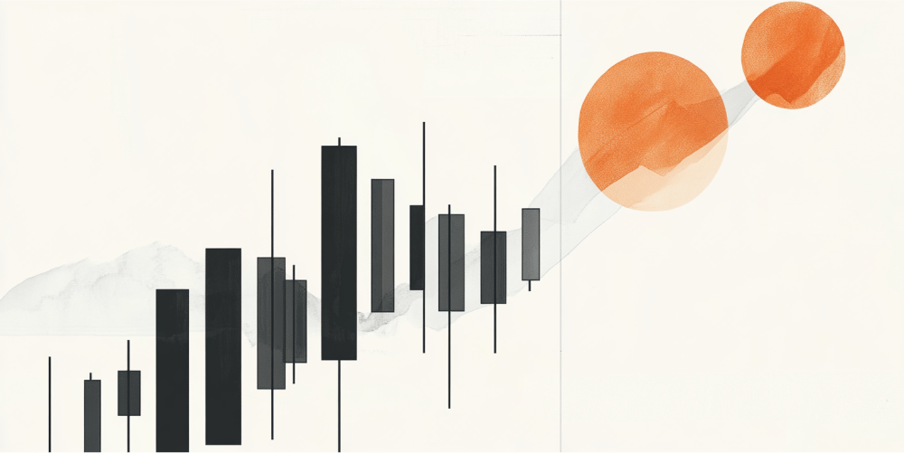
Are you trading with candle power?


Hello traders! This week’s newsletter will give you a bit of insight into the power of candlestick charts, especially when applied to your largest timeframes. Let’s get started on how to read candlestick charts and when to use them!
First of all, candlestick charts show us four pieces of information, they are:
-
The open (or first) trade of the time frame you are looking at
-
The high – highest priced trade for that timeframe
-
The low – the lowest priced trade for that timeframe
-
The close (or last) trade of the timeframe you are looking at. If the candle body is green, the bottom of the body is the open and the top of the body is the close; if the candle body is red, the open is the top of the body and the close is the bottom of the body. The “wicks”, “shadows”, or “tails” show how the highs and lows are placed in relationship to the open and close.
There are numerous Lessons From the Pros articles written about the basics of how to read candlestick charts. If you are new to them please dig a little and then come back to this piece.
At Online Trading Academy we believe that you should be looking at several timeframes to formulate your plan for any individual trade. This week, I’m going to focus on using weekly candlestick charts to help us get an idea of what will happen over the following few days of the next week. Generally, I want to know what the weekly charts are doing because it gives me a HUGE hint on what the big institutions are doing with their trades/positions. I’m not too concerned with 5 minute candles; when you start looking at small timeframes like 5 minutes, you end up trading too often (at least I do). Personally, I would rather ride the coattails of long term institutions than sit at my trading screen for most of the day!
There is an old phrase in trading: “Amateurs control the open and pros control the close.” Hey, it even rhymes! What I want to see is the CLOSE of a candle very near the highs, or a close very near the lows. I also prefer the candle itself to be larger than the previous candle. Notice the red candle marked “1”. Its high was higher than the previous green candle’s high, and the low was lower – hence a bigger candle. See where the red candle closed? Almost at the very bottom of its entire range. Also, it closed lower than the previous two candles’ lows. This is a small hint that there is an imbalance building in our supply and demand equation, probably to the downside. Here is the lesson: a very low (or very high) close relative to the range of the candle very often points us in the direction of the FIRST HALF of the next candle. Said another way, when a weekly candle closes at/near the very low, the first few days of the next week will more than likely go lower as well.
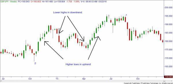
Now notice the red candle marked “2”. Many new traders will say that any red candle is bearish, but they would be incorrect. This particular candle is actually very bullish. As stated before, each candle shows the open, close, high and low. Notice the close vs. the low; that was a very strong move to the upside! As far as I’m concerned, there just wasn’t enough time in the week to close higher than the open, which would have given us a green candle. Notice how even the next candle (green) closed near its high, which leads us to believe the next candle will go in the same direction. Also, the very large next green candle closed near its high, leading us to believe the next candle would at least start off in the same direction.
Another helpful hint with these larger timeframe candles is to look at the lows of the candles in uptrends and the highs in downtrends. In both uptrends marked, the weekly candle lows had higher lows for several weeks at a time. Now, I’m not saying you would have bought the bottoms and sold the tops, but the first trend lasted from about 168.00 all the way to 189.50, and the second uptrend went from 175.00 to about 195.50. Not bad if you can pull out a chunk of those moves by paying attention to the weekly candle hints! In downtrends, pay attention to the candle highs. As long as the highs are still lower, this would lead you to believe that the downtrend is still intact. The two downtrends marked went from 187.80 to 175.70 and 185.00 to 175.00.
Obviously, no trend lasts forever. As the students of Online Trading Academy and the long time readers of these Lessons know, an uptrend will usually end at a significant supply zone and a downtrend will usually end at a significant demand zone. My hope is that by using these two candlestick charting hints, you will be able to pull out more pips when your chosen market is trending!
Until next time.
Author

Rick Wright
Online Trading Academy
Rick studied economics and psychology at Iowa State University, and entered into the brokerage business in 1992. He earned the NASD Series 4,7,9,10,24,55,63, and 65 licenses. He helped grow an online brokerage business which was eventually sold off.