It has been a while since I wrote about option payoff diagrams. If you are not familiar with these, it is a good idea to learn about them. They allow us to make good estimates of how our option trades will do under varied conditions. Being able to do this will give us a big leg up on the option trading competition.
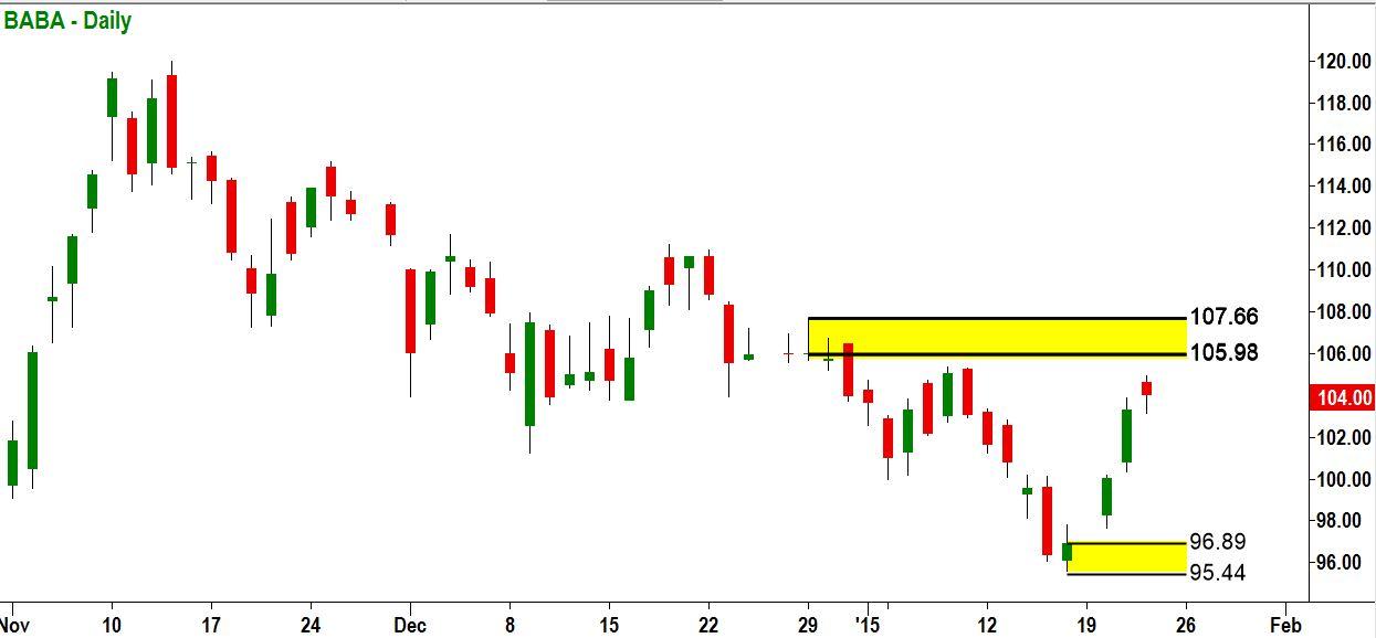
The best way to describe an option payoff diagram is through an example. First, we will look at the price chart of a stock. As of January 22, 2015, the stock chart for Alibaba Group looked like this:
The stock had been in a prolonged downtrend. It was currently rallying up toward a level of supply at around $106-108. It looked like a good bet to fail at that level and make another down leg. If the downtrend did continue, then it should take the stock down past its earlier low below $96. Looking at the last time that BABA made this trip from $106 to $96, which took 16 calendar days, we reckoned that this trip could happen in three weeks or less.
The options for this stock were selling relatively cheaply. The volatility level that option traders were paying for (called implied volatility, which is calculated based on option prices) was at the rate of 35% annually. This was in the context of a 12-month range for volatility between 33% and 47%. If the stock were to drop, then that implied volatility level could be expected to increase back toward the median level of 40%. Option traders generally get more fearful and more willing to pay high prices for puts when a stock falls.
In a case like this, where we are bearish on the stock and also believe that implied volatility is likely to rise, we want to buy put options. This will be profitable if the stock does go down since put prices move in the opposite direction from the stock price. And, if the level of implied volatility for a stock rises, as we expected it to do here, then all of that stock’s options will inflate, separately from the effect of the price of the stock itself.
In this case, we chose to investigate the put options at the $105 strike price, expiring in April of 2015, 84 days out. We would plan to buy those puts once BABA rallied up into $106, just inside our supply zone. We would then plan to sell the puts thereafter and take our profit, when and if BABA dropped down to our target at $96. But if the stock went up (the wrong way for us on this trade), we would conclude that we were wrong, cut our losses and sell the puts, if and when BABA rose past $108.
The next step was to create an option payoff graph for this position. This graph would tell us:
What the estimated price of that put would be when BABA went up by $2.00 into our entry zone.
What its estimated price would be when BABA dropped to our target.
And what its price would be if BABA rallied past our stop-loss price of $108.
With these three numbers in hand, we could calculate our estimated profit if successful and our estimated loss if the trade went wrong. This in turn would let us figure our reward-to-risk ratio. If that ratio were large enough, then it would be a good trade.
Here is what the option payoff graph looked like:
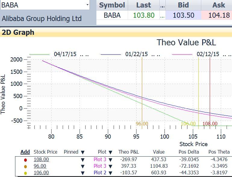
The graph plots theoretical profit/loss on the vertical axis vs. stock price on the horizontal axis. Each of the three lines on the graph is drawn as of a specific date. This is necessary because the price of an option goes down a little every day even if the stock does not move. With every passing day there is less time for the stock to move in a way that is favorable for that option. This effect is called time decay. Whenever we own an option we are in a race against time. The stock must move in our direction (down in this case) fast enough to more than offset the drop in the option’s value due to time decay. Time decay starts out slowly and then accelerates as expiration approaches. It is very fast in the last two months of an option’s life so we never want to hold them during that time.
The green straight line on the graph shows what the profit or loss would be for any stock price on expiration day, 84 days away. This line had no relevance for us. We would plan to exit this trade after no more than three weeks, win or lose. In this way we would stop the time decay clock before it really got revved up.
The blue curved line, labeled Plot 2, shows what our P/L would be as of today. The put’s value would change instantaneously as the stock moved, so any drop in the stock would result in an immediate increase in the value of our puts; any rise in the stock would result in a drop in the put’s value.
The magenta curved line shows theoretical P/L on a date that we chose that was three weeks in the future. This was the time we allowed for this trade to work.
We inserted price markers at three significant price levels. These are shown as vertical lines at these prices:
$106.00, the price of BABA at which we would enter this trade
$108.00, the price of BABA at which we would take our losses and exit
$96.00, our price target for BABA
When we insert price markers the table shown below the graph is created. This table shows, among other things, what the value of the option would be if BABA were at the price designated by the marker. That is shown by the Value column in the table. It shows that:
If BABA were to reach our $106.00 entry price, the value of the option would be $603.93. Thus we would not be buying the option at its current level of $707.50, but at that lower price.
If BABA dropped to our $96 target three weeks from now, the value of the option would be $1104.79. Subtracting our cost of $603.93, that would work out to a profit of $500.76.
And if BABA rose to our $108 stop-loss price, the value of the option would be $437.53. Subtracting this from our cost of $603.93, we would have a loss of $166.40.
So, a potential profit of $500.76 vs. a potential loss of $166.40. This looked like a good trade, one well worth taking.
The payoff graph and its associated calculations are absolutely necessary to figure what the price of an option will be at some date in the future. Without that information we are “out of the picture.”
This content is intended to provide educational information only. This information should not be construed as individual or customized legal, tax, financial or investment services. As each individual's situation is unique, a qualified professional should be consulted before making legal, tax, financial and investment decisions. The educational information provided in this article does not comprise any course or a part of any course that may be used as an educational credit for any certification purpose and will not prepare any User to be accredited for any licenses in any industry and will not prepare any User to get a job. Reproduced by permission from OTAcademy.com click here for Terms of Use: https://www.otacademy.com/about/terms
Editors’ Picks

EUR/USD: Fed calm, ECB steady, but the Dollar still leads Premium
EUR/USD is still struggling to find real traction. The pair has tried to stabilise, but momentum keeps fading, leaving the door open to further weakness.

Gold: Falling US yields, geopolitics help XAU/USD hold ground Premium
Gold (XAU/USD) gained traction and climbed above $5,200, ending the fourth consecutive week in positive territory. The next round of US-Iran talks and crucial macroeconomic data releases from the US will be watched closely by market participants in the short term.

GBP/USD: Will Pound Sterling defend key 1.3450 support ahead of US jobs data? Premium
The Pound Sterling (GBP) entered a bearish consolidation phase against the US Dollar (USD), after having tested critical support near the 1.3450 level on several occasions.

Bitcoin: Another month of losses, and it’s been five
Bitcoin (BTC) price is stabilizing around $68,000 at the time of writing on Friday, but the Crypto King is poised to close February on a fragile footing, marking its fifth consecutive month of losses since October and a rare start to the year with back-to-back monthly corrections.

US Dollar: At a crossroads; Fed steady, tariffs in flux Premium
The US Dollar’s (USD) upward momentum from the previous week seems to have encountered a tough nut to crack in the 98.00 region, as measured by the US Dollar Index (DXY).
RECOMMENDED LESSONS
Making money in forex is easy if you know how the bankers trade!
I’m often mystified in my educational forex articles why so many traders struggle to make consistent money out of forex trading. The answer has more to do with what they don’t know than what they do know. After working in investment banks for 20 years many of which were as a Chief trader its second knowledge how to extract cash out of the market.
5 Forex News Events You Need To Know
In the fast moving world of currency markets where huge moves can seemingly come from nowhere, it is extremely important for new traders to learn about the various economic indicators and forex news events and releases that shape the markets. Indeed, quickly getting a handle on which data to look out for, what it means, and how to trade it can see new traders quickly become far more profitable and sets up the road to long term success.
Top 10 Chart Patterns Every Trader Should Know
Chart patterns are one of the most effective trading tools for a trader. They are pure price-action, and form on the basis of underlying buying and selling pressure. Chart patterns have a proven track-record, and traders use them to identify continuation or reversal signals, to open positions and identify price targets.
7 Ways to Avoid Forex Scams
The forex industry is recently seeing more and more scams. Here are 7 ways to avoid losing your money in such scams: Forex scams are becoming frequent. Michael Greenberg reports on luxurious expenses, including a submarine bought from the money taken from forex traders. Here’s another report of a forex fraud. So, how can we avoid falling in such forex scams?
What Are the 10 Fatal Mistakes Traders Make
Trading is exciting. Trading is hard. Trading is extremely hard. Some say that it takes more than 10,000 hours to master. Others believe that trading is the way to quick riches. They might be both wrong. What is important to know that no matter how experienced you are, mistakes will be part of the trading process.
The challenge: Timing the market and trader psychology
Successful trading often comes down to timing – entering and exiting trades at the right moments. Yet timing the market is notoriously difficult, largely because human psychology can derail even the best plans. Two powerful emotions in particular – fear and greed – tend to drive trading decisions off course.


