Yield Curves and Economic Performance

The idea behind the use of a Yield Curve is to measure investors’ perception of risk and future developments in the bond market, as well as the overall economy. The theory suggests that the way the yield curve slopes should offer insights as to how investors believe the economy will evolve. The idea is that short-term bonds carry lower yields because lending to someone, regardless of whether that person is the government or the average Joe, is less risky for the investor; the longer you commit funds, the more you should be rewarded for that commitment, or rewarded for the risk you take that the borrower may not pay you back. As such, the yield on shorter-term bonds, which expresses the return investors are getting for committing their funds, is expected to be lower than the yield on longer-term bonds.
This behaviour is referred to as the normal yield curve, which slopes upward from left to right on the graph as maturities lengthen and yields rise. This is the usual case in most instances throughout history. However, there are times when the yield curve becomes steeper, i.e. the difference between the long-term and short-term bonds becomes larger. This usually occurs at the beginning of a period of economic expansion, following the end of a recession. At that point, short-term interest rates will likely be very low given that the Central Bank has lowered them to fight the recession. However, as the economy begins to grow again, many people believe that inflation will also follow suit. At this point long-term bond investors fear that they will be locked into low rates as a result of the until-then depressed rates. As a result, they demand higher rates and only commit to their funds if the long-term bonds increase their yields.
In periods preceding recessions, the yield curve can actually invert, with short-term bonds offering higher yields than longer-term bonds. While this appears to be counterintuitive, there is a reason this makes sense: given that lower economic growth means lower yields then bond investors seek the safety of longer-term assets for their funds. As such, demand for these bonds increases and yields decline. Given that lower yields are associated with lower interest rates and lower interest rates are usually associated with slower economic growth, an inverted yield curve is often taken as a sign that the economy may soon stagnate. Inverted yield curves are rare, however, they usually provide very good signals about the future of the economy.
The traditional way to calculate the yield curve is to plot the yields of various bonds against each other and observe the difference between long term and short term bonds. However, it is usually much easier just to subtract the short term (usually 3-month) yield from the long term (usually 10-year) yield. The Figure above presents the second calculation of the yield curve by subtracting the 3-month yield from the 10-year yield.
As the Figure clearly indicates, the yield curve got negative in the periods prior to the 2001 recession and the 2007-2009 recession. That is why the yield curve is used as a leading indicator. Naturally, like all indicators, there are times when it issues a false alarm: in September 1998 the yield curve turned negative for a brief period of time, but, following a rate cut by the Fed, it rose again. As you may have noticed, the yield curve has started to decline, standing at 1% at the moment. The last time it was at approximately 1%, on a declining trend, it took about 2-3 years for a recession to hit, hence why many economists predict a recession by 2020-2021.
Monetary policy naturally plays a role in determining the yield curve: the higher the policy rate, the higher overall yields will be. However, given that what the yield curve studies the most is the behaviour of the longer-term yield, then what matters most is investors’ perceptions of future policy changes and not monetary policy itself. Thus, forward guidance and other unconventional monetary policy actions are expected to have a stronger effect on the yield curve.
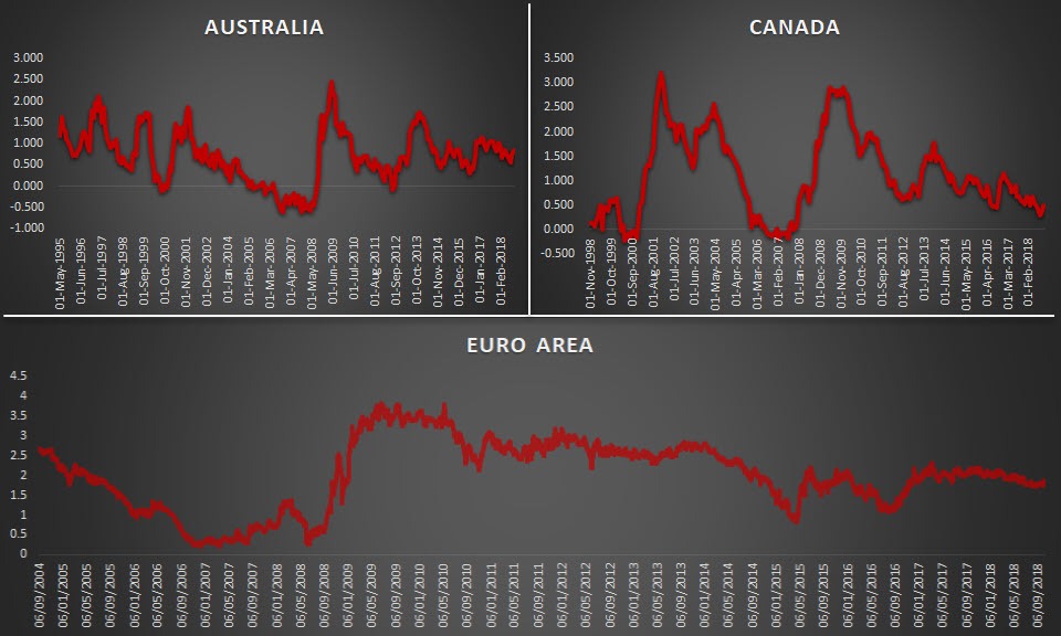
A note of caution when using the yield curve: results may not appear that clearly outside the US. For example, in the Euro Area, the lowest point of the yield curve was at approximately 0.26% in the period close the Lehman collapse. However, the issue is that the ECB is a bit selective on the bonds it uses to aggregate to the Euro Area level, given that it only includes AAA bonds and thus excludes countries like Greece, Italy, Spain and Portugal. This biases the result towards countries which are performing well hence reducing the usefulness of the yield curve. In contrast, the Canadian yield curve appears to have been performing well, suggesting a similar path to the US one. A stranger path can be observed for the Australian one which seems to be quite indecisive.
-square-636748434193726935.png)
Author

With more than 4 years of experience at the Central Bank of Cyprus where he obtained hands-on experience with real-life economics, Dr Nektarios Michail is a supporter of a balanced approach between science and art when it comes to


