A picture of maximum employment
To repeat what I said last month: “Every month we say “the NFP this month is really crucial,” and usually it is. This month it is, too.” And for the same reason: the Fed has largely hit its target on inflation, now it’s just waiting to see when it will hit its (vague) target on jobs.
In his press conference Wednesday. Fed Chair Powell said, “I’d say we have some ground to cover on the labor market side. I think we’re some way away from having had substantial further progress toward the maximum employment goal. I would want to see some strong job numbers…” When pressed about what “substantial further progress” in the labor market would consist of, he demurred. “We monitor a broad range of data about different aspects of the labor market. There’s unemployment, unemployment among different age groups and such, there’s participation, there’s wages, there’s all kinds of flow data, and we look at all of it to try to arrive at a picture of what is maximum employment.”
In this week’s Weekly Outlook, I’d like to give you an idea of the broad range of data that Powell et. al. are monitoring so you can see the picture that they’re forming of the labor market. What turns up is a lot of conflicting details, but overall confirmation of what he’s been saying: there’s been progress, but it hasn’t yet been “substantial.”
Unemployment is defined as (the number of people looking for work) divided by (the number of people working + those looking for work). The latter figure is called the labor force. But there are problems with this definition. What is “looking for work”? What happens to people who would like to work, but feel it’s hopeless and don’t even bother looking for a job? What about people who want to work full-time but can only find a part-time job? The US Bureau of Labor Statistics (BLS) calculates several measures of unemployment to take these problems into account.
The regular, standard, normal, average, every-day unemployment rate defines an unemployed person as:
Persons aged 16 years and older who had no employment during the reference week, were available for work, except for temporary illness, and had made specific efforts to find employment sometime during the 4-week period ending with the reference week. Persons who were waiting to be recalled to a job from which they had been laid off need not have been looking for work to be classified as unemployed.
There are some people who would like to work but don’t think it’s possible – right now for example this might include people (aka women) who have to stay home to take care of children since the schools are closed for in-person teaching. These people are included in the augmented unemployment rate, which equals total unemployed person plus such “job wanters” as a percentage of the civilian labor force plus “job wanters.” “Job wanters” are defined as persons who want a job but don’t meet the criteria to be counted in the labor force. Usually this means that they’re not actively seeking employment.
The broadest measure of unemployment is the U-6 rate, which takes the augmented unemployment rate and adds who want and are available for full-time work but have had to settle for a part-time schedule.
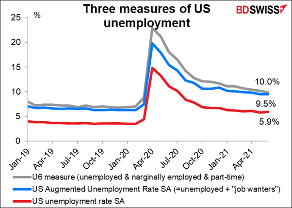
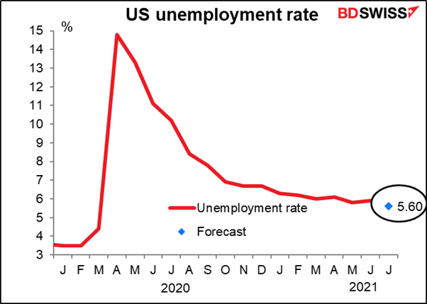
While the standard unemployment rate at 5.9% is currently 2.4 percentage points higher than it was before the pandemic began, the augmented unemployment rate is 3.2 percentage points higher and the U-6 rate is 2.8 percentage points higher. So unemployment is substantially worse than what the unemployment rate would have us think.
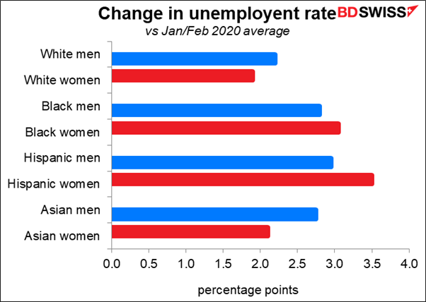
When you look at the change in the unemployment rate by ethnic group, it’s clear what Powell was talking about when he said, “joblessness continues to fall disproportionately on lower-wage workers in the service sector and on African-Americans and Hispanics.”
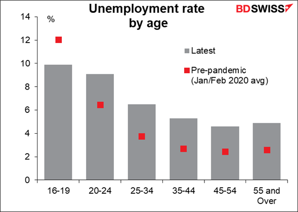
As for unemployment by age, the unemployment rate has gone up for workers of all ages except for those under 20. My guess is that they’re being employed in fast-food restaurants, where older workers are either hesitant to work because of fears of the virus or are now able to get better-paying jobs elsewhere.
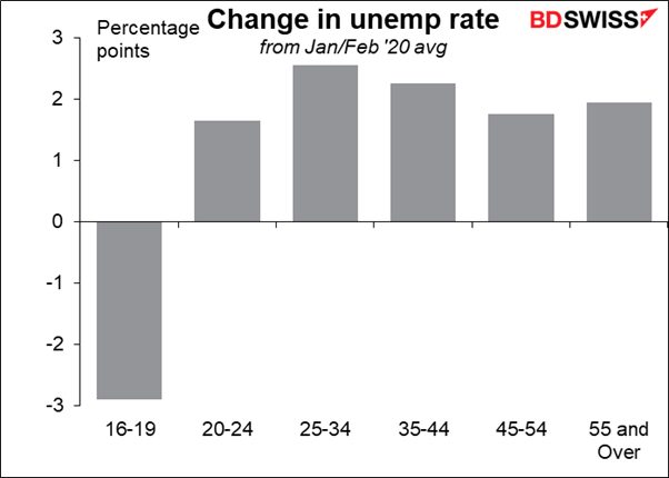
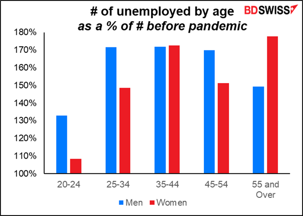
Breaking it down between men and women, it’s risen particularly sharply for men in their prime earning period and for older women.
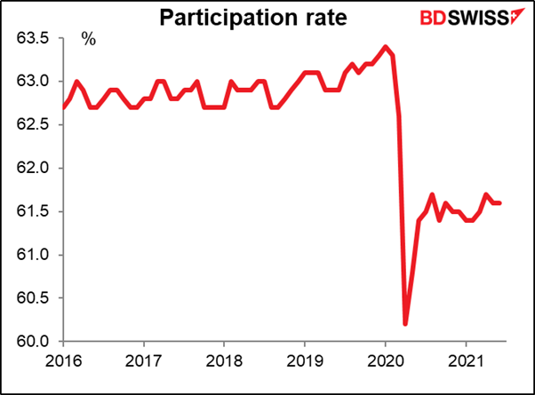
The participation rate was steady for several years, then started climbing in 2019 – only to be sent crashing lower in the pandemic. This indicator is one of the main focuses of the Fed as they aim for a “broad and inclusive” recovery in the labor market – they want to see a higher participation rate, particularly for minorities.
The participation rate has fallen for all ethnic groups. Oddly enough the participation rate has fallen the most for White men, followed by Black women, then White women. This could explain in part why unemployment has risen the least for White men and women.
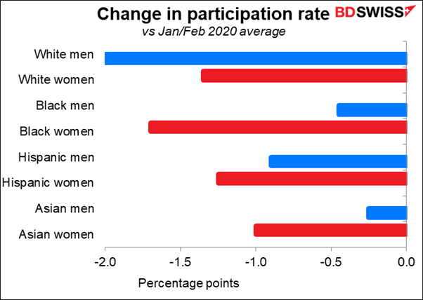
The participation rate for Hispanic and Asian men is higher than that for White men, while White women have the lowest participation rate among racial groups of women.
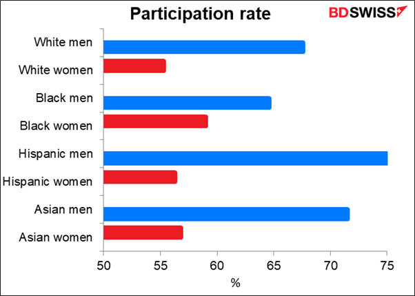
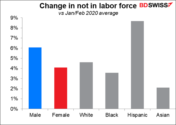
Hispanics have exited the labor force more than other groups, but Blacks and Asians have fared better than Whites.
I have to say I’m puzzled by some of these figures, which contradict some of what Powell and other officials have said and indeed what common sense would suggest, given the realities of life in the US. There’s something here I just don’t understand.
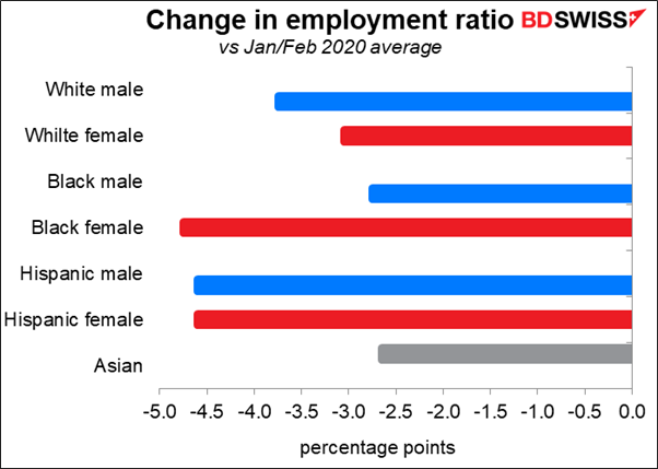
The employment ratio may be a better way to look at things. That shows the number of employed people as a percentage of the civilian noninstitutional population. In other words, it’s the percentage of the population that is currently working. This definition does away with the problem of people getting discouraged, although it may give an overly pessimistic view if a large number of people decide to retire, as could be the case now.
The employment problems of minorities show up clearly using this metric – although Black males fared relatively well. I’m also surprised to see the ratio falling more for White men than for women, because I had assumed the burden of childcare while schools were closed would fall disproportionately on women. Maybe I’m just being sexist? Perhaps if we broke this series down by age group that problem would show up as younger women are more likely to have children. The school issue could be one reason why the Black female employment ratio has fallen so much more than for Black males.
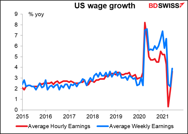
It’s hard to tell what’s going on with wages in the US, because the pandemic changed the mix of jobs. When lower-paid people, such as restaurant workers, lose their jobs but higher-paid people who can work from home, such as computer programmers, keep theirs, then the average level of wages will go up. When those restaurant and hotel workers get their jobs back, the average level of wages will go down.
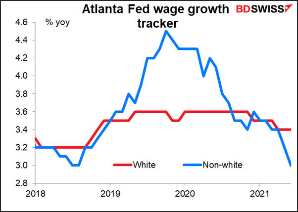
The Atlanta Fed produces a series of wage growth indices that track wages broken down by a dizzying array of categories. It confirms what Chair Powell was saying about how “the economic downturn has not fallen equally on all Americans and those least able to shoulder the burden have been hardest hit.” Note the plunge in wage growth during the pandemic for low-skill workers, while high-skill workers saw no change and medium-skill workers got a little bump up. Now that the economy is reopening, low-skill workers are starting to catch a break.

Minorities were making tremendous progress in wages before the pandemic hit, then: wham! I think this is one of the most significant graphs. This is the kind of thing that Fed officials would’ve heard in their “Fed Listens” sessions, when they went around the country soliciting views on monetary policy from ordinary citizens. I would imagine this is one reason why they have changed the focus of their employment mandate to “broad and inclusive” growth in employment. They will certainly want to see wages for minorities turning up before they start thinking about lifting rates.
As for the flow data…Chair Powell is right, there are all sorts of flow data on people entering the workforce, leaving the workforce, going from unemployed to exiting the workforce, etc etc. I’m not even going to try to give you a sample of that.
Powell and others have also pointed to the ratio of unemployed persons to job openings, Job openings come from the Job Openings and Labor Turnover Survey (JOLTS) report. At the moment there’s about one opening for every officially unemployed person, which historically has been unusual. Some point to this as a sign of a tight labor market, although if you substitute “persons receiving unemployment benefits” for “unemployed persons” you get a very different looking graph.

This week: Reserve Bank of Australia, Bank of England, and NFP
There are two major central bank meetings this week: the Reserve Bank of Australia on Tuesday and the Bank of England on Thursday..
Reserve Bank of Australia: Precautionary loosening?
Last month was the big month for the RBA. They had to decide whether to roll over their market intervention from the April 2024 bond into the November bond. They decided not to, which was a modest tightening of policy. They also decided to continue purchasing government bonds after the completion of the current bond purchase program in early September, although they would reduce the amount to AUD 4bn a week from the current rate of AUD 5bn.
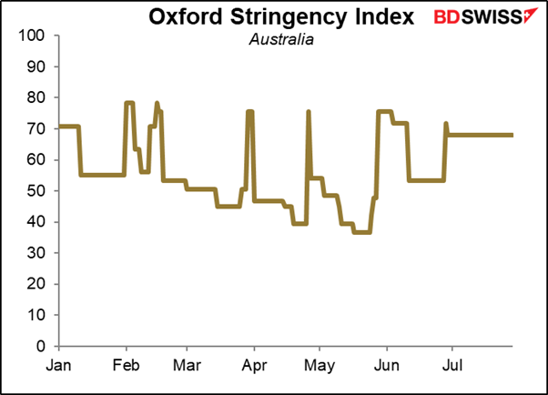
This month, the main topic of discussion will be the implications of the rise in COVID-19 cases and the extended lockdown in Greater Sydney. The lockdown was just extended to Aug. 28th and could be extended further. The area accounts for at least 21% of Australia’s population and so this is truly a Big Deal for the country. It’s likely to cause the economy to contract in Q3, although there would then be a stronger rebound in Q4 when Sydney reopens.
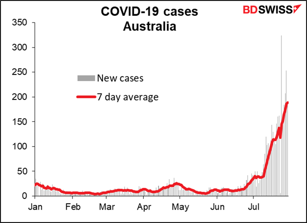
Previously the country has had a series of short, sharp localized lockdowns, but recently they have been more widespread and longer-lasting. The market may fear that this is likely to impinge on growth.
This makes it likely that they’ll revise down their forecast for 2021 growth in the updated Statement on Monetary Policy (SMP), which will be released on Friday. The main points of that are usually included in the statement following the meeting. Comparing their forecasts from the May SMP with the market’s current forecasts, they might revise down their growth forecasts but revise up their inflation forecasts – a difficult situation on the surface, except that with the trimmed mean inflation forecast not even expected to hit the bottom of their 2%-3% target range until mid-2023, they have no particular need to start tightening policy any time soon.

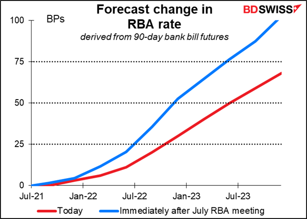
Rate expectations for Australia have come down substantially since the last RBA meeting on July 6th, probably as a result of the lockdown.
The question is, will they take any action to offset the lower growth? In the minutes to the July meeting, they said, “Given the high degree of uncertainty about the economic outlook, members agreed that there should be flexibility to increase or reduce weekly bond purchases in the future, as warranted by the state of the economy at the time, rather than a commitment to a specific rate of purchases over an extended period.” They could for example decide to increase the weekly bond purchases immediately.
Or they could rescind last month’s decision to cut the pace of purchases after September. That decision seemed to attract some discussion, but the hawks won out based on the brighter prospects for the Australian economy. “Members acknowledged that an argument could be made to retain the pace of bond purchases at $5 billion per week, given that economic outcomes were still well short of the Bank's goals for inflation and employment. However, the economic outcomes had been materially better than earlier expected and the outlook had improved.” What if the outlook has now worsened?
Given the possibility of action, no change in policy would probably result in a stronger AUD, while an adjustment to the bond purchases would be likely to cause AUD to weaken.
Bank of England: what’s the sequence?
The Bank of England is not likely to make any policy changes. The focus then will be on any changes in forecasts in the August Monetary Policy Report and how many people (if any) vote to change the quantitative easing program. The Bank could announce the results of a study into how it would go about unwinding its asset purchase program when the time comes.
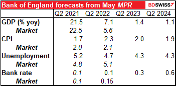
Note: The Bank said in June that Bank staff have revised up their expectations for the level of UK GDP in 2021 Q2 by around 1½% since the May Report. It’s unclear to me how that would affect the yoy rate of increase shown in this table.
As you can see, the Bank’s forecasts from May were not a million miles off from the current market consensus for this year and next. It’s therefore likely that their Q3 forecasts will only be tinkered with. Recent comments by Monetary Policy Committee (MPC) members have been fairly constructive despite the worsening virus problem in Britain. They could downgrade Q3 estimates because of the virus but then reasonably predict a stronger year-end as the economy rebounds, leaving unchanged the overall estimate that the economy will recover to pre-pandemic levels of output by Q4 this year.
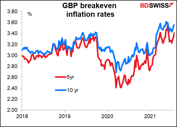
The near-term inflation forecast could be revised up, but like all other central banks, the Bank of England insists that higher inflation is just “transitory.” Inflation expectations remain fairly well anchored, indicating that the market (largely) believes them.
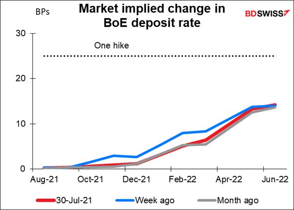
With considerable uncertainty around the course of the pandemic, plus various government support programs just starting to wind down, the MPC is likely to remain patient, with QE purchases continuing at their current pace until the November 2020 GBP 150bn QE package is exhausted in mid-December. Attention will then turn to when they start signaling a possible hike in rates. A the moment, the overnight index swap (OIS) market sees only about a 50% probability of a 25 bps hike within the forecast horizon (till June 2022).
One possibility: a map to normalization After the publication of the recent House of Lords Economic Committee report into quantitative easing (QE), the MPC has been under increasing pressure to map out its plan for normalizing policy. As the Committee’s report said,
The Governor told us that the Bank of England is reviewing whether to reverse the order in which it committed in 2018 to tighten policy. The Bank’s policy since 2018 has been to begin to unwind asset purchases only when interest rates had reached 1.5%. However, the Governor has recently expressed his preference to reduce the Bank’s balance sheet prior to hiking interest rates in order to give the Bank more room for manoeuvre in future downturns. He told us that, given the economic and health shocks since 2018, there is a “really strong case to re-evaluate that decision [to unwind asset purchases once interest rates hit 1.5%] in the light of what has happened since”. Any decision the Bank comes to will be done on “a predictable basis, which is announced in advance.”
The MPC could release the results of its review into sequencing at next week’s meeting. This might include lowering the threshold for reversing the asset purchases – quantitative tightening (QT), in other words – to 1%. Or it could even go so far as to say that they would start QT before raising rates at all. If for example they also announce that they are now capable of implementing negative rates, that would give them more flexibility on rates to respond to any emergency and reduce the need to rely on QE.
The vote: 7-1, probably – External member Saunders, usually one of the more dovish members, recently made a speech, The Inflation Outlook, in which he took a noticeably more optimistic and indeed hawkish tone. He’s likely to vote to curtail the Bank’s QE efforts. But comments from other MPC members have indicated that they think the cost of waiting for more information is low as long as inflation expectations remain anchored and price rises are confined to those components that are particularly affected by the reopening of the economy.
Market implication: Depends on any surprises – A slight upgrading of the economic forecasts and a 7-1 vote would probably not be enough to spur any new buying of GBP. What we saw from this week’s Fed meeting is that markets are looking for a definite inflection point in central bank thinking, but central bankers remain a cautious bunch. I might see GBP firming if they make some significant upgrade to the forecasts or if they make a noticeable change to their sequencing, but otherwise I think the market is likely to be disappointed by a “steady as she goes” approach and the currency could weaken.
NFP: Further progress but not substantial progress
The nonfarm payrolls (NFP) are expected to be good, but one good figure isn’t a string. It’s expected to constitute “further progress” toward the “maximum employment” goal, but not “substantial further progress.” The Fed will have to see several months of such figures for it to be “substantial.”
The median of forecasts on Bloomberg is currently for payrolls to be up 925k, with a range from 550k to 1050k. It’s still early days – there are only 16 estimates so far. The figure is likely to change over the week as more people weigh in with their estimate.
In any event, that would be a great number. It would be the largest increase since the bounce-back period right after the pandemic struck.
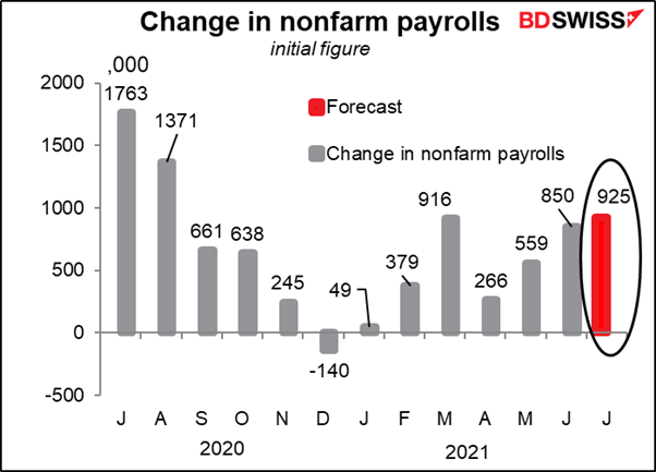
Furthermore, more of that would be private payrolls (808k vs 785k) and less government (117k vs 136k) than back in March.

The unemployment rate is forecast to move down one tic. There’s isn’t a forecast for the participation rate yet.
I would assume that fed funds futures would start to discount an earlier move on rates and the dollar would move up on a figure like this.
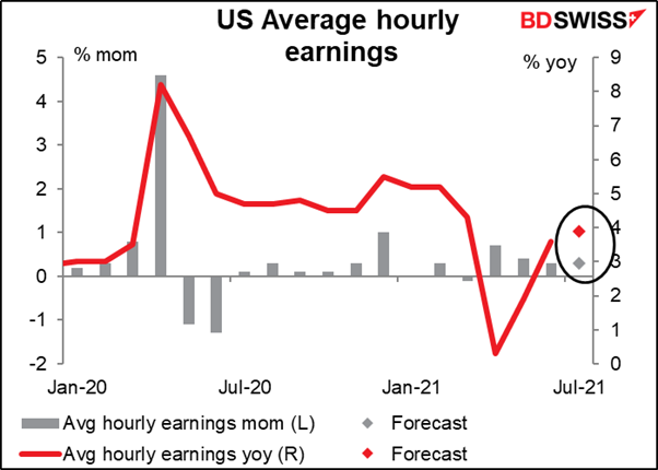
Expectations may be dampened somewhat however by the hourly earnings figure. Earnings are expected to grow at the same 0.3% mom pace as in June. That would result in a faster yoy rate of growth. I think that would be seen as slightly negative for the dollar, in that everyone assumes the easiest way to determine whether the labor market is tight or not is whether wages are rising. If the rate of growth in wages isn’t accelerating, then the labor market probably isn’t tight yet and the doves on the Fed can argue against tapering.
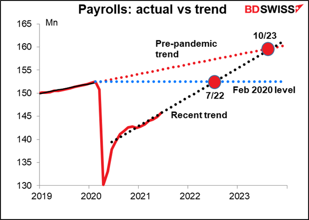
Footnote: at the current trend in payrolls, it’ll be next July before we’re back to where we were before the pandemic and October of 2023 before we’ve caught up to where we (maybe) would’ve been if the pandemic hadn’t occurred. The question is, how far along this path do we have to get before the Fed says there’s been “substantial further progress” toward the goal of maximum employment? That’s what we have to figure out.
Other major indicators this week: The manufacturing purchasing managers’ indices (PMIs) will be coming out Monday, including the final versions for those major countries that have preliminary ones, plus the Institute of Supply Management (ISM) version of that PMI for the US. Ditto on Wednesday for the service-sector PMIs.
German factory orders are on Thursday and industrial production on Friday.
New Zealand announces its employment data Wednesday.
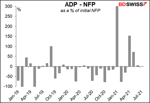
And of course there’s the Automated Data Processing (ADP) report on Wednesday, which everyone looks to for a hint of what the NFP will be.
No OPEC+ meeting this week. Usually, there’s an OPEC+ meeting the first week of the month. However, the extraordinary meeting that they had on July 18th was the 19th OPEC and non-OPEC Ministerial Meeting (ONOMM) that was supposed to be held this week. The 20th meeting won’t be held until Sep. 1st.

Author

Marshall Gittler
Trading Analysis


