BECOME AN INFLATION EXPERT
A. What is Inflation?
Inflation is a sustained rise in the general price level. Although it’s common knowledge that prices go up over time, the general public doesn’t quite understand the forces behind inflation. Inflation can manifest in many different ways and finds its roots in different aspects of the economy. Moreover, different people have different understandings of what inflation is, and accordingly, there are many ways to measure and estimate inflation.
What causes inflation? How does inflation manifest? What does inflation mean for a nation’s currency? How does it affect my standard of living? In the end, is it bad or good for the economy?
Let’s start answering these questions by taking a closer look
1. Demand-Pull Inflation
Inflation can start rising as a result of unchecked growth in an economy. This happens when aggregate demand is growing at an unsustainable rate leading to increased pressure on scarce resources. Extra money is then necessary because consumers are taking money out of their bank accounts and purchasing products. It can be expected that workers’ wages will increase as well as businesses are bringing in larger revenues and profits. As wages increase, consumers go out and buy even more goods making producers raise their prices again aiming for bigger profit margins.
This usually occurs in growing economies when there is full employment of resources and short-run aggregate supply is inelastic, meaning there are not enough goods to cover the existent demand. If this spiral is not contained, then the
actual economic growth can be in danger because people have more money, but at some
What are the main causes of Demand-Pull Inflation?
Direct or indirect taxes:
If taxes are reduced, consumers have more disposable income which causes a rising demand. Tax breaks for mortgage interest rates, for example, increase demand for housing.
Discretionary fiscal policy:
Higher government spending and increased borrowing can also create extra demand in the economy, for example, military spending raises prices for military equipment, and this in turn raises the costs of materials and associated products.
Brands:
Marketing campaigns can create high demand for certain products, like Apple products, which are higher priced than comparable products.
Changes in the exchange rate:
A fall in the exchange rate of the domestic currency makes imported goods more expensive (foreign currencies rise), and at the same time increases the competitiveness of exports (domestic goods are cheaper internationally) which can affect the level of demand and output.
Monetary stimulus:
Low interest rates may stimulate the demand for loans and lead to housing price inflation.
Technological innovation:
A company developing a new technology will have the entire market to grow until other companies cope with the innovations. For example, Tesla’s electric sports car was a recent technological breakthrough.
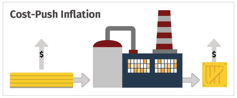
2. Cost-Push Inflation
Another commonplace view of inflation, cost-push inflation, happens when firms respond to rising costs by increasing prices in order to protect their profit margins. Increased costs can include things such as wages, taxes, or increased costs of imports.
The 1960s was a time when the American standard of living rose to record levels. It was also a period during which a legitimate scarcity in skilled
What are the main causes of Demand-Pull Inflation?
Raw material costs:
Inflation can be set off by an increase in the price of just one crucial item, such as energy. If the price of oil goes up, for example, many other items that use oil in their production process will increase in price, eroding the purchasing power of the currency. The same with copper used in manufacturing or agricultural products used in food processing.
Labor costs:
Wage costs, for instance, likely rise when unemployment is low because skilled workers become scarce and this can drive pay levels higher. This is a reason why the Average Hourly Earnings is such a closely monitored piece of data within the Employment Situation Report in the U.S.
Indirect taxes:
A rise in Value Added Tax, for example, may lead suppliers to choose to pass on the burden of the tax onto consumers.
Monopolies:
When dominant firms use their market power to increase prices well above costs, independently of the level of demand. Changes in the exchange rate: a fall in the exchange rate can increase the prices of imported products such as essential raw materials, components and finished products, making the domestically manufactured products more expensive.
3. Asset Inflation
Both prior definitions assume that the cause of inflation is deeply rooted somewhere within the market structure – from both the demand- and the
Rising asset prices are potentially misleading signs of a growing economy. Hard assets can become more valuable, with no changes to
What are the main causes of Asset Inflation?
Foreign investment:
The perception that one currency is a better store of value than other currencies attracts foreign investment causing asset inflation domestically. Since 1971, when the economies of the main industrialized nations adhered to the floating exchange rate mechanism, two-digit percentage swings every few years in the foreign exchange markets became the norm, causing dramatic changes in the domestic rates of inflation within any nation depending upon imports. A fall in the value of US Dollar against the Japanese yen, for instance, makes US real estate “appear” to rise, but in fact it only does so in terms of yen, in relative terms thus.
Political and economical risk:
The lack of trust in government or in the banking system can also force capital to run into tangible assets, reducing the velocity of money, collapsing the liquidity in the system, and setting the stage for an economic implosion.
Changes in the exchange rate:
Since everything has a relative international value, when a currency declines, assets will generally rise in proportion to the decline. On the day Brexit was voted, the Pound collapsed but the UK stock market rose. It did not collapse as it would be the case if money had moved out of the stocks into other asset classes. The nominal price of the FTSE went up in absolute terms, but there were no actual performance gains in relative terms. Although a strong move in the exchange rate is immediately seen in financial assets like stocks or bonds, the repricing of products and services throughout the economy is reflected on most sectors.
4. Implicit Inflation
Broader definitions of inflation are not only necessary to better understand our economies, but also to get a sense of what the future will bring from a market and investment perspective. If we get back to the idea that a loss of the “quality” of money (as a store of value) can manifest through inflation, we can also think of other causes of inflation which could have the same end result, that is, a collapse in purchasing power and a lower standard of living. By doing that, we do not necessarily search for explicit phenomena such as the rise in asset prices or in goods and services, but rather those implicit causes which could have similar effects as the other forms of inflation already described. Which causes can we think of that sooner or later could manifest through apparent economic deterioration for everyone? Notice that implicit causes could come unnoticed for most economic indicators tracking inflation.
What are the main causes of Implicit Inflation?
Privatization of profits & socialization of losses:
Even at the tepid levels of (explicit) inflation we’ve seen in the past few years, the population (not always fully aware of it) has to cope with losses felt in many fields: loss of physical and mental health, of political freedom, of environmental quality, loss of privacy (24/7 availability), of financial independence (special among young generations), and loss of diversity (in a monopolized economy). All these factors, which fall beyond the object of this study, have the potential to drive future inflation to exorbitant levels.
Money as debt:
An economic system which is primarily financed through the creation of “bad” money, i.e. debt, will be permanently unstable and suffer from boom-and-bust cycles of greater magnitude than a system where implicit deflationary (or at least implicit disinflationary) forces are allowed. With each crisis, money (or wealth) evaporates for a big part of the population resulting in a similar effect as one perceived in an explicit inflationary environment.
Wealth destruction:
Financial crashes, bail-ins and bail-outs, arbitrary expropriations, mandatory debt restructuring, controls on capital movement, monetary reforms, cash elimination… All these factors, some recently experienced in different parts of the world, have the potential to change the way people perceive value, and therefore how they decide what can serve as an hedge to preserve their wealth, and how to compensate for the perceived losses in many areas of their life.
B. Survey-based Measures of Inflation
Inflation has a substantial effect on various economical factors, going from the cost of money (interest rates), impacting on labor and growth prospects, to the behavior of all financial assets, including currencies.
In this section you will get to know 18 inflation-oriented measures which are an integral part of fundamental and technical analysis. The aim of this suite of indicators is to offer you the tools necessary to expand your view on inflation and inflation expectations. Having all these indicators at one place gives you a broad view of how strong or weak inflationary forces come into play at any given moment.
1. Survey-based Measures
Measuring inflation is a difficult task for everyone, including government officials. To do this, statisticians conduct large surveys by contacting thousands of retail stores, service establishments, rental units and professional offices to acquire price information on a variety of items. These items are put together into what is commonly referred to as a “market basket”, and represent a scientifically selected sample of the prices paid by consumers for purchased goods and services. The results are computed into indices which in the end are used to track and measure inflationary pressures surrounding the economy.
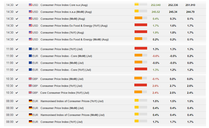
2. Consumer Price Index (CPI)
The Consumer Price Index (CPI) is the most frequently cited measure of inflation out of the various economic indicators. Also known as “headline inflation”, its release is generally the second or third week of each month. It is used by retailers in predicting future price increases, by employers in calculating salaries, and by the government in determining cost-of-living increases for social security. Central banks also monitor this release to help guide them in their rate and policy settings.
Calculating CPI involves considering the weighted average pricing of goods and services as experienced by consumers in their day-to-day living expenses, analyzing more than 200 categories, which are organized in eight groups: housing (41%), transportation (17%), food and beverages (15%), medical care (7%), education and communication (7%), recreation (6%), apparel (4%), and “other goods and services” (3%). As you can see, the biggest single component in the CPI is housing with a 41% weight.
To reduce some of the statistical noise in the inflation data and to give a more accurate measure of inflation, the government publishes the Core CPI, which is the CPI without the volatile components of food, which can suffer from seasonal price variations, and energy. The Consumer Price Index (CPI) is the most frequently cited measure of inflation out of the various economic indicators. Also known as “headline inflation”, its release is generally the second or third week of each month. It is used by retailers in predicting future price increases, by employers in calculating salaries, and by the government in determining cost-of-living increases for social security. Central banks also monitor this release to help guide them in their rate and policy settings.
Calculating CPI involves considering the weighted average pricing of goods and services as experienced by consumers in their day-to-day living expenses, analyzing more than 200 categories, which are organized in eight groups: housing (41%), transportation (17%), food and beverages (15%), medical care (7%), education and communication (7%), recreation (6%), apparel (4%), and “other goods and services” (3%). As you can see, the biggest single component in the CPI is housing with a 41% weight.
To reduce some of the statistical noise in the inflation data and to give a more accurate measure of inflation, the government publishes the Core CPI, which is the CPI without the volatile components of food, which can suffer from seasonal price variations, and energy, which can fluctuate wildly as a result of geopolitical shocks.
The Core CPI is typically more important to traders and the Federal Reserve as a measure of actual inflation since it tends to provide a more representative view of the inflationary forces in presence in the domestic economy. Comparing the CPI with the Core CPI can give you a good idea of how much consumers, who account for two-thirds of the economic activity, are spending on commodities such as energy and on agricultural products.
Once you understand there are different types of inflation, it is fairly easy to see that the CPI can perpetuate a kind of cost-push inflation, in which the cause of rising prices is precisely rising prices. This is not the only criticism the CPI is fraught with. Many analysts claim that the basket of goods is too static, that it changes infrequently, and it may not always reflect items that provide an accurate accounting of the consumer experience. For instance, new products are not counted for a while after they appear on the market, or variations in price can cause consumers to substitute the product on the spot, so that the basic measure holds their consumption of various goods constant. And not few analysts say the CPI can be misleading when making financial decisions, because it no longer measures the true increase in inflation, required to maintain a constant standard of living.
Notice, for instance, that while certain taxes are included in the CPI, namely, taxes that are directly associated with the purchase of specific goods and services (such as sales and excise taxes), taxes not directly associated with specific purchases, such as income and social security taxes, are excluded, as are the government services paid for through those taxes. It is important to know that net disposable income can be drastically reduced by higher levels of taxation, leaving the population with a need for inflation measures which are more relevant and appropriate to explain the perception of reduced standards of living.
Consumer prices related releases for several countries can be followed on FXStreet’s Economic Calendar.
3. Producer Price Index (PPI)
Another standard gauge of inflationary pressures in an economy is the Producer Price Index (PPI). The Bureau of Labor Statistics (BLS), the government body that collects PPI data, releases it on a monthly basis, two or three weeks after the reporting month ends.
The PPI is somewhat similar to the CPI with the exception that it looks at the rate of change in prices from the perspective of the producer rather than the consumer. Every month, around the week that includes the 13th, the Labor Department receives answers to questionnaires requesting prices on about 100,000 different items. It then gauges the average changes in those prices received by domestic producers for their output at all stages of processing. Certain categories are intentionally left out of the PPI basket such as imported goods and most services. Excise taxes are also excluded.
In total there are three measures of PPI which are based on the different stages of processing: the PPI Crude Goods, the PPI Intermediate Goods, and the PPI Finished Goods. One way to forecast the future movement of the PPI Finished Goods consists of monitoring the Intermediate index, and in turn, the direction of this index can be determined by analyzing the PPI Crude Goods.
In the end, the PPI Finished Goods provides a sense of the expected CPI movement, serving as a leading indicator because when companies experience higher input costs, those costs are ultimately passed on to the subsequent buyers in the distribution network. Although firms throughout the supply chain will typically hedge their input costs, higher prices will eventually be realized once the hedging contracts expire. Tracking PPI also allows one to determine the cause of the changes in CPI. If, for example, CPI increases at a much faster rate than PPI, such a situation could indicate that factors other than inflation may be causing retailers to increase their prices. However, if CPI and PPI increase in tandem, retailers may be simply attempting to maintain their operating margins. Discrepancies between the PPI and CPI can be based on factors such as sales taxes and markups as products move through the various stages of the supply chain.
But don’t look at the PPI as a short-term leading indicator. A correlation does exist, but only over larger time horizons. The reason is the volatile
The monthly data is subject to revisions that are published four months later, which can also lead to a significant market impact. In addition, deviations of the most recent PPI number from expectations can be seen in FXStreet’s Market Impact Tool (to be found in all economic data of our Economic Calendar
4. Personal Consumption Expenditure (PCE) Price Index
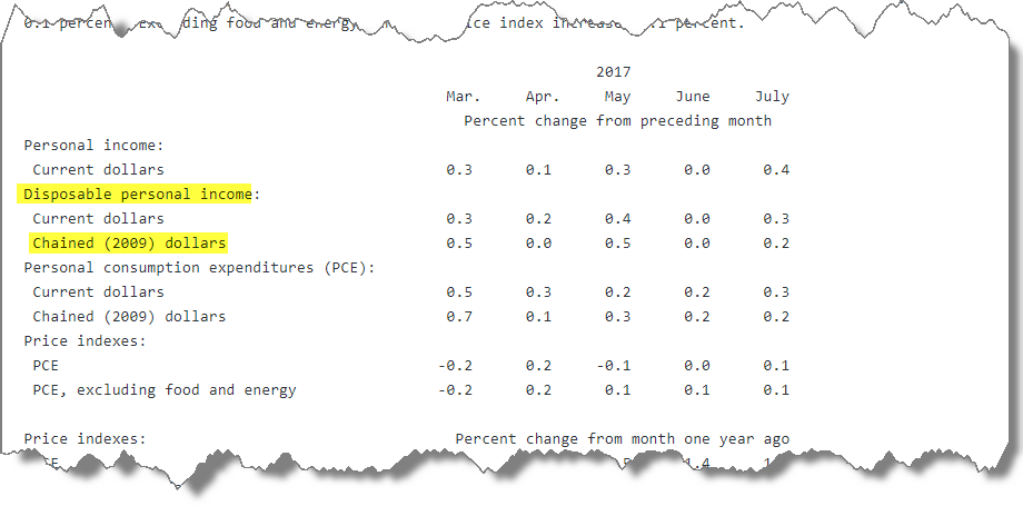
An alternative to the CPI is the Personal Consumption Expenditure (PCE). This measure is the component statistic for consumption in the Personal Income and Outlays report and also the largest part of the Gross Domestic Product (the PCE accounts for 70% of total GDP), both collected by the U.S. Bureau of Economic Analysis (BEA).
The PCE consists of the actual and imputed expenditures of
According to many analysts, the PCE is the preferred consumer inflation gauge for the Federal Reserve because it switches the specific goods and services that make up
What
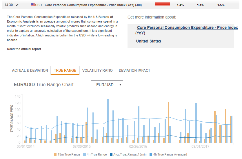
The PCE is presented in both current dollars (which are not adjusted for inflation) and constant or real dollars (which removes the effects of inflation). Similarly, the GDP is also initially calculated based on the current dollar (nominal) value of all goods and services. However, this measure does not help to discern whether an increase in GDP came from
On the FXStreet Economic
So, while the quarterly GDP report lags behind many other monthly indicators, the inflation statistics contained in the GDP -like the PCE- can make it a market mover,
The below picture shows the PCE’s market impact on the EUR/USD pair in terms of
Another good measure of true consumer purchasing power is the Real Disposable Personal Income expressed as chained-dollars. The reason why this is important is
5. Average Hourly Earnings (AHE)
This indicator, released by the U.S. Department of Labor, measures the change in worker’s wages. If worker income rises, it bodes well for future spending, since wages and salaries from employment make up the main source of household income. The Federal Reserve pays close attention to this data when setting interest rates, because of its strong correlation to inflation. Poor wages are a drag for inflation, while strong wages are a sign that inflation may start to
Several analysts have pointed to possible caveats with this indicator. One of them is the fact that when firms want to reduce wage costs, they can allow inflation to erode an unchanged or slowly increasing nominal wage, instead of cutting wages in nominal terms. Some economists argue that in the recent low-inflation environment, this erosion has been so slow that real wage cuts effectively restrain wage growth, despite a recovering
With wages accounting for a significant share of costs in most industries, it makes intuitive sense that rising
Another caveat is the changing structure of the U.S. economy, with technology making it easier than ever for consumers to compare prices. This intensifies price competition and limits the influence of wage growth on inflation. At the same time, globalization has diminished the role of the domestic
The data can be seen on FXStreet’s Economic Calendar. Past months’ data, consensus and actual releases, are shown as a separate report from the NFP.
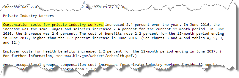
6. Employment Cost Index (ECI)
This is another indicator to add to your early-warning system of rising inflation pressures. The ECI tracks changes in the cost of
Rising
While the AHE is published on a monthly basis, the ECI comes out quarterly, a reason why the first is often preferred by analysts and traders. But on the other hand, the ECI covers both hourly and salaried workers, whereas the AHE considers only workers who get hourly pay. Moreover, the ECI incorporates all major expenses, including benefits that businesses pay to their workforce (vacations, sick leaves, holidays, insurance benefits, just to name a few), while the AHE does not.
Its source is the U.S. Bureau of Labor Statistics who conducts surveys of both private and public sectors, then organizes the data in a fixed basket of job types, and finally converts it into an index expressed in percentage change.
To even better gauge inflation pressures, compare the annual percentage change in compensation costs for private industry with the annual change in non-farm productivity (this is published as a standalone input in the FXStreet’s Calendar). If costs rise no faster than the pace of annual productivity, there is no sign of price inflation. But costs rising faster than productivity growth can fire up price pressures and eventually force the Fed to raise rates.
Once on the FXStreet’s Calendar, expand the event row, and then click on “Read the official report” to get the suggested numbers.
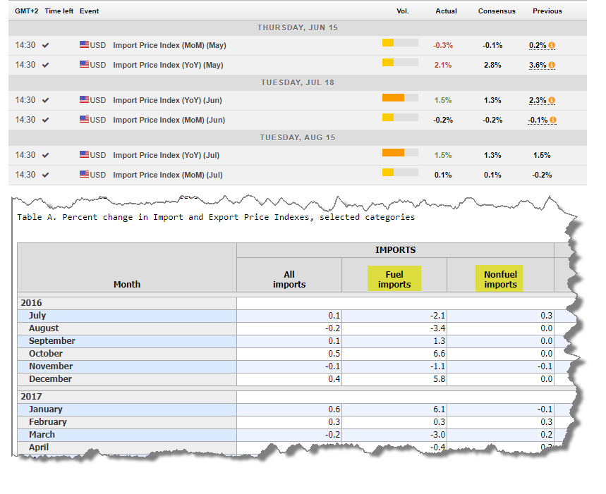
7. Import and Export Prices
Every month, the Bureau of Labor Statistics in the U.S. collects information on export and import prices on more than 20,000 products, weighs them against a fixed basket of goods, and builds an index.
As in the case of other inflation indicators, the reason for establishing this index in the first place was to convert the monthly U.S. trade figures from current dollars into real dollars. Only by converting the trade figures into real dollars...”, you’ll know if an increase in imports was the result of more products being purchased or because foreign exporters raised prices. The same applies
It’s also well established that changes in import and export levels tend to be inversely related to currency value. You don’t need to be an experienced currency trader to understand the logic: domestic goods and services are less expensive in foreign markets when the home currency’s value falls. But this is a two-way street: a weaker currency also translates into higher prices for imports. With imports now pricier, domestic companies will be emboldened to lift their own prices as well because they have less to worry about in terms of foreign competition.
The same relationship implies that a stronger dollar drives up the price of domestic products being sold overseas. The domestic companies might prefer to keep the prices lower just to stay competitive, reducing revenues and earnings
To summarize: a strong currency is deflationary for the domestic economy, while a weak currency is inflationary, a reason why this piece of information should be always analyzed together with currency charts. The impact of the dollar can be best seen in the report’s section for “non-petroleum imports”. Under the section for “petroleum imports”, on the other hand, patterns can emerge in tandem with the developments in the price of oil. That’s also a key issue for the U.S., which is dependent on crude oil imports in rather large quantities. But when both the cost of petroleum and non-petroleum goods fall, then we can interpret that given inflation could remain tame for a while. In such
If import prices are rising, analysts expect higher reading in the CPI release, whereas a sustained fall in import prices is a forerunner for disinflationary forces (or outright deflation in case the CPI is already depressed). This makes import prices a leading indicator for the CPI. Some analysts though, say the U.S. does not import enough for a weak dollar to push goods inflation upward, only about 15.5% of GDP.
8. Unit Labor Costs (ULC)
The Average Weekly Hours is a compilation of the average number of hours worked per week (including overtime) by all employees of private business concerns (except those in the agricultural sector). Overtime hours are an excellent indicators of future employment trends. When overtime increases are sustained for several months, companies will be pressured to hire new employees.
Therefore this report can be seen as a precursor of new permanent hiring, or an early indication that employers are preparing to boost their payrolls, although in the later stages of economic expansion,is may be seen as a sign that employers are finding it hard to get qualified applicants for open positions.
The reason these indicators is used it as a basis for analyzing other employment statistics is the fact that in the US, unlike in many other countries, the workweek is not fixed. Employees can work any number of hours per week (including overtime). It's also worth knowing that unpaid absenteeism, labor turnover, part-time work, and stoppages cause average weekly hours to be lower than scheduled hours of work for an establishment.
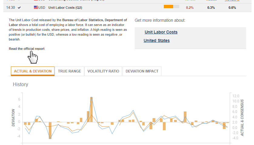
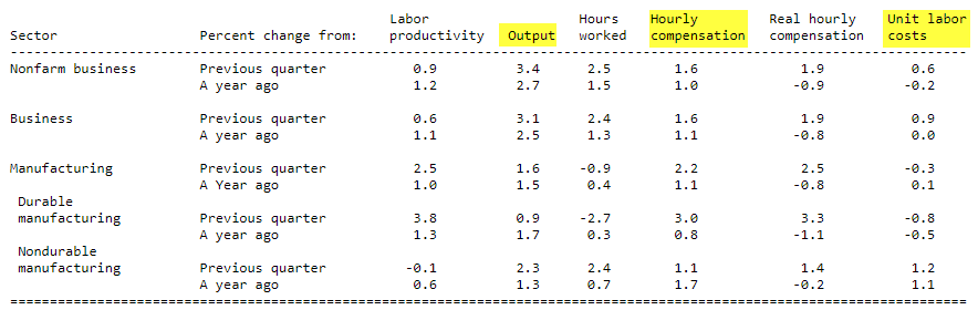
The ULC indicator contains three major components: “output” (
Revisions can be substantial and frequent because many of the statistical sources that underlie this report come from other indicators. Data on hours worked comes from the monthly payroll employment report, for instance, and for
Unit
Unit Labor Costs is the indicator published on the FXStreet’s calendar. In order to analyze the data, click on the indicator row to expand it, and click on “Read the official report”. This will take you to the source where you have access to the above table.
9. Gross Domestic Product (GDP) Deflator
We have already seen that one of the problems with trying to understand the performance of an equity index is that currency movements skew results. For example, if over the past year the Dow Jones increased by 5%, and at the same time the U.S. dollar devalues against the Euro by 15%, in real terms, a European investor actually lost 10% buying the U.S. index.
There is the same problem with trying to understand an economy’s performance: price inflation skews results. For example, if over the past year your wages increased by 5%, but now as a result of price inflation it costs 15%
Looking at the source document for the GDP report, under “Updates to GDP”, we see a small table with several rows of data. Of our interest, in terms of inflation concerns, are the upper two rows. The first shows the “Real GDP” which, expressed in percentage terms, reflects the change of the constant-dollar output, which means how much the economy really produced in volume or quantity. The second row shows the current-dollar GDP which is the nominal GDP or the value of aggregate output including price increases. In economies where inflation is positive and not negative, real GDP should be lower than nominal GDP. The real dollar percentage change is the one you can get on FXStreet’s calendar and is the one more closely followed to get an accurate picture of the economy’s health.
But to get a specific measure for price inflation, economists have developed the concept of the GDP Deflator (also called “Implicit Price Deflator”). This is a way to measure the relationship between nominal and real
The advantage this econometric has over the CPI, for instance, is that the fixed basket used in CPI calculations is static and sometimes misses changes in prices outside of that basket of goods, while GDP as such isn’t based on a fixed basket of goods and services. Consequently, the GDP Deflator has an advantage over the CPI in that changes in consumption patterns or the introduction of new goods and services are automatically reflected in the Deflator. Therefore, it can be used as a measure
C. Market-based Measures of Inflation
To some
When trying to interpret financial market developments, and especially when trying to give an economic meaning to those developments, we usually only have proxies for what we really want to know. In this regard, there is no such thing as “the” real inflation rate. Rather, there are observed patterns on specific market prices, which can be used to detect inflationary forces derived from all sorts of causes.
In this
1. Oil Prices
Are commodities, in general, reliable as a barometer of inflationary expectations? A number of studies conclude that commodity prices can be used as a leading indicator of inflation although some of the characteristics of an “optimal” leading indicator are not met.
Above
But financial markets also move on expectations, that is before facts become reality. In this context, the relationship between the price of oil and inflation is often perceived when the oil price is expected to rise. This is called “backwardation
In practice though, the opposite may also happen if people continue to use the same amount of oil as before, they will simply allocate more money to oil and less money for other goods and services, which is not more than altering the composition of spending. This
There are other scenarios which can be misleading: oil prices can also rise to compensate a falling U.S. dollar. A weak dollar, in the eyes of oil producers, carries the consequence of falling purchasing power as the weak currency erodes the value of their dollar-denominated oil receipts. This rise in the commodity, in turn, is expected to result in inflationary pressures.
2. International Gold Prices
It is also well-known that members of central banks monitor the price of gold carefully and consider it a good estimate of inflationary expectations. Not few financial observers are convinced that central banks may intervene from time to time in the gold price.
Analogous to the cause-effect relationship between oil and inflation, a rising gold price increases inflationary expectations, and a falling gold price may imply deflation and recession. But gold is not really an inflation hedge per se. If it was true, the price of gold would have not felt from $850 in 1980 to $250 in 2000 with inflation every step of the way. Rather, gold seems to perform well in specific instances, the primary ones being a loss of faith in central banks and their monetary policies, or when political and economic instability is sensed.
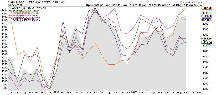
Although many real case studies reject the hypothesis that there is a reliable long-run relationship between the level of gold prices and the level of inflation, there is a way to measure changes in the price of gold that anticipate other inflationary signs. This consists of denominating gold prices in a broad index of major-country currencies. Generally, when commodity prices are rising, the U.S. dollar is falling, a reason why foreign currencies usually rise along with commodity markets. But when a commodity rises in all currencies, it means that a real inflow of capital is pushing that commodity higher. As a result, higher asset-inflation can be expected.
Summarizing: gold has to rise in all currencies, and not only against the U.S. dollar in which it is quoted, to imply it is acting as
The below chart shows how the recent high in the gold price in USD (grey mountain) is not confirmed by all currencies. Despite
3. Gold/Oil Ratio
On the theory that rising oil prices push up inflation, increasing demand for gold as
The long-term average multiple over the past 40 years sits above 15:1, and above 20:1 if we account the first half of the 20th century based on annual closings (on monthly closings, as in the picture below, the peaks are higher). Should the price of gold rise because of an asset-inflation scenario - due to a collapse in confidence in the monetary system, for instance-, then this ratio could hit historical highs above the Great Depression levels (above 30:1 on annual closings).
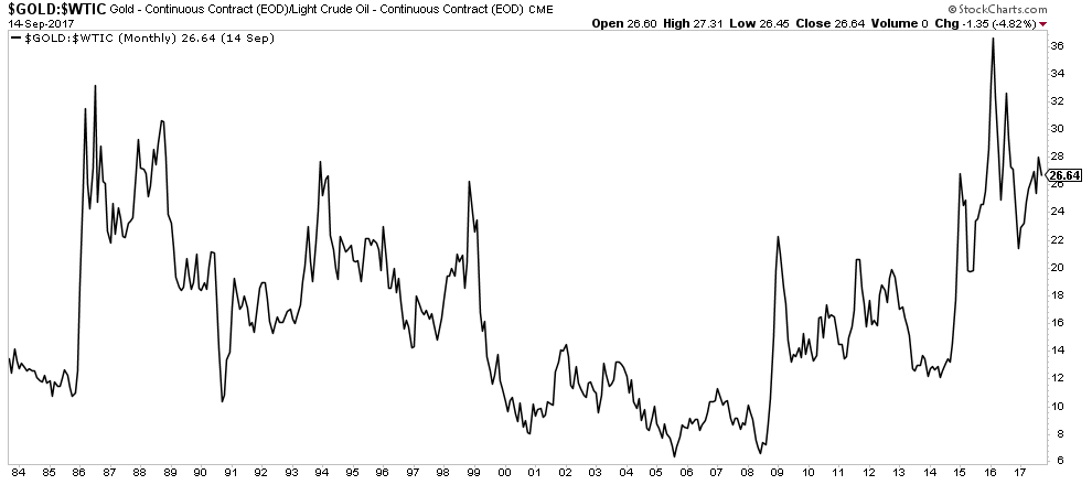
While the gold/oil ratio may be a somehow arbitrary indicator, when it rises to extreme levels it’s a clear signal that investors are nervous, preferring safety to growth, that is, the safety hedge gold is believed to offer over the confidence in economic growth expressed via oil prices.
Gold prices rise most steeply when investors hoard the metal in anticipation of some systemic troubles or when reacting to any other cause of implicit - or asset-inflation. Oil prices, Gold/Oil Ratio FXStreet 2017 Trade the News Series 22 on the other hand,
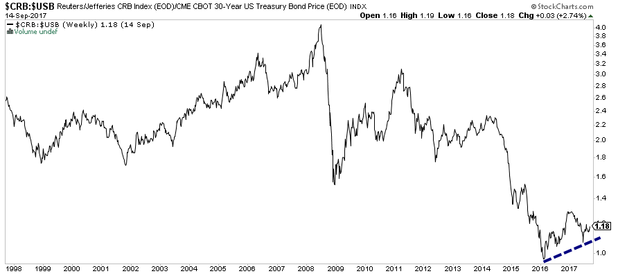
4. Commodity/Bond Ratio
Continuing with the idea that commodities have special characteristics that make them ideal candidates to receive at least a small allocation in every investor’s portfolio as
The rationale for using this ratio is rather simple: when commodity prices are rising faster than bond prices, we see this as an indication of inflation. Conversely, when commodities are declining in
When constructing this ratio with a single commodity though, if that commodity’s price starts to rise faster than bond prices, it can be partially a result of a falling dollar. Fortunately, there are several commodity indices which can be used as a numerator for this ratio in order to offset the currency effect: the S&P GSCI is widely recognized as a leading measure of general price movements and inflation in the world economy; the JOC-ECRI Industrial Price Index developed by the Economic Cycle Research Institute is considered a leading indicator of inflation based on a broad assortment of raw materials used in industrial production; the Thomson Reuters/Core Commodity CRB Index, made up of 19 commodities, also provides accurate representation of broad commodity price trends; or the S&P World Commodity Index which is based on investable commodity index futures contracts traded on exchanges outside the U.S. It is broad-based, world-production-weighted, and designed to measure international commodity market performance over time. Although a ratio can’t be calculated on our charts, you can follow the S&P WCI here at FXStreet’s Rates & Charts section.
5. Trade Weighted Exchange Rates
In order to account for countries whose currencies experience
As we have mentioned before, an appreciating exchange rate is usually thought to be contractionary and deflationary, while a depreciating exchange rate is usually thought to be expansionary and inflationary. Hence, having different ways to measure the level of an exchange rate is important to assess the economic efficiency in terms of
As a Forex trader, you are probably familiarized with bilateral nominal exchange rates which
One of them is an aggregate measure, called the nominal effective exchange rate (NEER), which provides a clearer picture of currency value developments. The NEER is a way of evaluating the strength of a country’s currency which consists of weighting its value according to the relative amount of trade carried out with each of its trading partners. If the majority of a country’s trade is with Japan, for instance, then the movement of its currency against the yen will be given greater weight in the overall measurement of that exchange rate’s value. Being a nominal variable, the NEER only describes relative value: the price of the national currency in terms of trading-partner currencies. But at the same time, NEERs are relatively straight-forward to calculate and widely available for almost any country. As with all exchange rates, the NEER can help identify which currencies are becoming attractive as a store of value and thus attracting lots of flows.
There are two well-known trade-weighted currency indices. The first is the U.S. Dollar Index (USDX), calculated using six major world currencies where the euro has more than 50% of the weight, reason why a USDX chart is almost the mirror image of a EUR/USD chart. The second is the Trade Weighted U.S. Dollar Index, sometimes called the Broad Index. The Federal Reserve realized the bias of the USDX and created a
For our purposes of detecting inflationary signals, neither the nominal nor the nominal effective rates indicate the relative (real) price of goods. For instance, how do we answer the question: is the value of one UK-produced car the same as an identical U.S.-produced car of the same brand and model? In order to answer this question, we need to measure the currency’s strength in real terms. To do that, we need to take into account price and wage developments and construct what is known as the real effective exchange rate (REER).
The REER is also a nominal effective exchange rate index but it is adjusted for relative movements in national prices or cost indicators of the home country and those of the selected other countries.
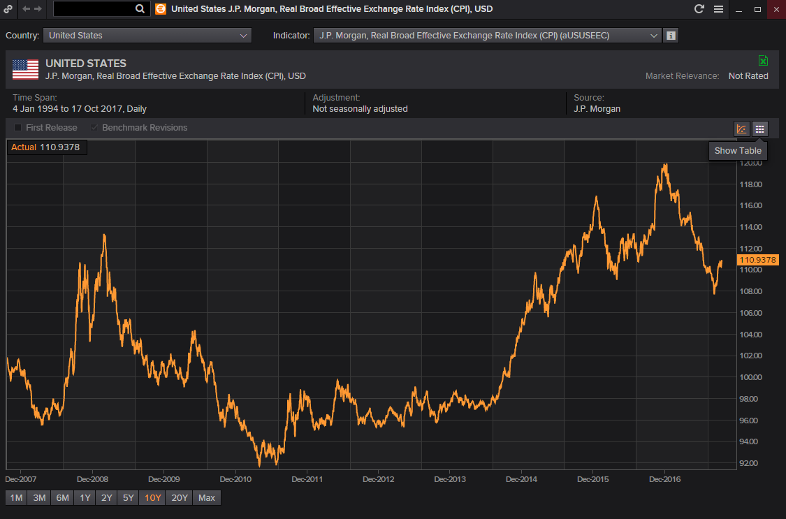
A rising REER means the domestic product (or consumption basket, for that matter) is becoming more expensive than the foreign product, indicating higher domestic inflation levels. This also means reduced cost of imports but undermined
Suppose the UK-produced car from our example costs £50,000 in the UK and $50,000 in the U.S. The REER is thereby 1:1. If the nominal exchange rate was also £1 = $1, then we have perfect purchasing power parity (PPP) and none of these two countries
is showing stronger inflation. Now suppose that the cost of the British car increases to £75,000 in the UK, and in the U.S. it still costs $50,000. This means that the car in terms of Pound is 50% more expensive than the one in
Forex markets are very liquid and efficient so the nominal exchange rates are thought to be always in equilibrium with the REER. Internally, the equilibrium can be kept if there is no output gap and no inflationary pressures, and externally, if the current account is financed with a sustainable level of capital flows. Failure to understand capital flows can make many inflation indicators mislead you. So let’s learn something about capital flows. You can find NEERs and REERs on sites like the Bank of International Settlements and The World Bank.
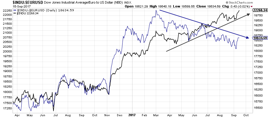
6. International Asset Prices
Inflation is generally understood and perceived as the rise in
As we also explained in Part 1, hard assets can rise a lot in price, with no accompanying changes in
Unfortunately, most people -and not few financial market pundits- do not understand the fact that a currency (money) is most of the time playing the opposite role of hard assets in terms of
To qualify as a bull market, whatever asset you are looking at must rise in terms of all currencies. Most of the time, bull markets never unfold simultaneously. Let’s assume that gold has doubled in U.S. dollar terms, but the U.S. dollar depreciated 50% against the Australian dollar. Down under, the gold price is unchanged, there is no ascending trend. Or imagine new highs in the FTSE making headlines, when it is only because the Sterling is declining. Only looking at FTSE in international terms (in USD, JPY, EUR) exposes the real trend, and in that
This means that a sharp correction on a stock index can be mitigated by the rise in the domestic currency because
The same disparities happen in the commodity world. Let’s assume commodities are declining in dollar terms but this time with the dollar rising at the same time. Domestic (
You see, money is in many ways a metaphor for language. We look at the world of financial and hard assets without making the effort to translate the different languages or trying to see the world from a different perspective. Nominal quotes in any asset are like a message expressed in a native language. If you are looking at the Nikkei’s quote, and your financial “language” is not Japanese, by not translating that nominal quote into your home currency, you will not be able to discover the real value the Nikkei may have for you.
In order to monitor capital flows capable of igniting a so-called asset-inflation, we look for situations when we see domestic assets and the currency value both rising in an aggressive manner. A currency with a bullish trajectory because of a strong capital inflow, one based upon foreign investment, will make assets quoted in that currency also look attractive for global investors. So, one trend feeds the other: a true bull market in stocks will bid up the currency in which those shares are negotiated. Ratio analysis, made of asset/currency studies, provides a useful technical tool for spotting true trend changes in these complex global relationships.
The above chart illustrates the Dow Jones Industrials Average in USD (in black). Concurrently
7. Phillips Curve
The Phillips curve is a graph describing the relationship between wage changes and price level changes on the one hand, and the unemployment rate on the other. This relationship is often attached to monetary policy decision-making by several central banks. Its framework purports that greater demand drives unemployment lower, and as the
But
In case you haven’t noticed, many of the dedicated contributors at FXStreet.com are critical with the Fed’s reliance in the Phillips curve, in that the tighter
Some analysts mention the increased focus on the deflationary effects of technology, demographics, and the debt burden as
Once again, we recognize how difficult it is to de facto measure inflation. There is no yardstick by which the purchasing power of money can be effectively measured. We are also forced to recognize that both money and goods are subject to changes in supply and demand, hence averaging the prices of goods and services simply makes no logical sense when the issue at hand is money itself which sees its lure changed. As the supply and demand of goods and services
Although the original concept has been challenged empirically, we should pay attention to the Phillips Curve since the Fed has been using this model for decades as a guideline to set interest rates.
8. Forward Breakeven Inflation Rate
As you have seen so far, there are many methods of varying complexity that investors and central banks alike use to estimate inflation levels. One of these refers to the expected or implied inflation.
While inflation is what affects the purchasing power of the money in the people’s wallet, expected inflation is what people think their purchasing power is likely to be in the future. For modern policymakers measuring inflation expectations is a major objective, because controlling inflation expectations is the first step to control inflation.
The logic of this measurement starts with the following assumption: if you could enter into an agreement today to buy a 5-year bond 5 years from now, that term structure would tell you something about the expected inflation. Likewise, the interest rate on that future bond is something you could calculate today from the current 5-year and 10-year yields to maturity. This is known as the “5-year, 5-year forward rate”. Effectively, there is a way to do that: you would sell a 5-year zero-coupon bond (without periodic interest payments), let’s say, currently worth $1,000, and simultaneously buy a 10-year zero-coupon bond also worth $1,000. You wouldn’t have any net cash flows in or out for 5 years, at which point you’d have to pay back the redemption value on your 5-year bond. After five years, you’d collect the redemption value on your 10-year bond.
One relatively straightforward method to calculate such a forward rate is to examine the difference between the yield on a nominal fixed-rate bond, and the real yield on
Let’s break it down a little bit for clarification purposes: TIPS are so-called “inflation-indexed government bonds”. A plain-vanilla bond, like a Treasury note in the U.S., is a stream of payments that
A TIPS bond may have a $1,000 face value and pay a 2% interest rate. However, every 6 months, the interest payment is adjusted for inflation. Then, after 10 years, the bondholder gets back $1,000 multiplied by the ratio between the CPI at the end of the period and the CPI at the beginning of the period. This way, the bondholder is guaranteed a 2% real return no matter what the rate of inflation is in the interim. Because the amount of principal an investor receives on the original investment is adjusted, the coupon rate represents the investor’s “real return,” or return above inflation.
The difference between the yield on a regular plain-vanilla bond and the yield on an inflation-indexed bond with the same maturity is the implied inflation expectation. If the 5-year Treasury has a yield of 4% and the TIPS with a same maturity of 5-year has a yield of 2%, then inflation expectations for the next five years are (roughly) 2% per year. Similarly, using two- or ten-year issues would tell us the expectation for those periods.
The reasoning is: since plain-vanilla bonds carry no inflation protection, leaving investors fully exposed to the impact of inflation, they demand a premium- a higher interest rate
If you didn’t follow that, don’t worry, just remember how to read a forward break-even rate chart: if investors expect future inflation to be greater than this difference (the breakeven rate), then this would make TIPS outperform regular bonds, and the break-even rate would increase as investors sold bonds (pushing down the price and the yield up) to buy TIPS (pushing the price up and the yield down). The opposite effect would occur if inflation expectations were lower than the breakeven rate, then bonds would be more attractive than TIPS.
Therefore, in equilibrium, the difference should reflect the market’s consensus for future inflation, but only roughly. This distortion happens because actually, in addition to expected inflation, the bond investor bears the risk that inflation may be very different from the level expected by the market. All things being equal, it is better not to have inflation risk than to have it. But investors in TIPS, which are adjusted for whatever inflation occurs, do not bear this risk. So the implied inflation expectation is actually slightly less than the breakeven rate because the bond yield may include an extra risk premium to compensate for this additional risk. Another reason why the breakeven inflation rate is not a perfect estimate of inflation expectations is that the bond market is more heavily traded and liquid than the TIPS market. In this case, the yields on TIPS may have an additional premium to compensate for lower liquidity. This can push its price down (yield up) in an eventual rush to liquidity, which can be misinterpreted as a signal of expected deflation.
Nevertheless, it’s worth keeping an eye on this measurement of far-forward inflation especially in those economies where people believe that monetary mavens are not capable to keep inflation under control. In contrast, in countries with credible inflation targeting, the breakeven rate does not react as much to economic developments.
You can use the Treasury and TIPS yield curve rates which are published daily on the U.S. Treasury Department website.
9. Bond Yield Spreads
The term “yield spread” refers to the spread between yields on long- and short-term debt securities, and is a market-based measure that you may see quite frequently mentioned. Usually, it’s a way to measure bond investors’ feelings about risk. You will also see analysts looking to the yield spread as a potential source of information about future growth and inflation at moderate horizons of a few years. The yield spread is also used as a gauge for near-term monetary policy expectations, which is yet another reason why it’s widely monitored.
In order to understand why the information in the yield curve is considered to be forward-looking, and therefore containing predictive power for real growth and inflation, it’s important to know why different maturities (or “time-until-maturity”) have different yields attached (remember, the yield on a government bond is the annual rate of return, or interest rate, that would be earned by an investor who holds the bond until it matures). Consider how investors would behave if they expected one-year interest rates to be higher next year than this year: investors would demand a higher annual return for holding a
The yield spread precisely describes this relationship between yields at different maturity lengths, reflecting the direction of future inflation changes. Thereby, the yield spread also provides information on the slope of the so-called “yield curve”. The slope of the yield curve is equally used by financial and policy analysts as an indicator of future real activity and inflation.
The larger the spread, the steeper the slope of the yield curve will be. A positive slope reflects investor expectations for the economy to grow in the future and, importantly, for this growth to be associated with
A large spread also predicts that in response to relatively accommodative monetary policy, real growth will pick up and inflation will increase. The same expectations of higher inflation can also lead to expectations that the central bank will raise short-term interest rates in the future.
If widening spreads lead to a positive yield curve, contracting spreads, however, are indicative of worsening economic conditions in the future, thus resulting in a flattening of the yield curve, another sign that market expectations for inflation have eased. Long-term maturity securities are the ones usually affected by inflation expectations. Yields on short-term maturity securities, in turn, are more affected by changes in monetary policy.
Improved credibility of monetary policy, or a response to the relatively tight stance of monetary policy (aimed to slow economic activity and to decrease inflation), may also translate in a suppressed spread, that is, when current short-term yields are high relative to long-term yields. Long-term yields may react to
Narrower spreads can even lead to a negatively sloped yield curve indicating not only lower growth and inflation but also a possible recession. A so-called “inverted yield curve” means the yield difference between a long-term bond and a shorter-term one is negative. This is in contrast to what is considered a normal market, where longer-term instruments should yield higher returns to compensate for time. Inverted yield curves thereby imply that the market believes inflation will remain low because, even if there is a recession, a low bond yield will still be offset by low inflation.
In the U.S., Treasuries are traditionally seen as a safe haven asset. Under this view, when long-term yields are rising, that’s usually because investors are selling long-term bonds in hopes of finding better short-term investment opportunities elsewhere. But when long-term yields are falling, that means an increase in demand for bonds on the long end of the yield curve, and that’s an indication of a so-called “flight to quality”. When investors
10. The Business Cycle
The idealized business cycle (or hypothetical economic cycle) revolves around a point of balance known as equilibrium. This equilibrium can be thought of
The chronological sequence of peaks and troughs in the various asset classes (bonds, stocks and commodities) can be used as a framework for identifying in which phase of the cycle the market is
The idealized picture usually starts with bond prices bottoming in an early recessionary phase (below the equilibrium line). Midway during a recession, commodity and stocks are still falling together, but at some point, falling bond yields are positive for equity prices.
Once the economic recovery has been underway, commodity prices bottom and also start to rally, and all asset classes are rallying together. Gradually, the economic and financial slack, which developed as a result of the recession, is substantially absorbed, and the demand for credit puts upward pressure on interest rates. As a consequence, the bond market peaks out and begins its bear phase. When bonds peak, usually in the late upswing phase (above equilibrium), it’s a signal that a period of healthy non-inflationary growth has turned into an unhealthy period of inflationary growth.
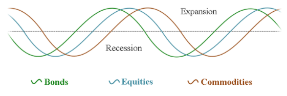
Later during the economic expansion, other signs of inflation begin to crop in, usually in the form of high commodity prices, and the rally in the three markets leads policymakers to raise interest rates in the front-end of the curve to combat inflation. Initially, the resulting inverted yield hurts equities which top out. At the same time, a tight economy (rising yields) is
Inflation pressures are the strongest near the end of the expansion. Because inflation is a lagger, it will persist until the rise in interest rates takes its toll on the economy. The stock market discounts the development and tops out. Now that inflation has been brought under control, commodity prices also begin to slip.
In the latest phase, when the economy starts to slow, the demand for commodities reduces and the cycle slips into a recession. At this point, all asset classes are declining together until the credit markets bottom out first and the cycle starts once again.
Now let’s take equities in isolation, analyze the different sectors of the stock market in their own rotation cycle, and categorize them according to their sensitivity to deflationary or inflationary forces. The stock market peaks and bottoms in stages, which means that not all issues change their trends simultaneously. This also implies that different stocks will display leading or lagging characteristics, which can be used as a gauge of inflationary and deflationary forces.
Cyclical stocks, also named consumer discretionary (automobile, steel, real estate, household durable goods) tend to follow the business cycle and are thereby considered inflation- sensitive. These are consumer-linked industries that typically benefit from increased borrowing, including diversified financials. Financials, albeit being liquidity-driven, sees money flowing to them because interest rates are starting to rise.
While it is important to note outperformance, it is also helpful to recognize sectors with consistent underperformance. In this sense, basic materials and energy stocks are considered to be laggards at this stage of the cycle because interest rates are still low and so are commodities. Yield spreads are now widening and the yield curve steep, but inflationary pressures tend to be still low during
In the late expansion, industrial stocks which are considered economically sensitive sectors (aerospace and
The energy sector has seen the most convincing patterns of outperformance and
At this stage consumer staples and services are underperforming because the economy is still growing and there is no perceived need for defensive stocks yet. Investors drop these groups because they still expect more future inflation. Utilities and financials are also not in vogue because interest rates are probably still rising.
One way to tell when the economy has crossed the threshold from late expansion to early contraction is when leadership switches from energy stocks to more defensive stock groups like healthcare and consumer staples. Drug stocks are also defensive in nature and show better relative strength when investors begin to glimpse signs of an economic slowdown. Their leadership is a sign of lack of confidence in the stock market and anticipates deflationary forces in the economy. This is also the stage when the yield spreads can get negative and the curve inverted.
On the opposite side, industrials, basic materials, information technology, and cyclical stocks (which are inflation-sensitive) tend to suffer the most during this phase, as inflationary pressures crimp profit margins.
In the late contraction or recession phase in the business cycle, those stock sectors that are defensively oriented move to the front of the performance line. Telecommunication services and healthcare which consumers are less likely to cut back on during a recession (auto-related, entertainment, home-builders, home appliances, restaurants, and retailers, i.e. products with inelastic demand) are now leading. Note that inelastic items constitute
The business cycle approach is best deployed with the use of relative strength studies (ratios) which are an ideal technical tool to visualize shifts in phases allowing investors to adjust their exposure accordingly. For Forex traders, it can be used to complement the other approaches we have been studying, and so anticipate changes in monetary policies.