Options payoff graph

When trading options, we have quite a few moving parts to juggle. Fortunately, technology now gives us tools that make this much easier.
One of those tools is the option payoff graph, also called the risk graph. We’ll take a look at this tool today.
We have been using the stock of General Electric for our examples recently, so let’s continue with that. Here’s how GE’s chart looked on January 27, 2016:

Let’s say we were neutral-to-bullish on GE and expected it to hold or go higher from here in the next few weeks. We might consider the trade that I described last week, which was to sell (short) put options for the February 19, 2016 expiration at the $27 strike price. These could be sold for $.39 per share, or $39.00 per 100-share option contract.
To view the profit and loss possibilities of an option position, there is a standard format for portraying them graphically. The option payoff graph for this short put trade looks like this:
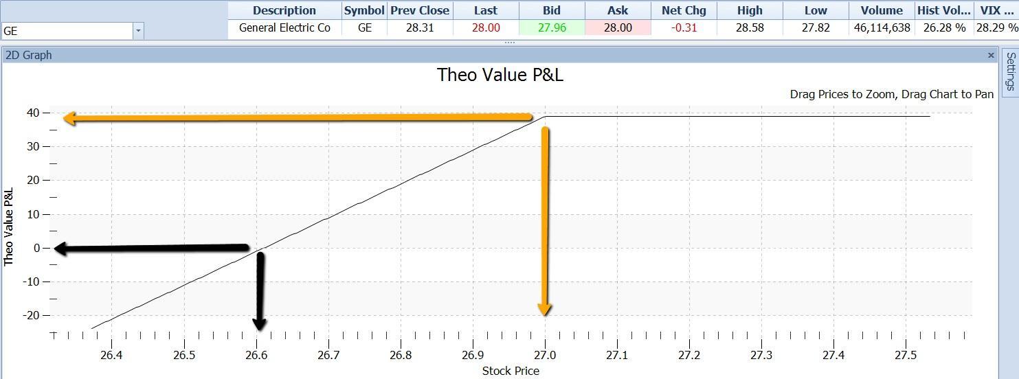
The gray line on this graph relates the stock price at the option expiration date to the amount of profit or loss that the option position would make with the stock at that price. The system “knows” that we would receive $39 when we sold the puts to enter the position.
These graphs take a little getting used to for those of us accustomed to using stock price charts. Note these points about the payoff graph:
-
The price of the stock runs left to right (on the X or horizontal axis), not up and down on the Y or vertical axis, as price charts do.
-
The vertical axis is profit or loss on the position at the indicated stock price.
-
Not shown but, built into the graph is the amount of money paid out or taken in to open the position. In our example, we sold puts for $39.00 for the contract.
-
No time or movement is shown on the graph. The gray line is drawn as of a specific instant in time – the moment of option expiration, 23 days in the future. It shows what the amount of profit or loss would be if the stock were to be at the indicated price at that time.
In this case, the gray line slopes upward from left to right and then levels out at a profit of $39.00. This indicates that the maximum profit on the trade is $39.00 and that this would be the result if the stock were to be at any price at or above $27.00 at expiration. The gold arrows point to the amount of profit ($39.00) and to the corresponding stock price ($27.00).
This makes sense when we remember that the puts will be worthless when they expire unless the stock is below their strike price of $27.00. If they are worthless then we will not have to pay anything to buy them back and terminate the trade, and we will keep the $39.00 we received for them. This will be our profit.
The black arrows point to the zero point on the P/L axis and to the corresponding stock price of $26.61. This indicates that if at expiration the stock is at $26.61, our trade will break even. In that case the puts would be worth $.39 per share. They convey the right to their holders to force us to buy the stock and pay $27.00 (their strike price), which would certainly happen. Since $27.00 would be $.39 higher that the stock value at that point, we would have a loss at that time of $.39 per share. This would exactly absorb our original credit of $.39 per share, for no net gain or loss.
At stock prices between $26.61 and $27.00 our position shows positive values for profit of more than zero and less than the maximum profit of $39.00.
And at stock prices below the $26.61 break-even price the position would show a loss.
There is quite a bit more that the option payoff graph can tell us. Next time we’ll continue with that.
Author

Russ Allen
Online Trading Academy
Russ decided to make his lifelong passion, trading, his full-time occupation in 2003. With extensive experience in trading, education, and business in general, he sought the highest-quality trading education he could find.