Focus on price, trend, and momentum
Investopedia is partnering with CMT Association on this newsletter. The contents of this newsletter are for informational and educational purposes only, however, and do not constitute investing advice. The guest authors, which may sell research to investors, and may trade or hold positions in securities mentioned herein do not represent the views of CMT Association or Investopedia. Please consult a financial advisor for investment recommendations and services
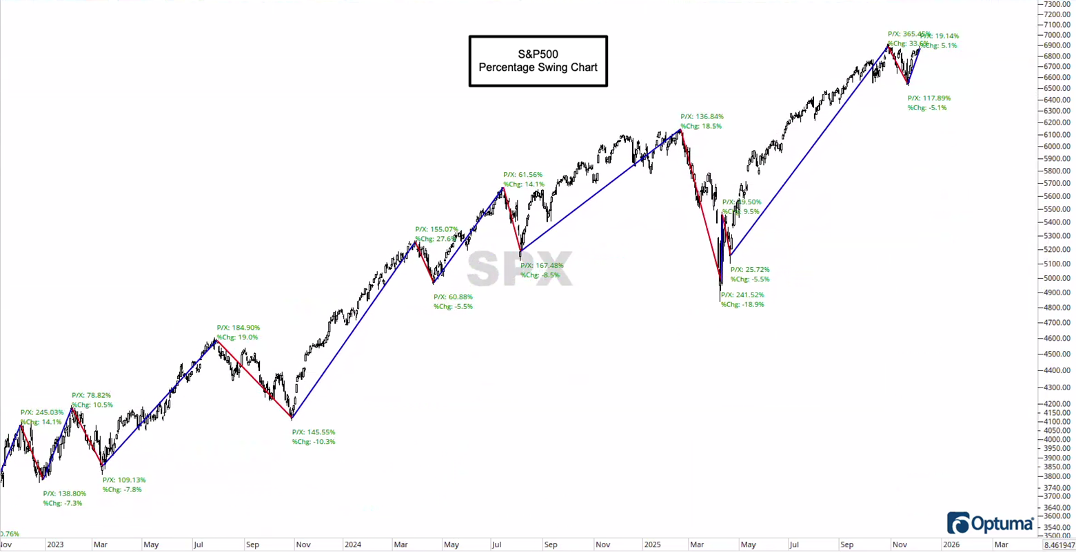
To kick off Day 2 of “The 5-days of Chartmas,” I want to start with a “percentage swing” chart, which allows me to pick any percentage, and when the investment in question moves up (or down), it creates a zig-zag plot and marks the total gain or loss from the previous high or low.
Notice back in late-2022 and early-2023, we saw pullbacks of -7.3%, -7.8%, and then -10.3% in summer/fall of ’23, and another -5.5% pullback in spring of ’24.
There wasn’t a single drop of -5% or more between spring of ’24 and spring of ’25, which is when the market faced “The Tariff Crash” – what we’ll call a “severe market correction” to the tune of -18.9%.
The reason I wanted to share this chart is to bring things into perspective. The fact that the market rose with relative ease off the summer ’24 lows until the Tariff chaos created a sense of calm.
We humans suffer from a serious case of recency bias, and we got used to the market going up without even a mild pullback, so when the market started to fall, coupled with a heavy dose of “doom & gloom” from your favorite political news (i.e., “opinion”) network, the level of “freak out” was amplified by the difference in market smoothness and subsequent volatility.
While it was “just a -5% pullback” in November, the same can be said for how people felt last month. Call it “The A.I. Bubble” or pick your cortisol-spiking headline du jour… if you watched the financial news, you’d think we were in the beginning of another dot-com bubble. Meanwhile, some of the riskier, more offensive sectors and stocks are hitting all-time-highs.
My point? Focus on price, trend, and momentum… and turn off the news.
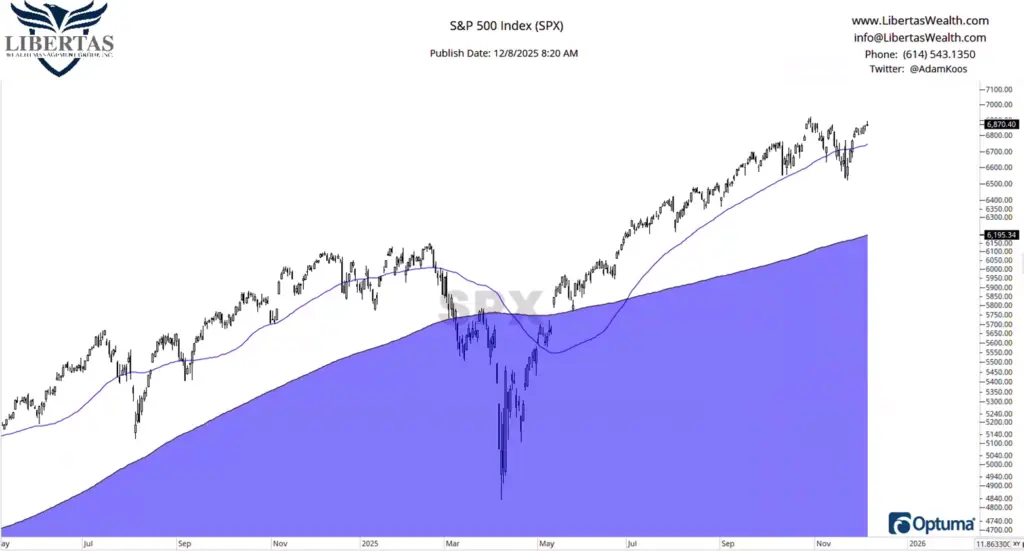
If I showed most 5th graders the chart above and asked them “is this an uptrend or a downtrend,” only the engineers would zoom in on the most recent market action this past month and try to turn it into something that looks like a major market top. The vast majority of people would say that this market is in an uptrend, and the chart below reiterates this point.
We invest our clients’ retirement funds in models that use an intermediate timeframe, which is six-to-nine months. Said another way, it’s not short-term in nature, and it’s most certainly not “weekly” (which is what swing traders use for their trading timeframe).
So when I analyze the markets, I’m focused on the 200-day moving average (200MA) – or 40-week moving average, which is mathematically the same thing (and you can see this in the blue, shaded area below), and more aggressively, I pay attention to the 50-day moving average (which is mathematically the same as the 10-week moving average) – the blue line, below.
What I see is a healthy market, in an uptrend, moving higher above a rising 50 and 200-day moving average, and focused on price and trend alone… the only negative thing I could say about this chart is that there is a lot of “daylight” between the 200MA and current price of the S&P500. Typically, the more “daylight” you see between the moving average and price, the higher the probability of a correction – either in price (down) or time (sideways chop) as the moving average “catches up.”
Still, not only is this market trading decisively above its long-term moving averages… but some of the strongest markets tend to hold above their 50-day moving average, which is exactly what we’re seeing below.
So, unless something changes, “The trend is your friend, till the end, when it bends.”
…but no sooner!
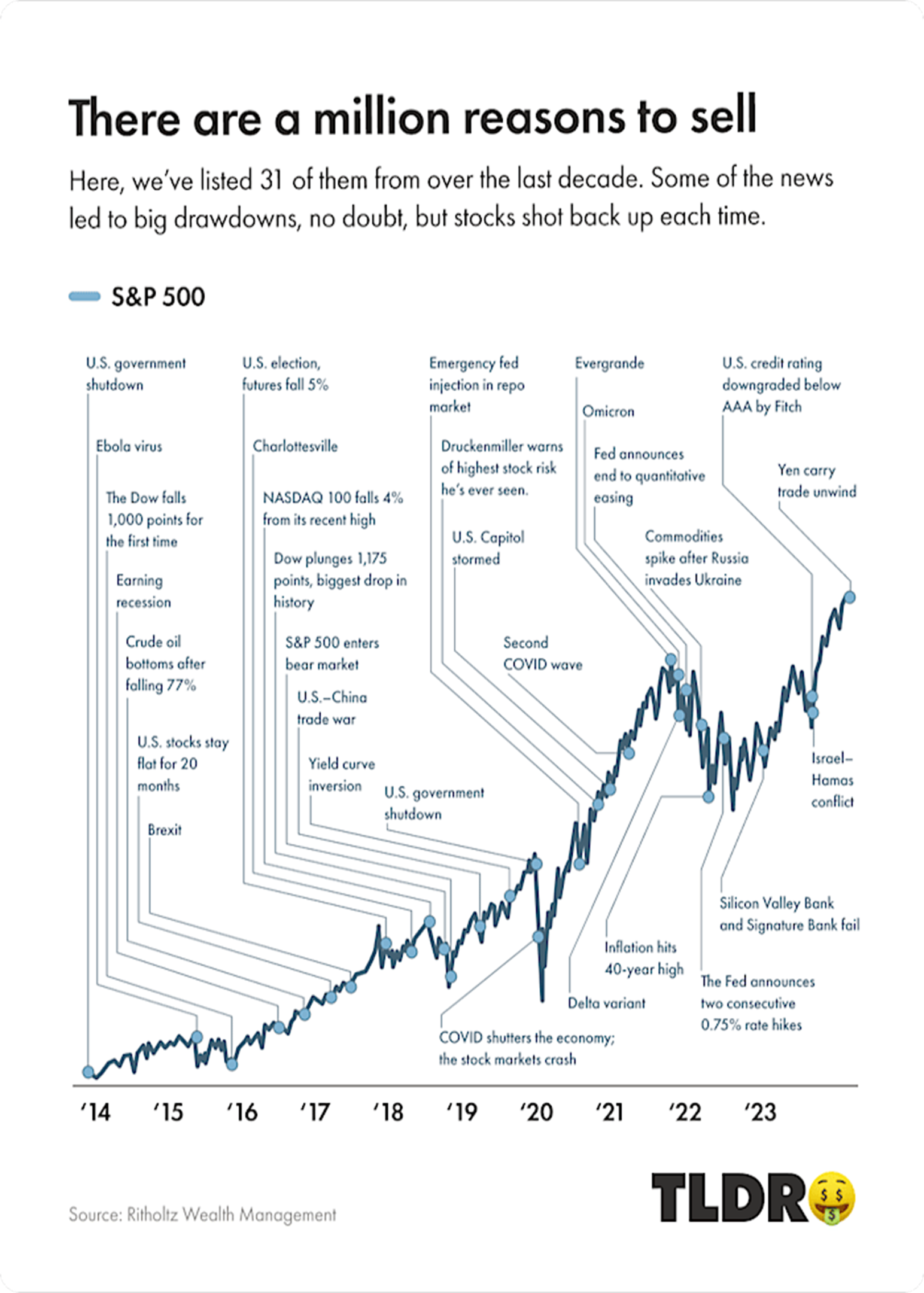
Some people don’t like the chart below because it implies that people should stay invested all the time, but that’s not the point.
Sure, some professionals regurgitate this chart (and others like it) because they’ve been force-fed the lie that you must always stay invested, all the time, but the reason I’m sharing it is to point out that, when the market is in an uptrend, we should be invested – but there are still a bunch of reasons to sell (or not invest the cash you have sitting on the sidelines), even when things are healthy and the trend is up. I recently wrote a controversial article on this very topic last month, by the way, which you can check out by clicking here, if you’re interested.
But I get it – it’s tough out there… with no shortage of opinions, analysis, timeframes, and even professionals who share a complete different thesis, it’s tough to figure out what to do when we’re all observing the exact same market.
My recommendation is this… either you:
- Decide on a single timeframe over which to invest your hard-earned retirement money, create a set of rules that make sense for that timeframe, and then stick to your strategy over time, avoiding all other news and analysis, or
- Hire a professional who utilizes a strategy that aligns with your personality, opinions, and thought processes to partner up with so that you can focus your time and mind space on your family, friends, work, and hobbies… not your life savings.
Unlock exclusive gold and silver trading signals and updates that most investors don’t see. Join our free newsletter now!
Author

CMT Association Research Team
CMT Association
The CMT Association is a global credentialing body that has served the financial industry for nearly 50 years.