Drawing and Filling Out an Option Profit/Loss Graph

An Option Profit/Loss Graph is the primary tool for option traders to calculate the potential profit or loss on an option position. We need to do this to decide whether the potential profit on an option trade is worth the risk.
Using the profit/loss graph is easy when you understand it, so here, I’ll show how to build one from scratch if there wasn’t a computer to do it for us. I’ll demonstrate how it was done in the covered wagon days, on a sheet of graph paper. This will make it easy to grasp how it works. (Note to millennials: paper is a substance with two flat surfaces and four straight edges, on which people used to make symbols with writing instruments called pencils, before the invention of screens).
Calculating Profit/Loss on Options
Let’s say, for the sake of example, that SPY closed today at $332 per share and I believe that it will go up further in the next few weeks (not a recommendation, just a for-instance).
I see that there are call options at the $330 strike price that expire in fourteen days. One of these call options gives me the right to buy SPY at $330 at any time within the two weeks. The options can be purchased for $3.00 per share today.
If I buy the calls today for $3.00, how much money can I make if SPY goes up by, say, $4.00 per share? Or any other amount?
Here’s an example with images of how to manually create an option profit/loss graph to calculate whether or not an option trade has viable profit potential:
Creating the Option Profit/Loss Graph (the old-fashioned way):
1. Laying Out the Option Profit/Loss Graph
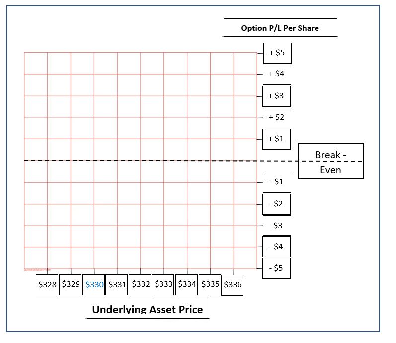
-
Take out a sheet of graph paper
-
Label the horizontal axis Underlying Asset Price.
-
Label the vertical axis Option Profit/Loss per Share
-
Draw a horizontal line across the middle of the sheet, label it Break-Even
-
Across the bottom of the page, label grid squares with numbers representing the SPY per-share price, with the $332 current price in the center, looking left to right.
2. Plotting the Proposed Option Trade Entry
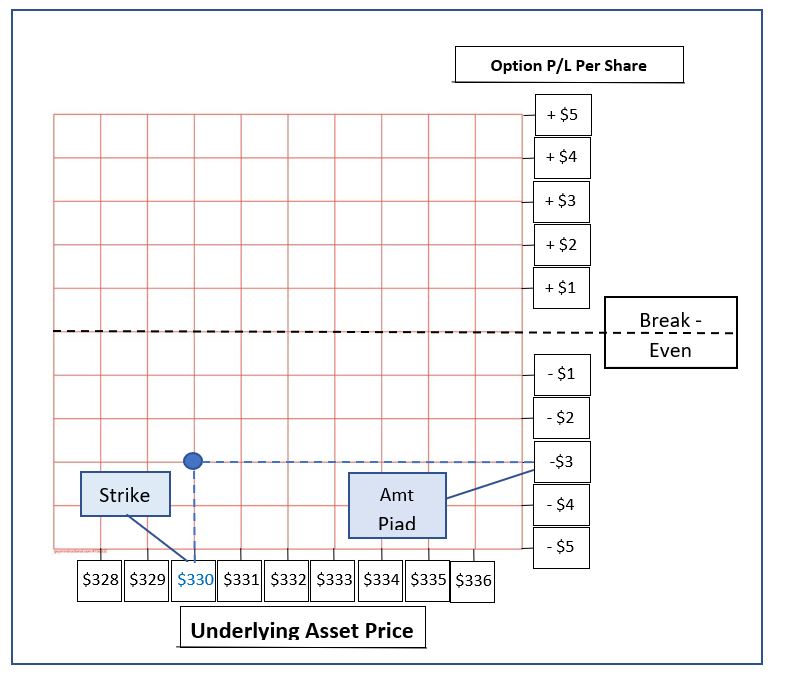
On the graph, place a dot where the strike price ($330) and the amount paid for the option (-$3.00) intersect.
3. Determining Loss if Price Is Below Strike Price at Expiration
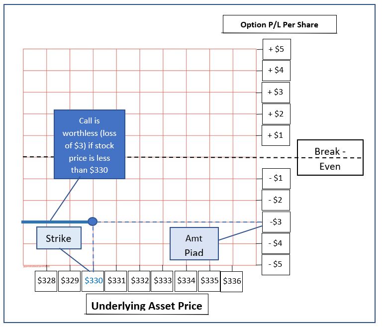
Since this option trade example is a call, we will extend a line horizontally from the dot to the left edge of the chart. This shows that, upon expiration the loss would be equal to the amount paid for the option ($3), if at expiration the price was less than the $330 strike price by any amount ($0 – $330).If this trade were a put, the line would extend to the right edge of the chart to show that, upon expiration the loss would be equal to the amount paid for the option, if at expiration the price was more than the strike price by any amount.
4. Determining Potential Profit/Loss at Expiration
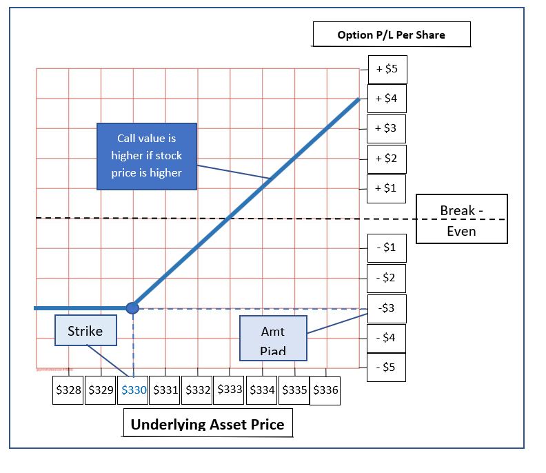
For this call example, we will draw a line from the dot diagonally upward to the right. This line should run straight through the intersections in the grid lines, as shown. This shows that if the stock price is higher than the call strike at expiration, the call’s value will be equal to the amount by which the stock price exceeds the strike.If we had used a put, this line would be drawn diagonally upward to the left in the same fashion to determine the potential profit/loss.
5. Reading the Option Profit/Loss Graph
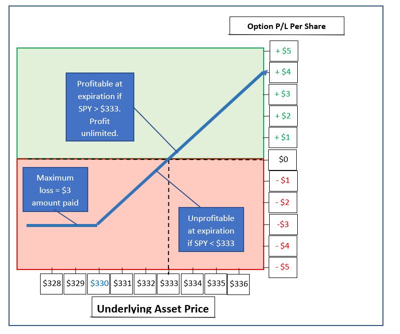
The finished graph above shows the following:
-
The maximum loss on any option purchase is the amount paid, and this maximum loss occurs on an option held until expiration if the stock price then is such that the option is worthless. This is conveyed by the horizontal line at -$3 P/L stretching from stock prices of $330 across to zero (although prices below $328 are not shown on the graph in this example).
-
This is a bullish trade – one that rewards an upward move in the stock price. This is conveyed by the upward slope of the diagonal line. Higher stock prices (farther to the right) equal higher profit potential, as indicated by the increase in price as the diagonal line moves upward.
-
Profit/loss can be determined by doing the following:
-
Draw a vertical line upward from the horizontal axis at any underlying asset price (price of SPY) at which you want to evaluate the trade’s profitability, say $333. This horizontal reference line you just drew is called a price slice. In practice, computers draw them for us.
-
From the point where the price slice intersects the blue diagonal line, draw a new horizontal line to the right, all the way to the vertical axis.
-
The value at which your newly-drawn horizontal line intersects with the vertical axis shows the profit or loss per share on the option trade, if the stock were to be at the price indicated at expiration.
-
Starting from an underlying asset price of $333, this process gives a value of $0 per share P/L. This indicates that if SPY is at $333 at expiration, the trade will break-even. A line drawn upward from $335 would intersect the P/L line at a P/L axis value of +$2.00, indicating a $2.00 profit, and so on.
-
-
Using the same logic, it is now easy to see that if the stock is at any price below $330 at expiration, the maximum loss of -$3.00 per share will be the result.
-
And, if the stock is between $330 and $333, there will be a loss on the trade of from $0 to -$3.00.
-
Finally, if the stock were to be at any price higher than $333, then there will be a profit on the trade, equal to the amount by which the stock exceeds $333, with no limit on profit.
The construction of these graphs is elementary, but very useful. This is just the beginning of what an option profit/loss graph can tell us. I hope that this step-by-step description makes learning how to use an option profit/loss graph easier.
Author

Russ Allen
Online Trading Academy
Russ decided to make his lifelong passion, trading, his full-time occupation in 2003. With extensive experience in trading, education, and business in general, he sought the highest-quality trading education he could find.