CRASH COURSE TO BECOME AN NFP EXPERT
A. What to do BEFORE the NFP release?
Paying attention to related macroeconomic data from the United States (US) usually published ahead of the Nonfarm Payrolls (NFP) release can help you elaborate a fundamental analysis to estimate the NFP likely outcome.
The reports described below take different approaches to determine whether US labor-market conditions are improving or deteriorating. At the end of the section, you will find a checklist to do your own NFP prognosis.
Most of the data is available on FXStreet’s Economic Calendar . Make sure you are familiar with it. Each of the Calendar rows is clickable, unveiling important details for the data point, including a direct link to the original report.
CONTENT
1. Nonfarm Payrolls
What is it?
NFP stands for Nonfarm Payrolls, an indicator that shows the total number of paid workers in the United States (US), excluding those employed by farms, the federal government, private households, and nonprofit organizations.
The headline figure, expressed in thousands, is an estimate of the number of new jobs added (or lost, if negative) in a given month. The NFP headline figure gets the most attention because it measures the change in the actual number of paid employees, both full and part-time.
Nonfarm Payrolls is part of the Employment Situation report – released by the US Department of Labor –, which also includes other statistics such as the Unemployment Rate, the Labor Force Participation Rate, Average Hourly Earnings or Average Workweek Hours.

Why is it important?
Nonfarm Payrolls and the broader employment report provide a fresh insight into the health of the US economy in general and the labor market conditions in particular. If the labor market is growing, that means more people are making money, probably reflecting more consumer spending.
More spending results in higher growth in the Gross Domestic Product (GDP), which is the broadest measure of how is the economy performing. Employment figures can also have an impact on interest rates, a key factor for currencies: higher employment can lead to higher interest rates because of central bank policies aimed at balancing inflation with economic growth.
How to read it?
To be accurate, the Nonfarm Payrolls (NFP) number is the total number of employees in all sectors, farming industries excluded, while the released figure is the monthly changes to this figure. One should therefore use the expression "changes to the NFP number" more than "the NFP number" as it measures the number of jobs created or lost in the US economy over the prior month.
For instance, a -200,000 reading means that 200,000 jobs were lost in all non-agricultural businesses. A look at the history of NFP releases is a good starting point to get a feel for the job situation. Try to detect the long-term trend in the NFP figures, if it is rising or falling. Look also at the ranges: were recent reports close to historic highs or lows?
Are expectations for the next release far from the last figures or are they too modest? In both cases we might have room for surprises, which we will deal with in the second part of this study.
Where to find it?
On FXStreet’s Economic Calendar you can find the report showing its data series on a chart. It is released usually on the first Friday of each month at 8:30 ET.
Revisions
The number is subject to revisions in the following two months, and those revisions also tend to trigger volatility in the Forex board. Moreover, once a year, the Labor Department also issues a so-called benchmark revision of all payroll numbers affecting the 12-month period through March.
2. Challenger Job Cuts
What is it?
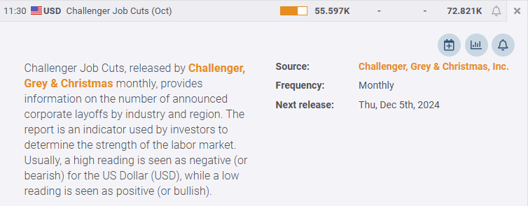
The Challenger Job Cuts report – released every month by Challenger, Grey & Christmas – provides information on the number of announced corporate layoffs by industry and region in the United States (US).
Why is it important?
The Challenger report is important because it reflects US-based employers’ future plans. Its release tends to be more forward-looking than most economic reports. The data is based on previous corporate announcements but it aggregates upcoming layoffs and hirings. Layoff announcements shouldn’t be utilized as a sole leading indicator of the Nonfarm Payrolls (NFP), but because of their forward-looking quality, they provide useful hints on where the job market is headed.
How to read it?
As an NFP expert, you take the numbers and look for a consistent pattern together with the rest of the leading indicators. For example, a large and unexpected jump in layoffs is a bad omen for the job situation and hence for future NFP releases. This is especially true if it happens in a context of economic weakness as expressed in a weak employment component of the ISM manufacturing report.
Use this number to discount after you estimate your headline number. For example, if your model suggests an increase of 300,000 jobs at NFP but the average Challenger Report is 50,000 job cuts, then reduce your estimate to 250,000.
Where to find it?
You can find the Challenger Job Cuts report and its historical charts on FXStreet’s Economic Calendar. It is usually published the first week after the end of the reference month and it is expressed in the number of people, in thousands.
Revisions
The data isn’t usually revised in the following months, except for a few exceptions. These usually happen when a large US-based employer announces a certain number of job cuts but later reconsiders the number of layoffs.
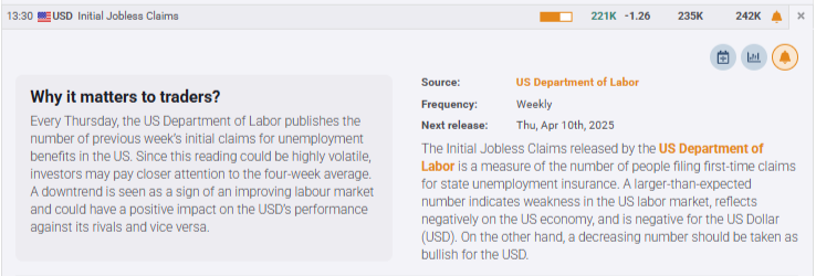
3. Initial Jobless Claims and Continuing Jobless Claims
What are they?
Initial Jobless Claims, released by the US Department of Labor, measures the number of people filing for first-time claims for state unemployment insurance. Continuing Jobless Claims, on the other hand, measure the number of individuals who are unemployed and are currently receiving these unemployment benefits.
Why are they important?
Experts seek out clues in the Initial Jobless Claims report because of its weekly frequency and because it reflects what is going on in the labor market. Moreover, it is viewed as a good coincident indicator based on actual reports from state agencies around the US. When looking at the Continuing Jobless Claims numbers – the weekly claims for unemployment insurance – it is important to know that not everyone who is jobless is entitled to unemployment benefits.
How to read them?
If the number of people filing for unemployment benefits increases on a sustained basis or is relatively high, it means a large number of people are losing their jobs and applying for unemployment compensation. In such a case, investors and traders will infer that the economy is struggling and the next Nonfarm Payrolls (NFP) release may come out weak.
Alternatively, a decline in Initial Jobless Claims is indicative of a healthy economy and future NFP releases should reflect health growth in employment levels.
Meanwhile, a rise in Continuing Jobless Claims has negative implications for the NFP, since it will affect consumer spending, which, in turn, discourages economic growth. Generally speaking, a high reading is seen as negative for the labor market while a low reading is seen as positive.
Both Initial Jobless Claims and Continuing Jobless Claims are generally analyzed as a four-week moving average in order to smooth the volatility that may happen week-to-week.

Where to find them?
On FXStreet’s Economic Calendar you can find both reports, each showing their dataseries on charts.
Revisions
The data is usually revised a week later, although the magnitude of these revisions is generally minor.
4. ISM Manufacturing and Services PMIs
What are they?
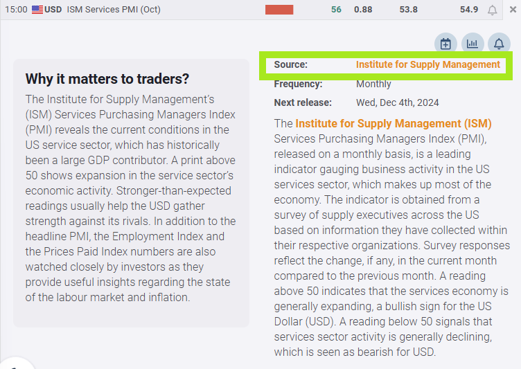
Released by the Institute for Supply Management (ISM) on the first and third business day after the reporting month, respectively, these indicators hint at business conditions in the US manufacturing and services sectors.
Why are they important?
These indicators are based on surveys done to supply chain managers. To compute these business activity indices, survey respondents are asked if they are experiencing higher or lower activity (or no change) for each of the 10 components of the indices, including employment. This component tells whether employment is experiencing an increase or decrease, as well as its rate of change compared with the previous month.
Some analysts suggest that the Manufacturing ISM has a closer relationship with Nonfarm payrolls (NFP), as jobs in this sector can be easier to measure. In contrast, it can be hard to measure jobs in the services sector due to the temporary nature of some of these jobs, remote working, etc.
However, you should consider the employment component of the Services PMI as more important than the Manufacturing one, simply because the services sector includes up to 70% of US total employment.
How to read them?
This information in both reports provides a window on business plans and what the monthly NFP number might reveal when it comes out for the reported month. Make sure you read the employment summary in the official reports to infer about the labor market conditions.
Expressed in percentage terms, a higher reading means the majority of respondents’ comments indicate optimism about business conditions and the overall economy, a case for a strong NFP.
Where to find them?
On FXStreet’s Economic Calendar, click on each report’s row, and you will find a link to the official source that will take you to the original report on the ISM website. Once there, scroll down for the employment data and commentaries further below.
Revisions
There are no revisions to the data, but there are yearly reassessments of seasonal adjustment factors.

5. University of Michigan Consumer Sentiment Index
What is it?
The Consumer Sentiment Index, released every month by the University of Michigan, is based on a survey of personal consumer confidence in economic activity. It queries between 900 and 1,000 adults.
Why is it important?
Many experts mention this survey more frequently than the Conference Board’s Consumer Confidence Index (explained below) for an early clue on the Nonfarm Payrolls (NFP) figure. Its popularity among analysts is partially because the data includes interviews conducted up to a day or two before the official release, making it a good real-time measure of consumer mood, but foremost because it gauges consumer attitudes on their finances and income.
How to read it?
Consumer exuberance can translate into greater spending and faster economic growth. Therefore, a positive correlation is expected to the NFP numbers. As such, a high reading anticipates a strong NFP, if aligned with all the other indicators.
But as with other sentiment tools, this one seems to be a better gauge when identifying the first signs of an exhausted economy rather than the beginning of a recovery after a depressed cycle. Behavioral finance studies explain this in terms of people being usually more sensitive to losing money than happy about gaining it. So make sure to contextualize the report in the overall business cycle.
The above chart shows the Actual data (blue line) for the past two years and the Consensus line (red dotted line) quite close.
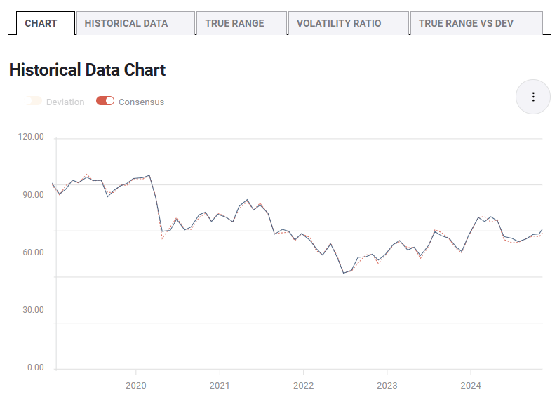
The above chart shows the Actual data (blue line) for the past two years and the Consensus line (red dotted line) quite close.
Where to find it?
The index figures are published twice a month, consisting of a preliminary release mid-month and a final report at the month’s end. Most details are reserved for subscribers. As for viewing historical charts, FXStreet’s Economic Calendar offers all you need.
Revisions
The revisions are part of the release structure: the preliminary numbers, out mid-month, are revised two weeks later.


6. Conference Board Consumer Confidence Index
What is it?
The US Consumer Confidence Index (CCI), released by The Conference Board, measures the degree of optimism on the state of the economy that consumers are expressing through their activities of savings and spending. The monthly index, based on an online sample, is conducted for The Conference Board by Toluna, a technology company that delivers real-time consumer insights and a panel of over 36 million consumers.
Why is it important?
The Conference Board questionnaires place more emphasis on households’ reactions to labor-market conditions than other surveys. But analysts also know that the labor market is slow in reacting to economic changes. In any case, you should add it to your Nonfarm Payrolls (NFP) checklist. Moreover, it includes specific questions about the labor market, both current conditions and the outlook.
How to read it?
A high level of consumer confidence stimulates economic expansion, while a low level can lead to an economic downturn.
The correlation is straightforward: an uptrend is the index is good for NFP prospects while a descending trend (or bad data) is a bearish omen for the next NFP.
Be advised: Since the Conference Board queries an entirely new group of people every month, the index shows more erratic behavior than the University of Michigan’s, which polls many of the same individuals every month. In any case, trends may develop, which makes up for a stronger case.
Where to find it?
The Conference Board is a subscription-based service, and unfortunately the data does not appear on FXStreet’s Economic Calendar anymore. But News pieces are published after the report which can be sought after under the News section of the website using the search topic “ConsumerConfidence”.
Revisions
Minor revisions can occur in the following month.
7. ADP Employment Report
What is it?
Automatic Data Processing Inc., a leading provider of payroll-related services in the US, in association with the Stanford Digital Economy Lab, releases a monthly estimate of private-sector employment in the US based on a sampling of real payroll data collected from around the country.
Why is it important?
Investors often consider the ADP report as the harbinger of Nonfarm Payrolls (NFP), because it is usually published just two days before the official BLS release. However, the existent correlation between the two is weak, and generally, when looking at individual months, the discrepancy can be substantial.
Another reason traders follow this report is the same as with the Employment Situation report: persistent vigorous growth in employment figures increases inflationary pressures and, with it, the likelihood that the Federal Reserve (Fed) will raise interest rates, a key factor for currencies.

How to read it?
A strong report indicates a lot of hiring in the private sector. If more people are working, household income rises and that fosters more consumer spending. Much of the focus Forex traders put in this report rests on what impact the estimates will have on US interest rates. A job growth of less than 100,000 a month tends to suggest that the economy is weakening.
Where to find it?
Published monthly, two days before the Bureau of Labor Statistics puts out the NFP, the data can be seen on FXStreet’s Economic Calendar. Past months’ data, consensus and actual releases are also shown.
Revisions
There can be revisions for the prior month, some of them substantial.
8. Job Opening and Labour Turnover Survey (JOLTS)
What is it?
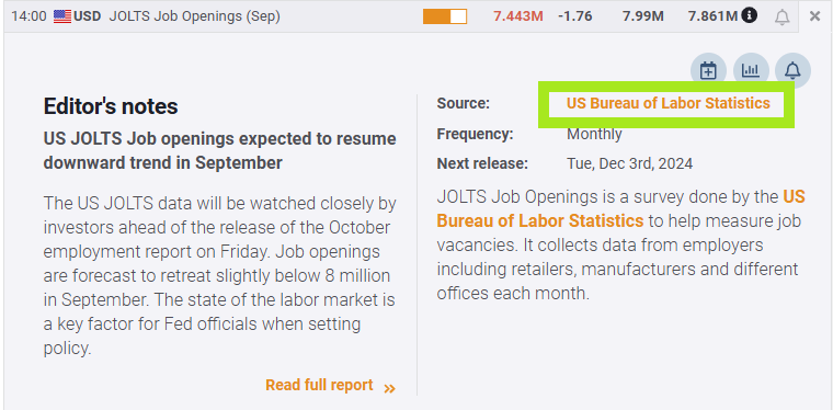
The Job Opening and Labour Turnover Survey (JOLTS) report publishes the total number of new hires and layoffs in the month, as well as how many job openings remained in that period. It gives a snapshot of the need for employees, or demand for labor, in different parts of the economy.
Why is it important?
The JOLTS provide a comprehensive picture of the churning that occurs in the workforce. By now you already know that the Nonfarm Payrolls (NFP) is the month-to-month change in the number of people on corporate and government payrolls, which is simply the net difference between the number of jobs created and the number of jobs eliminated.
But that figure doesn’t inform about the actual gross figure of positions filled and eliminated in the labor market. Traders therefore look for this report to get information about the total number of hires, job openings, and level of quits. It is supposedly one of the jobs reports Federal Reserve (Fed) officials pay the most attention to when deciding on monetary policy.
How to read it?
The Job Openings represent the number of jobs available on the last day of each month, made of positions that firms are actively recruiting from outside the company. Firms are highly sensitive to weaker demand for goods and services and manifest that by pulling back on job postings well in advance of an economic recession. An increase in Job Openings is therefore seen as positive for the next NFP release and vice versa.
Hires refers to the total number of positions filled in the same month. The pace of hiring is what traders and analysts look at. A slowing pace is seen as negative and vice versa.
A third piece of data is shown, Separations, which includes quits, layoffs and discharges, and other separations. There can be a lot of noise in this series and messages can also become contradictory. To better understand this component, we recommend visiting the original report which usually offers more information on the definition level as well as corroborating the data with other economic indicators with the help of FXStreet coverage.
Having said that, the JOLTS report is backward-looking as the release looks back at the last business day of the prior month. For example, if the upcoming NFP data is, let’s say, for October, the latest JOLTS data will refer to September.
Where to find it?
Published monthly, about five to six weeks after the reference month by the Bureau of Labor Statistics, the Job Openings component can be seen on FXStreet’s Economic Calendar. Past months’ data, consensus, and actual releases are also shown. A link to the original report is also provided.
Revisions
With each release, revisions are made to the previous month.
Apart from the above-mentioned data, there could be other leading indicators such as home sales, construction spending, and auto sales, all of which can provide hints if people are being hired. But we will leave this in your hands to explore further.
At this stage, you already have your checklist of Nonfarm Payrolls (NFP) leading indicators. First, you have to ask if they are unanimous in their outcomes, that is, if the majority of indicators point to a stronger or a weaker NFP reading.
Second, you want to know how many of them line up with NFP expectations, the so-called consensus numbers. If expectations do not differ too much from your own estimation, perhaps there is less chance the actual figure will surprise the market and consequently trigger any big move in the main Forex pairs.
Third, make an assessment if prices are showing the expectations being already discounted. In such a case, you could see a so-called “buy the rumor, sell the news” effect.
Now that you have spotted consistent patterns among the several leading indicators, you are prepared to take trades before the release.
The next block will be about trading the reactions to the actual release.
B. What to do AFTER the NFP release?
Now that you know whether the risk of the next NFP release is to the downside or upside, especially if leading indicators are consistent with a weaker or stronger NFP, you need another checklist to interpret the actual data and some of the subcomponents of the Employment Situation report.
Judging the total number of sub-component releases up against each other is the critical part in terms of trading the outcome. When doing so, there are several additional considerations to be taken into account.
One is that during uncertain times, the changes to the NFP figures are more important than either of the other data points. This is especially the case during periods of high unemployment. A big surprise element in this release will therefore have a substantial impact in markets.
When unemployment is low (a 4% unemployment rate in the US is by most economists seen to be close to no unemployment at all), the NFP releases tend to have less influence. Attention then shifts towards Average Hourly Earnings (and possibly Average Hourly Week), as this number is important to inflation and therefore an interest-rate sensitive number.
Other considerations have to do with market conditions, which we will explain further below. To start with, here's your “after-the-event” checklist:
1. Deviation between actual and consensus
The first figure that comes to anyone's mind during release time is the changes to the NFP number and the first reaction in the market (over the first seconds) is always a consequence of the surprise element in this figure. This surprise element is the difference between the actual number and the consensus estimate.
An NFP release that is stronger than the consensus indicates that the labor market is stronger than what markets expected, and the US Dollar often rises as a result. Alternatively, if the actual report is below the consensus, the US Dollar often depreciates against other currencies.
In any case, you should look for shocks or surprises between both numbers. However, this rule is not absolute, and we also need to keep in mind any changes to the previous release’s data (one month earlier). Be aware that significant improvements are expected when the previous release has been very weak, and vice versa.
The initial reaction can be extended, muted or even corrected, which is a consequence of the few seconds it takes for traders to absorb what the other figures are telling – and whether they are supporting or contradicting what the NFP release said.
It takes a few seconds to absorb and digest the overall impact from the NFP release, revisions of earlier NFP releases, the Unemployment Rate, the Participation Rate, and Average Hourly Earnings (possibly also Average Working Hours).
What would be considered a surprise?
FXStreet has come up with a handy tool to give you an objective answer to that question. The deviation information is published at the same time the data is released. This proprietary indicator shows the ratio between the difference of consensus and the actual numbers, and the standard deviation of this difference for the previous five events. Should several consecutive “surprises” occur, each new one will show a lower deviation number: the market will be already used to surprises and have them discounted in the prices. Typically, a number above +3 (or below -3) would be considered a market-moving deviation.

Besides the deviation calculation, we publish tons of material dedicated to the NFP release which will help you gauge what would be considered a surprise. An NFP editorial can be found under the Economic Calendar section of the website.
In case of a deviation, will it be sufficient to move the USD?
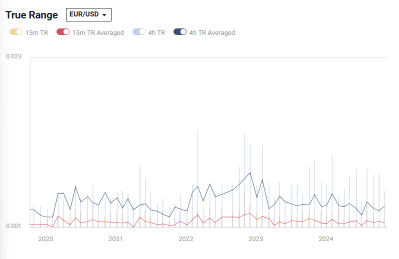
This is a more tricky question that we have tried to answer with another market-impact study. Switch the tab by clicking on “True Range” and the chart will show how much each release moved each of the five currency pairs available. The True Range chart shows the volatility of a currency pair in terms of pip variation 15 minutes and 4 hours after the data release. The amount of pips is indicative of the potential the release has to move the markets again in the future.
A declining average of the True Range shows that the NFP report, while still being one of the most important economic indicators, is losing force as a market-moving event. The opposite occurs if the average increases.
2. Revisions of the NFP change
Pay close attention to the revised number from the previous month because revisions are common and can trigger market movements. The market often trades that new information instead of the actual number, especially if the current month did not deviate from the consensus data.
What to do when successive revisions happen?
It is worth taking revisions into account when calculating the number of jobs created in a larger period of time. This can make a difference when calculating the average or calculating a total sum based on the previously reported numbers without the revisions. The revised numbers are marked with a special icon on FXStreet’s calendar at the moment the data is published.

3. Unemployment Rate
Unemployment numbers are often mentioned by analysts. The forward-looking merit of indicators such as the unemployment rate resides in the ability to act as an early sign of an economic downturn: as soon as executives detect signs of a softening in business activity, they respond fast with layoffs, sometimes months before the economy begins to sink. But there are some caveats with this number.
The Employment Situation report is divided into two main parts: the Household Survey, which produces the Unemployment Rate, and the Establishment Survey, which generates the payroll numbers shown on most economic calendars.
As the name suggests, the Establishment Survey is based on employer reporting. The Household Survey, on the other hand, is a survey conducted by the BLS that measures unemployment and many other factors.
If you work one hour, for example, you are employed for the purpose of the Household survey and thus for the calculation of the Unemployment Rate. The same is true if you work in three part-time jobs, 12 hours each, the BLS considers you a full-time employee.
If you don’t have a job and have failed to look for one in the prior month, you are not considered unemployed, but rather you are considered to have dropped out of the labor force. You need an actual interview or to have sent out a resume to count as “looking for a job”.
These distortions artificially lower the unemployment rate, boosting full-time employment and thus contributing positively to the payroll jobs report every month because of the potential for double-counting jobs in the payroll survey.
To get a more realistic picture of what the Unemployment Rate is, you have to count all the people who want a job but gave up, all the people with part-time jobs who want a full-time job, all the people who dropped off the unemployment rolls because their unemployment benefits ran out, etc.
The BLS calculates this number. You can find it in the last row labeled U-6 and is often referred to as the underemployment rate. It is usually much higher than the more commonly quoted U-3 unemployment rate. In fact, both numbers would be higher still, were it not for millions of people dropping out of the labor force over the past few years. Some of those are absent because they have retired. The rest are due to forced retirement, discouraged workers, and young people moving back home because they cannot find a job.
4. Labor Force Participation Rate
The participation rate, also released by the BLS, is the percentage of the total number of people of labor-force age who are either working or looking for a job.
A decline in Labor Participation is seen as negative because it means fewer people are looking for a job. When the Unemployment Rate drops because of a reduction in the Labor Force, it is not a good economic signal either. The good signal is when the unemployment rate drops and the Labor Force Participation Rate rises.
The Unemployment Rate may also tick lower driven by a retreat in the Labor Force Participation rate. In other words, the decline in unemployment can be caused by fewer US citizens looking for work rather than a big increase in the number of US citizens with jobs.
So, a drop in unemployment can partly be attributed to a decline in the Labor Force Participation Rate. In a recessionary environment, for instance, a sudden drop in the Participation Rate is critically assessed because workers may get discouraged after trying to secure employment for a long time, and they may decide to drop out of the workforce. This would make the Participation Rate fall, as these people are then classified as not actively seeking employment.
The data can be seen on FXStreet's Economic Calendar.
5. Average Hourly Earnings (MoM)
We have been showing you there are some nuggets of information in the official Nonfarm Payrolls (NFP) release that can provide useful insights for the whole set of labor-market-related data. Average Hourly Earnings, also released by the US Department of Labor, is a significant indicator of labor cost inflation and of the tightness of labor markets.
Included in the NFP report, the indicator estimates the growth in average (weekly) earnings of all nonfarm employees.
The interpretation is straightforward: If worker incomes rise, it bodes well for future spending, since wages and salaries from employment make up the main source of household income. The Federal Reserve (Fed) pays close attention to this data when setting interest rates, because of its strong correlation to inflation. People won’t spend if they don’t make enough to do so. Poor wages are a drag on inflation, while strong wage growth is a sign that inflation may start to accelerate.
The data can be seen on FXStreet’s Economic Calendar, as well as past months’ data, consensus and actual releases.
6. Average Weekly Hours
The Average Weekly Hours is a compilation of the average number of hours worked per week (including overtime) by all employees of private business concerns (except those in the agricultural sector). Overtime hours are an excellent indicator of future employment trends. When overtime increases are sustained for several months, companies will be pressured to hire new employees.
Therefore, this report can be seen as a precursor of new hiring or an early indication that employers are preparing to boost their payrolls. Still, if it occurs in the later stages of economic expansion, it may be seen as a sign that employers are finding it hard to get qualified applicants for open positions.
The reason why this indicator is used is that in the US, unlike in many other countries, the workweek is not fixed. Employees can work any number of hours per week (including overtime).
7. Number of Participants and Dispersion Figures
This data is of minor importance and few analysts do mention them. In order to calculate the Consensus numbers for the NFP (or many other reports for that matter), analysts are surveyed about their forecasts for that particular release. It is only accessible if you have access to a Reuters or Bloomberg terminal. A lot of dispersion among economists means poll participants have no clear estimates based on their models. The higher the number of participants, the better.
9. Difficulties to trade the NFP release
When preparing to trade the Nonfarm Payrolls (NFP) release, there are some difficulties when trading through broker platforms. We constantly hear about prices not being accessible (flashing yellow prices more than green and red) for seconds after the release. This is simply due to the lack of interest liquidity providers have to supply broker platforms with prices during the heated seconds after the release. This is because liquidity providers give priority to their own volume clients and care less about retail traders in these critical seconds.
Retail traders are therefore often left with a gap move from the release price before they can enter a trade. Instead of trying to hit prices over the first seconds and experiencing these difficulties in obtaining tradeable prices, one way could be to cover your interest in the form of preset orders. There is an additional risk element of doing so, but it is also a higher probability of having executions done.
The divergence between target spreads – those listed by brokers – and the actual spreads applied during a high volatility event as the Nonfarm Payrolls release can be substantial. During these minutes, spreads first fall and recover slowly afterward as the market calms down. Usually, spreads get wider right before the economic event, they skyrocket right after the announcement and then they consolidate after a couple of minutes at a slightly higher level.
How particular brokers handle economic events is something you should verify. Even if you get a competitive quote from your broker, it doesn't mean you will get a competitive fill price. Slippage due to low liquidity or latency is frequent, especially around such events.
Most Forex brokers now use Non-Dealing Desk and ECN business models. They are not market makers. This means you receive the retail market price for your trades.
During high-volatility situations, the market is either very thin or has a glut of orders to be processed. In either case, the bid-ask spread can widen, sometimes as dramatically as 25 pips. It is not your broker's fault, just the market price at that moment. If you had placed your stop 20 pips away, you would have been stopped out of an otherwise potentially profitable trade.
The battle for positioning heading into the figure can cause skewed trading conditions even in the days leading up to the release. Participants looking to establish positions pre-release can cause unexpected directional flows in a currency pair.
For example, if markets are expecting a strong number, we could see people trying to sell EUR/USD ahead of the release as they would expect the US Dollar to strengthen against the Euro. The volume of this positioning is key. If we see large institutional players positioning, this tends to have a bigger effect on the currency pair than if we are seeing smaller speculative players positioning. The actual size of the positioning is also important: if institutional players are positioning with reduced size, it will have less of an impact than if we see them positioning with greater size.
For all these reasons – whipsaws, wide spreads, and slippage – it is not advisable to use an options-style trading strategy by placing market orders above and below the current price just before the release of the Nonfarm Payrolls (NFP) report. It is generally done with a One-Cancels-Other (OCO) so that if one order is triggered, then your position is entered into the market and the other order is canceled. The goal of this strategy is to get into the trade immediately after the news and in the direction of the initial move of the market. But the mentioned potential dangers make this strategy a risky proposition.