How To Read A Bitcoin Price Chart

Keeping track of the price of bitcoin and its general direction can help inform you of when to buy, hold or sell. Since reading bitcoin price charts can be often daunting for beginners, we put together a guide to help.
-
Measuring the price of bitcoin
-
Types of bitcoin price charts
-
How to read a bitcoin price chart
-
Predicting bitcoin price trends
Though the value of bitcoin should derive from its overall adoption and use, prices don’t always reflect this. As with all tradable assets, bitcoin’s price is strongly influenced by external factors such as public sentiment, supply and demand, and sheer speculation.
Like with all currencies, there is no single price for bitcoin at any given time. Different markets trade at different rates, depending on the fees involved, available volume and even the whims of massive individual investors (otherwise known as whales).
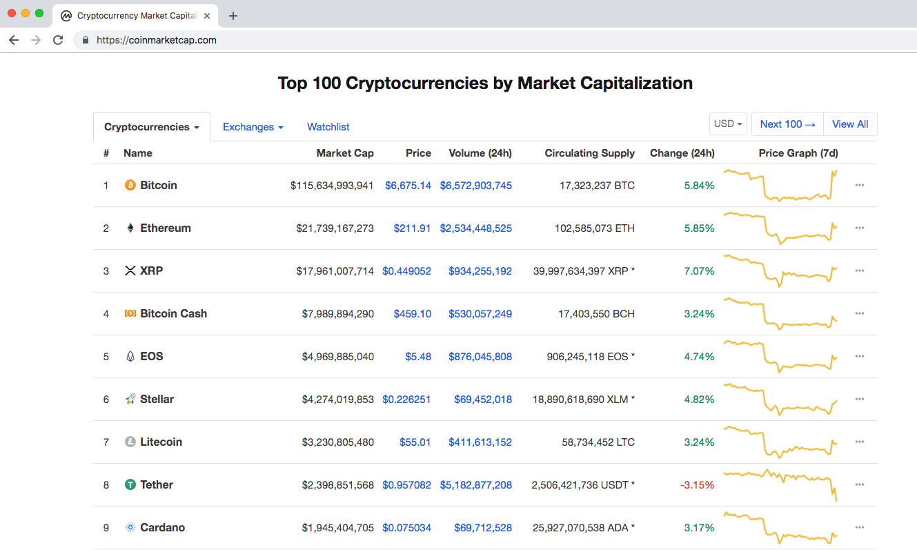
Cryptocurrency prices in Coinmarketcap’s homepage
Even if in the long run prices tend to converge, you should expect them to deviate from this average - sometimes considerably - depending on where you look. Each exchange keeps its own books, and individual sellers are free to set their prices, as are buyers to accept or refuse them.
Amidst this chaos, however, there are powerful tools to help participants keep track of average prices in the cryptocurrency market: price charts. In this article, we outline the two most common types of charts, as well as the most popular platforms that offer them.
To learn how to buy your first bitcoin, check out our tutorial here!
Types of bitcoin charts
The two main types of bitcoin charts reflect the level of detail that the user wants. Some users are looking for simple and easily digested representation of bitcoin price movement.
Those with a vested interest, such as traders and early adopters understandably, require a comprehensive way of interpreting the change in bitcoin's price, its fundamental influences, and general market direction.
Simple price charts
The simple line bitcoin price chart should be very familiar from school days plotting data on two axes. It displays the price on the vertical Y-axis - Euro, Dollar etc - over time on the horizontal X-axis which can be viewed by day, week, month or hour depending on how granular you want to get.
A simple line chart will default to a linear scale giving equal weight to price change across the entire scale. This is a good way of broadly gauging prices.
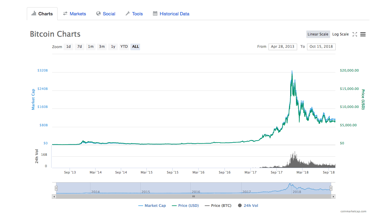
Bitcoin-US Dollar historical prices on Coinmarketcap
The most popular and widespread provider of these simple charts is Coinmarketcap, who has grown to become the de facto index for cryptocurrencies. It offers price averages for most noteworthy tradable coins and tokens, and it is regarded by some as the closest one can get to an “official” price.
These graphs are great for a quick reference, but they lack in detail and don’t quite reflect the (sometimes huge) price disparity throughout marketplaces. Alternatively, some aggregators like Coinwarz offer plotted graphs with prices broken down by exchange.
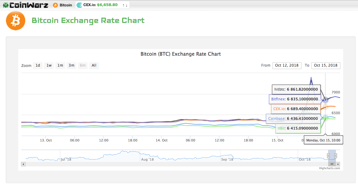
Prices broken down by exchange on Coinwarz
However, linear scales can obscure the significance of change. Is, for example, an increase from $10 to $100 - where price increases by a factor of 10 - as significant as an increase from $100 to $200 - a mere doubling?
The use of Logarithmic price scale addresses that issue. The log chart is plotted so that prices in the scale are not positioned equidistantly, but rather in a way that two equal percent changes are plotted at the same vertical distance on the scale.
Some simple price charts - such as those used at Coinmarketcap - will plot lines for both BTC and USD values and add a secondary X-axis for market capitalization, essentially the value of all coins in circulation for the given currency given the current price.
While the simple price chart is straightforward and easier to understand it represents an average of price for the time scale chosen, and usually doesn’t take into account the crucial influence of volume.
CMC provides separate volume bar charts but for those that want much more detail about what the average is hiding, the Candlestick Chart - combining a more complex representation of price along with volume - is much more appropriate.
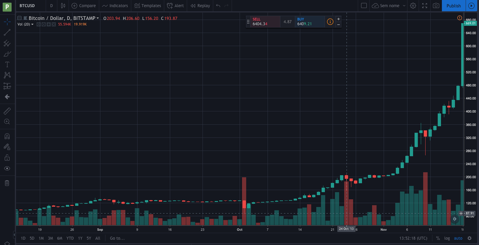
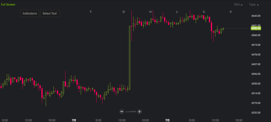
Bitcoin Candlestick charts explained
A bitcoin Candlestick Chart is so-called because the individual data plot points of a simple chart are replaced by a candlestick shape vertical rectangle with a wick at the top and bottom.
This is a realm where Tradingview reigns supreme, providing investors - and even some major cryptocurrency exchanges, like Bitfinex and Bitstamp - with high levels of detail and customization.
You can even go back to find historical price movements from each of these exchanges.
Maybe you should have chosen a bitcoin for your birthday
To make it easier to discern price trajectory, rising and falling prices within a candlestick period are differentiated by colour. Green indicates that the price rose within the period range, while red indicates a price fell.
The candlestick components unpack a simple closing price value for a given period telling you the following, as represented by the letters and numbers on the top left corner:
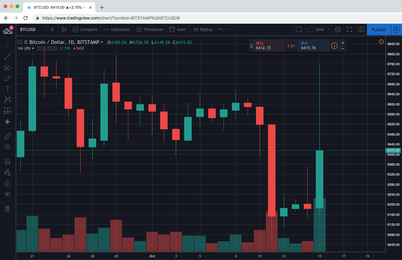
O: Opening price; H: Highest price; L: Lowest price; C: Closing price
The Opening Price
The opening price for a time period will be the bottom of the candle body if the price rose within that period, and the top if the price fell.
Highest Price
The highest price reached within the chosen time period will be indicated by the highest point of the top wick.
Lowest Price
The lowest price reached within the chosen time period will be indicated by the lowest point of the bottom wick.
The Closing Price
This is simply the inverse of opening price. If the price rises within a time period the closing price will be the top part of the candle body if the price fell it will be represented by the bottom part.
Looking across a range of time and the dominance of one colour over another reveals the direction the price moved during the period, which is also discernible from a basic price chart, but the additional elements provide context showing you the extremes to which price moved which provide clues to volatility.
Longer candles show greater change from one period to the next, while longer wicks show greater change within a period.
Combining candles with volume
As much as candlestick charts provide better context to bitcoin price change, you cannot seriously understand price movement without combining it with a measure of volume traded.
On Tradingview, by hovering your cursor on a candle the Opening (O), Closing (C), High (H) and Low (L) are returned along with the Volume (V). The basic candlestick chart is just the tip of the iceberg in terms of analysis; you can choose a Volume bar chart from the ‘Indicator’ drop-down menu to actually plot traded Volumes.
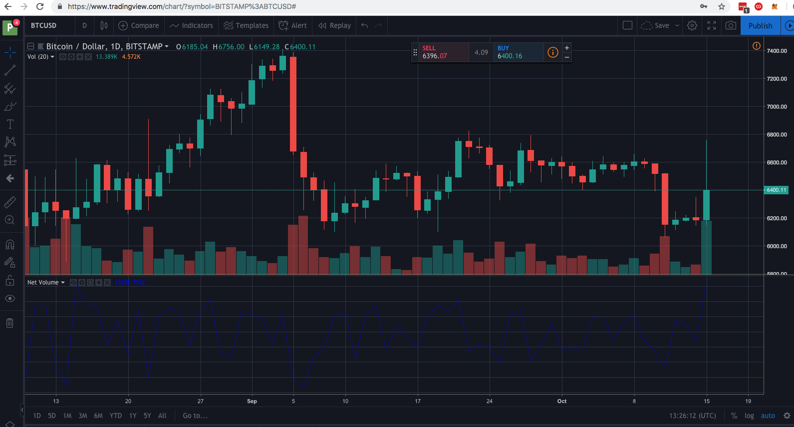
Volume is displayed at the bottom of the chart
A falling bitcoin price on the back of the relatively low volume is less bearish (indicative of long-term downward change) than falling price with high volume. For this reason, candlestick charts are generally accompanied by a bar chart of volume which tell the real story of what is moving price.
The crucial importance of volume
Volume is the most fundamental indicator of price direction but is just one of an array of technical analytical methods that are useful in trying to figure out where price will go next. The most common include:
Resistance & Support Levels
When the market is experiencing strong downward or upward pressure there will be a price point which checks the momentum. This is often a number of psychology weight such as $10,000. For the rising price that is called the Resistance Line (aka ceiling) and falling prices tend to check at the Support Line (aka floor).
Moving Averages
Another commonly used technical analysis is the moving average, literally an updated average price for a given period e.g 50 day MA. These can provide useful insight when varying ranges are combined, so the 50 day MA crossing above the 200 MA is indicative of upward momentum and the reverse is perceived very negatively - known as the Death Cross.
In just the space of a few hundred words, you should hopefully have got to grips with how to read a simple bitcoin price chart. Though they provide an easy way to see the direction of price, to understand the context of change you need the broader range of data-points that a candlestick chart provides.
Even then, you are just taking the first step into the fascinating world of technical analysis. Volume, resistance, support levels, and moving averages are just the tip of the iceberg when it comes to discerning why the price of bitcoin is moving and what might happen next.
Now, after amassing some serious profits from your newfound trading skills, you can win twice by diving into another kind of chart on Cloudbet’s Sportsbook, or take your coins for a spin in our Live Casino.
Author

Mirio Mella
Cloudbet
With ten years experience authoring articles around betting strategy and psychology, I know use my interest in bitcoin and cryptocurrency to inform my work in prediction markets and behavioural economics.