How to get close to your neighbours

S2N spotlight
Let's face it, if you are on speaking terms with your neighbours, you are doing well. Today I will teach you a trick on how to know if you are a good match for your neighbour. Its a bit technical, so this might not be everyone's cup of tea. Tomorrow I will try and keep it lighter.
When you build a portfolio, it is common to group a bunch of similar symbols into a category for a fixed allocation. For example, the classic 60% stocks and 40% bonds portfolio. You will either use 1 stock and 1 bond in the 60:40 ratio, or you might use a group of similar stocks and bonds to get a little bit of diversification within a category allocation.
The ETF symbols in my example are:
Stocks
-
"SPY", Broad US market /large-cap.
-
"QQQ", Tech/Growth tilt.
-
"VTI", Total US market.
Bonds
-
"BND", Broad bond market
-
"AGG", Aggregate bond market.
-
"TIP", Inflation Protection bonds.
-
"LQD", Investment-grade corporate bonds.
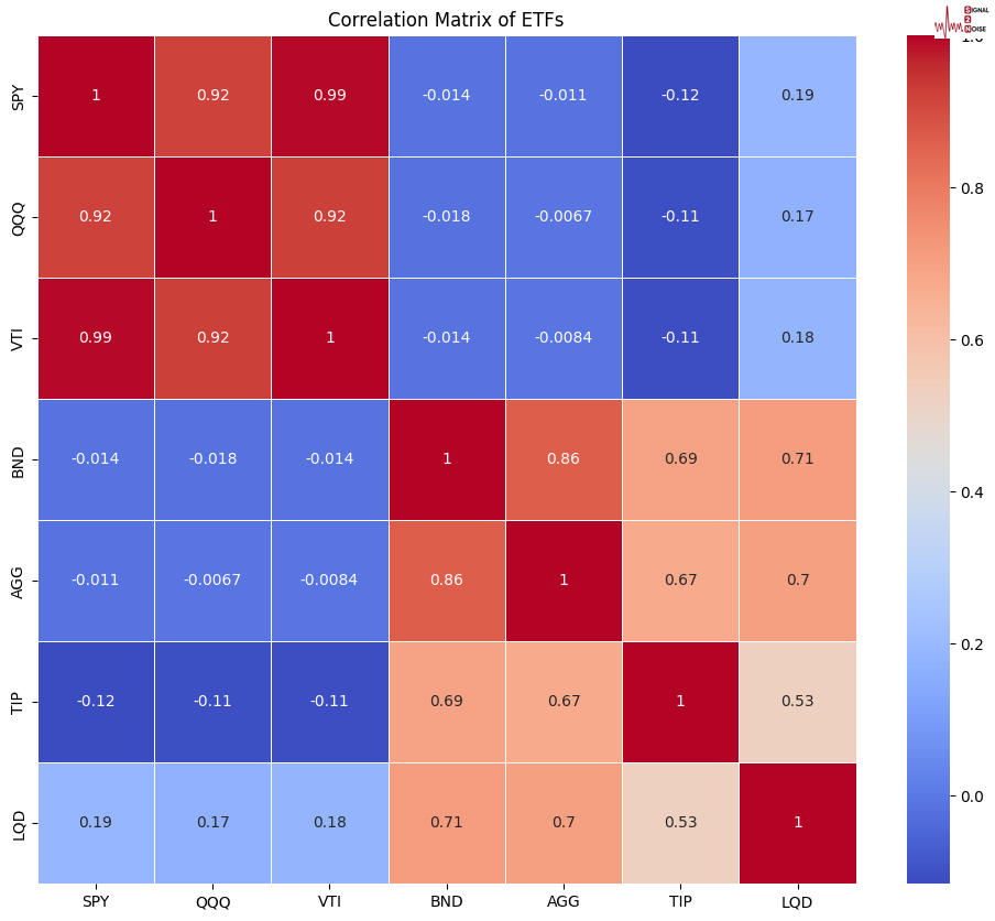
The old-fashioned quant way would be to use a classic correlation matrix to do the grouping. Like you see below.
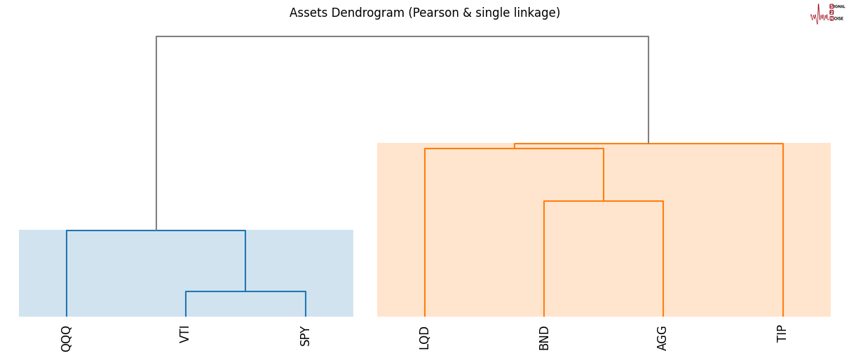
However, if you want to play with the big boys, you need to move with the times. There is a more sophisticated approach called a dendogram cluster that falls within a cool statistical framework called, Hierarchical Clustering.
I am keeping it as basic as I can, hence a single linkage. Do not worry about what that means; lets focus on what the plot is showing us. If you have been wondering what the reference to neighbours was, you are about to find out, and it is corny. I am blushing. If you have worked with machine learning (AI ), there is an iterative process of looking for your nearest neighbours. I did warn you it was corny.
If you look below, you can see visually, without me whispering in the machine's ear, how to group the symbols; it does a pretty neat job. The stocks are grouped in light blue and the bonds in orange. The height of the vertical lines and the colour clusters are very important; the shorter they are, the closer they are in relationship. In the plot below, the 3 stock ETFs are more closely related than the 4 bond ETFs.
The takeaway is that the dendrogram can sometimes reveal more nuanced relationships to traditional correlations by considering the overall structure of the data.
S2N observations
The benefits of a tariff are visible. Union workers can see they are “protected”. The harm which a tariff does is invisible. It’s spread widely. There are people that don’t have jobs because of tariffs but they don’t know it. –Milton Friedman
President Trump announced a 25% tariff on steel, with details to follow today. We are only getting started with tariffs. This is going to get incredibly messy. Tariffs provide amazing bargaining power, but I remain convinced the net effect is bad for the global economy, the US included.
This weekend, a well-known market strategist made the same meaningless comment another highly paid analyst made last week. Howard Silverblatt, senior index analyst at S&P Dow Jones Indices, said last week. "Since 1928, when the S&P 500 has had a positive return in January, there is an 80% chance it will be up for the year."
Don't get excited since 1928; the S&P 500 has had positive full-year returns in 71 of 97 years, or 73% of the time. I really wouldn't read too much into Howies "January Effect" indicator.
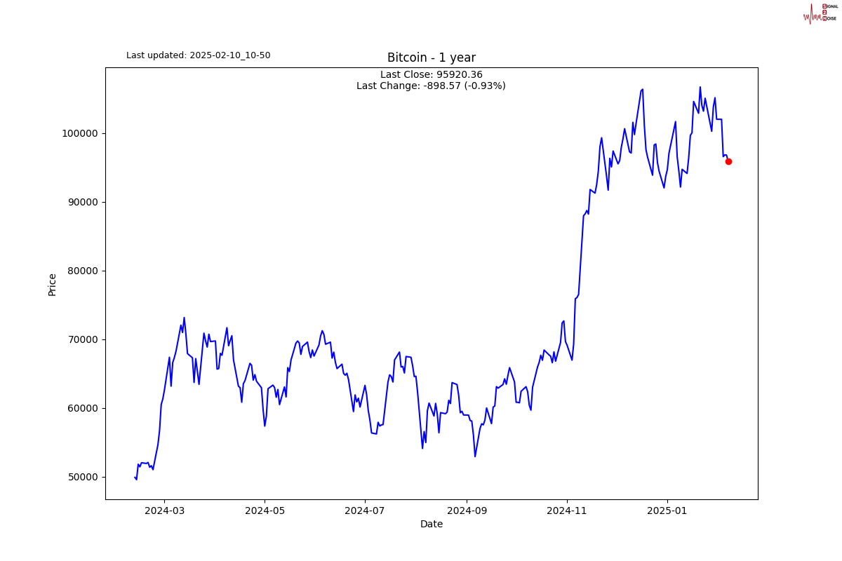
I bet you if you asked the average person in the street how they thought crypto was doing since the Covid heddy days, when you could buy a digital ape for a few million bucks, or when Sam Bankman-Fried bought a SuperBowl ad for $13 million, they would say crypto is killing it.
Easy Tiger, the S&P Crypto index, excluding the megacaps, is down 64% since 2021.
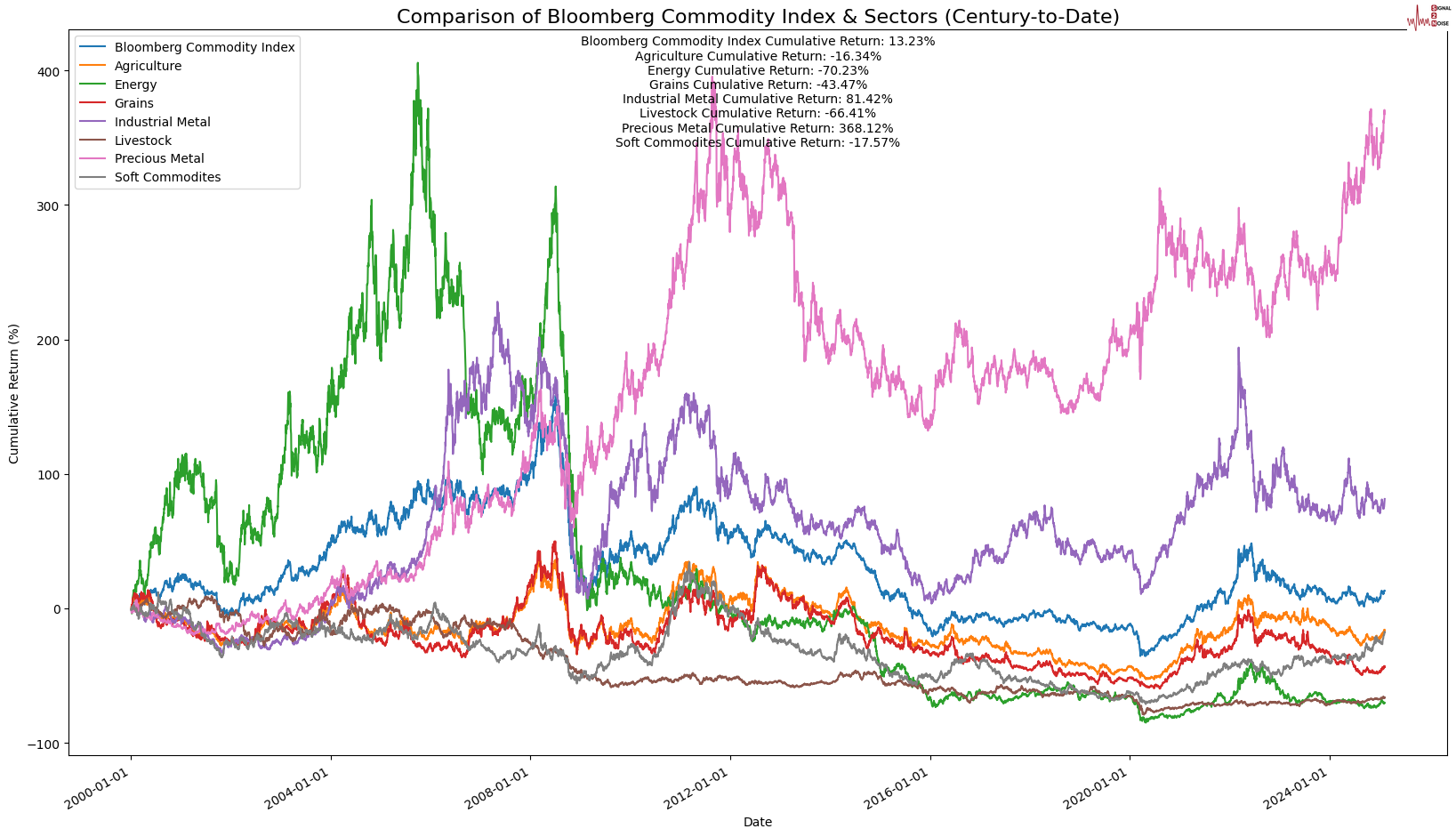
Trying to redeem myself with something easier to chew on, especially since many of you will be suffering from a SuperBowl hangover. Here is a breakdown of the commodity index since the turn of the century. Precious metals killing it. Energy is getting killed.
S2N Screener Alerts
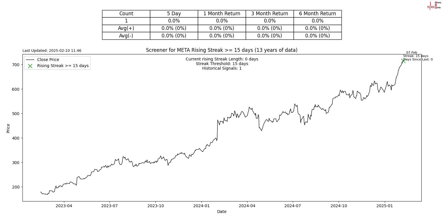
Can you believe 15 days after Mark Zuckerberg looked down Jeff Bezos girlfriend's shirt, his stock is still rising? A 15-day resurrection is META's all-time record.
Performance review
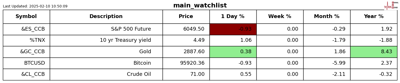
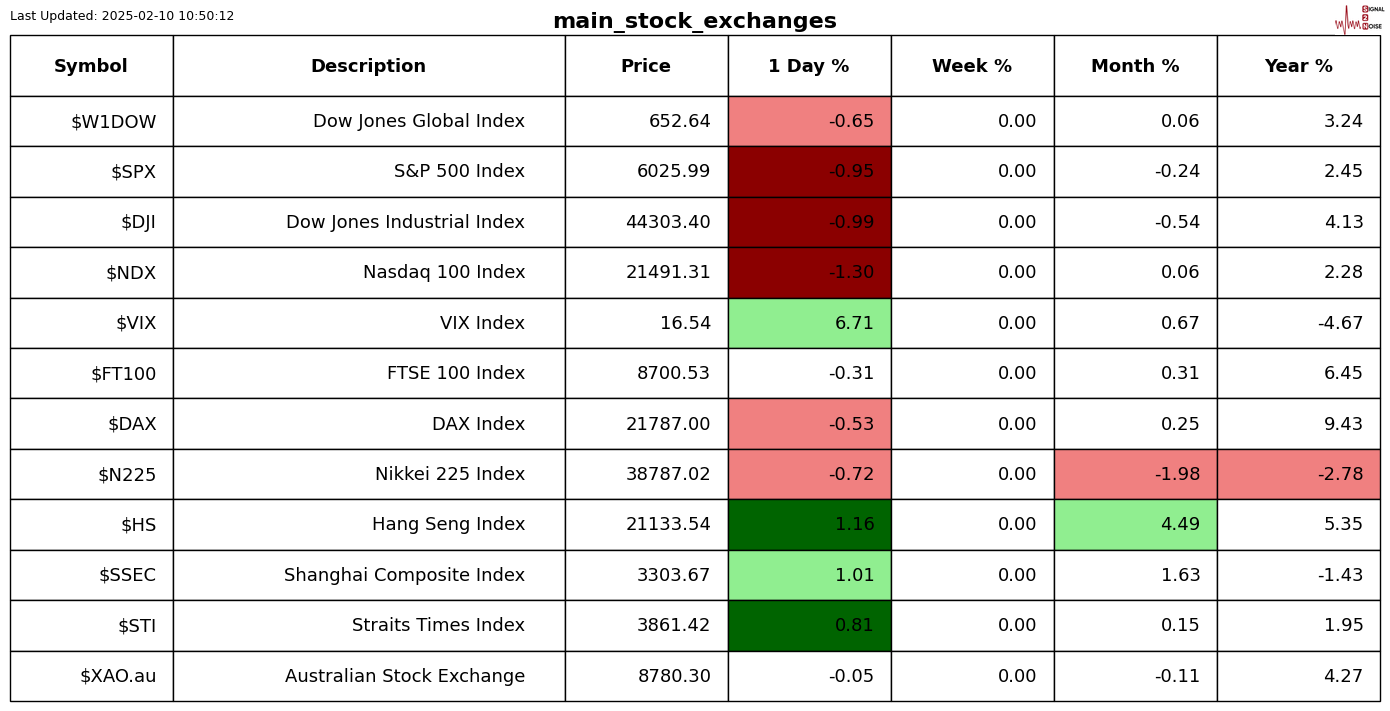
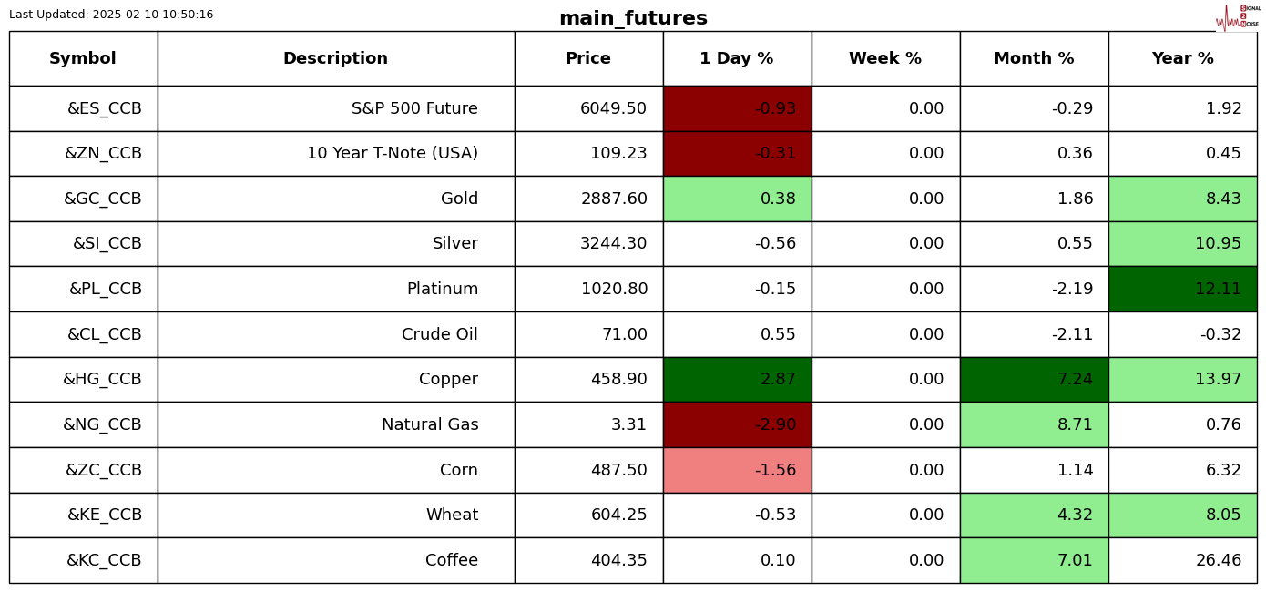
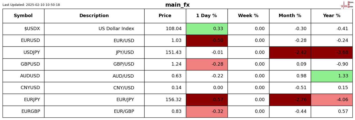
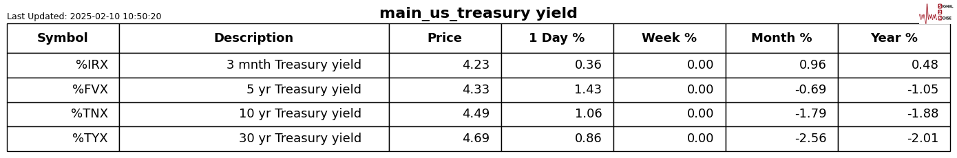
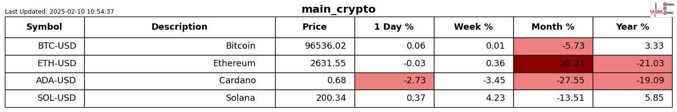
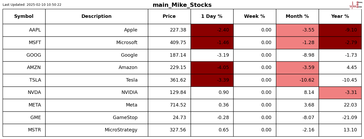
For those who are new to the letter, the shading is Z-Score adjusted so that only moves bigger than usual for the symbol are highlighted.
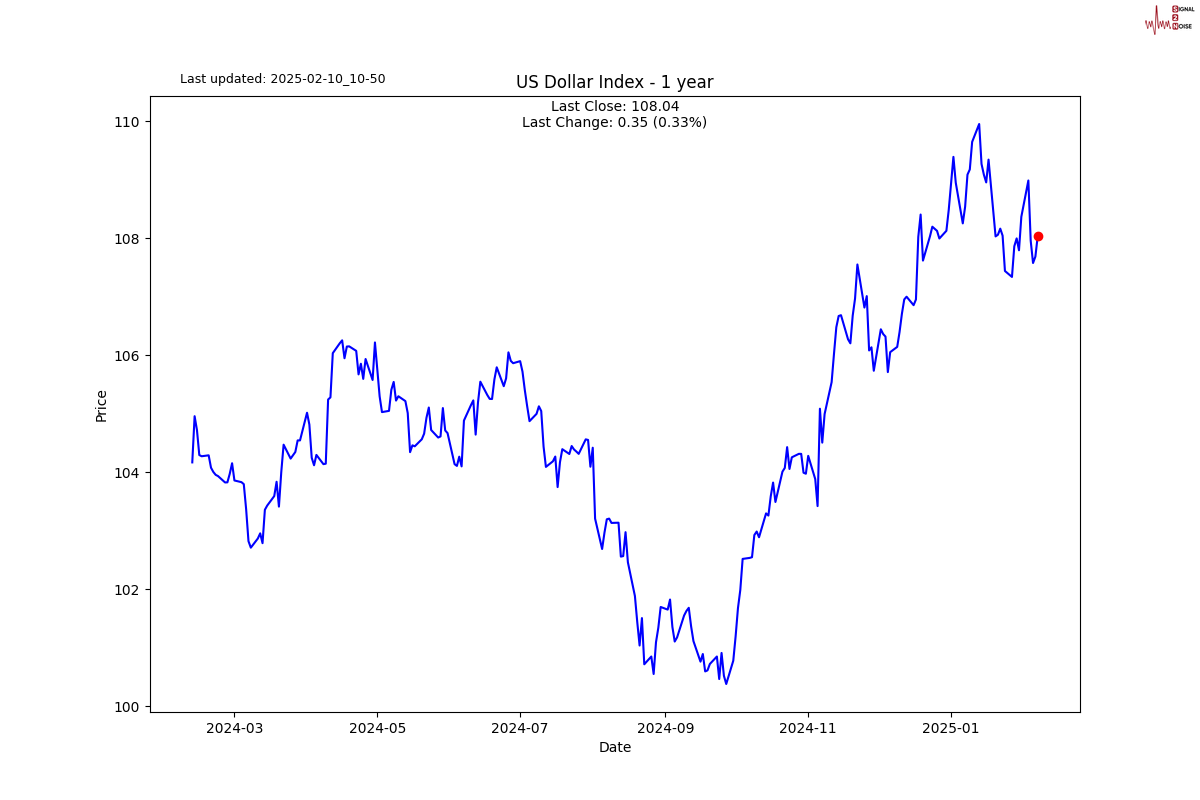
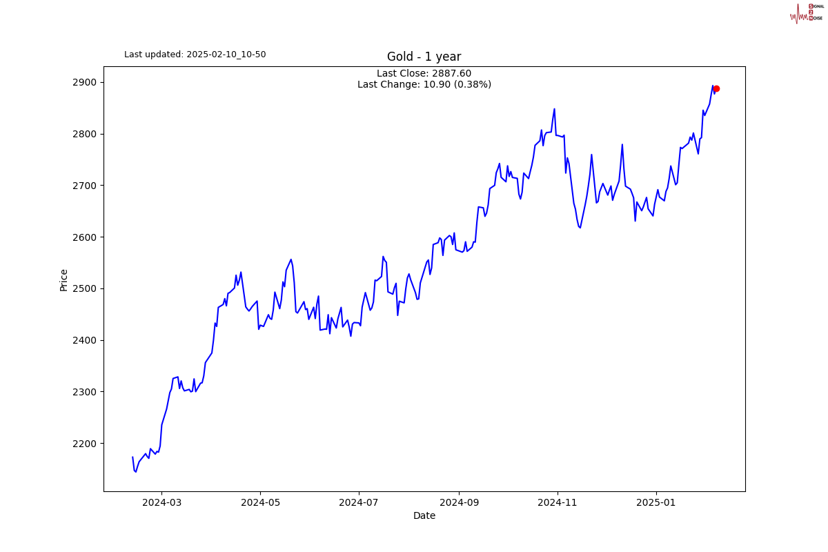
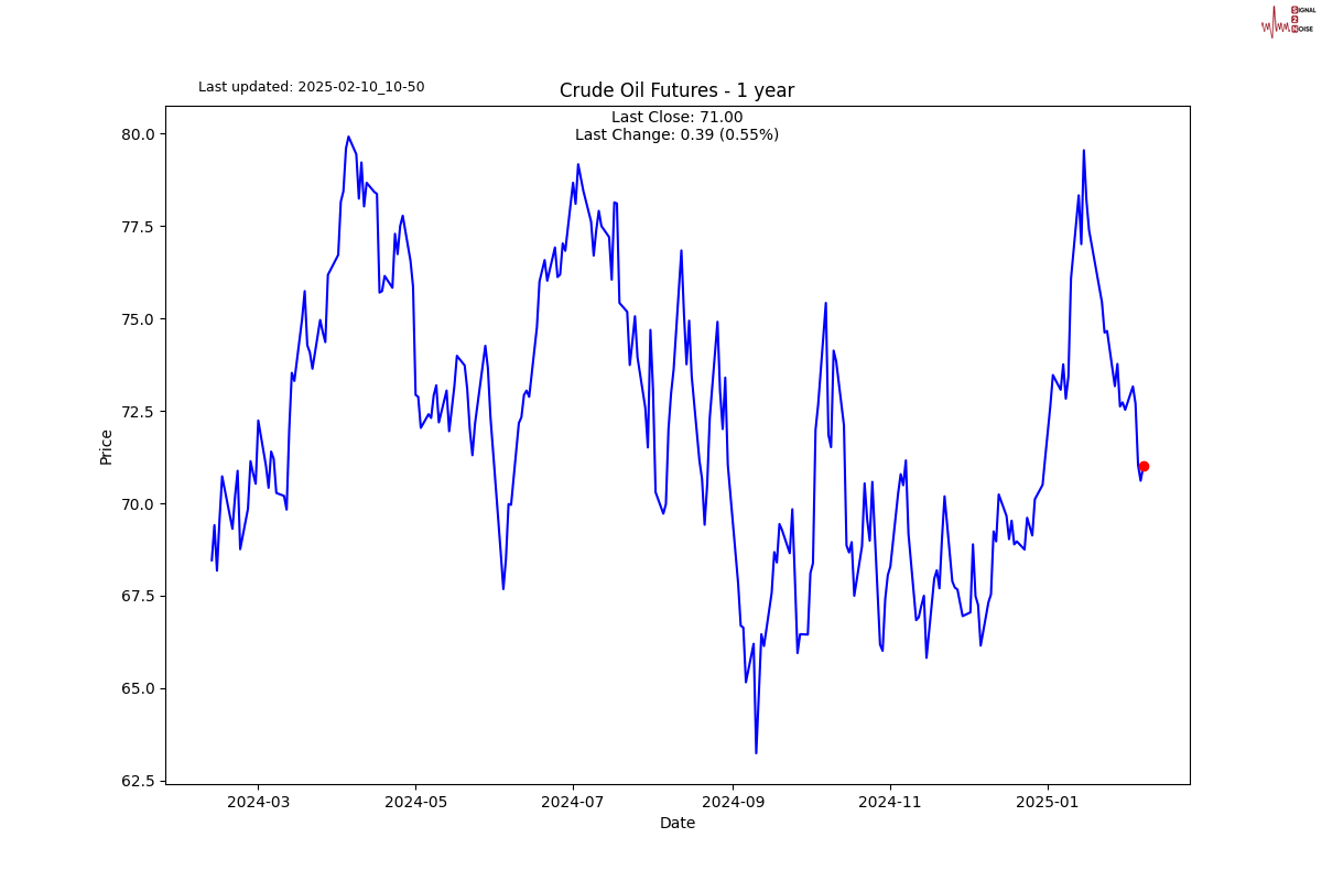
Chart gallery

News today
Author

Michael Berman, PhD
Signal2Noise (S2N) News
Michael has decades of experience as a professional trader, hedge fund manager and incubator of emerging traders.


