Is The Bull Market Over?

Point and Figure overview of SPX
Long term trend: It’s time to consider the possibility that the coronavirus pandemic could bring an end to the bull market. This would become even more likely if the current correction extended below the October 2018 bottom of 2346.
Intermediate trend: Intermediate target minimum: 2620 with potential to 2360. (no change)
Important (known) cycles
I follow only a few reliable cycles in my analysis. This is complemented by the analysis of Erik Hadik (www.insiidetrack.com).
The 80-d cycle is due on 4/7-6/8; 40-wk 7/14; 9-yr ~7/14.
Market Analysis (Charts courtesy of QCharts)
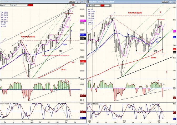
SPX-IWM weekly charts:
If IWM truly leads the stock market on the downside – and there is much evidence that it does – then this “correction” is not over. The weekly charts below show that IWM displayed considerable relative weakness to SPX at the recent top, and that it is now expanding this weakness to last week’s low which is already starting to penetrate the lower level of the large congestion pattern that was formed between January and October,while SPX has only penetrated it partially. That, and the position of the weekly oscillators suggests that more weakness should be expected in the weeks ahead.
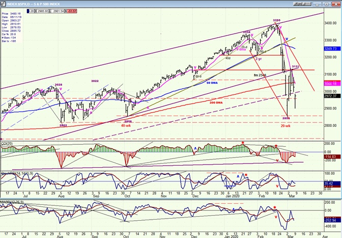
SPX daily chart
There is now enough data to estimate the path which the intermediate correction is taking. This is drawn on the chart as a steep bearish channel. As of Friday’s close, there was no sign that we have seen the end of thedecline of the past three-weekswhich retraced ~50%(537points) of the 62-week, 1047-point uptrend which started in Oct. ’18. After finally finding support, SPX retraced in reverse about 50% of the plunge before turning down for another 228-point decline into the last hour on Friday, and then rallying about 80 points into the close.
Thissuper-volatility in price has created a consolidation in a downtrend which could come to an end by next week, followed by a resumption of the selling which would take the index to a new low. On the P&F chart, the congestion pattern looks far more formidable than it does on the bar chart. The hourly chart (which will be analyzed next) is a little more representative of the distribution which is taking place in this area, and a P&F count taken at the 3010 level suggests that the next decline could send the index several hundred points lower.
Uncertainty is behind this selling! We do not know how severe the coronavirus pandemic is going to be, and how long it will take to be controlled and to eventually subside. This means that we have no way of estimating its economic repercussions and this is why investors are dumping their holdings as quickly as they are able. During uncertainty, you sell first and try to figure it out later. Could this situation turn the bull into a full-fledged bear? We have no idea, and by the time we understand the magnitude of the crisis, the Dow Industrials could be down many more thousands points.
Hopefully, objective technical analysis which concerns itself only with supply and demand will guide us through this turbulent period and let us know when the economic danger has passed.
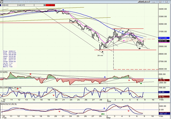
SPX hourly chart
The hourly chart provides a better representation of the consolidation pattern of the last few days. Most of the trading took place above 3010 and this may provide overhead resistance for the rally which started on Friday.
I want to point out the value of P&F charting by comparing the two small bases (A & B) that formed at the low of this consolidation. “B” took seven hours to build and has a base which gives it a maximum count of ~110 points, the equivalent of a potential rally of this magnitude whichprojects to about 3050. “A” was also built in 7 hours, but ended up with many more reversals and a count of 240 points, which suggested a rally to ~3140 – the actual top of that rally. As I mentioned before, these projections tend to be very accurate. This is why I do not want to minimize the potential for another decline down to the 2600 level when we break below the red horizontal line,but this will have to be confirmed by the market action.
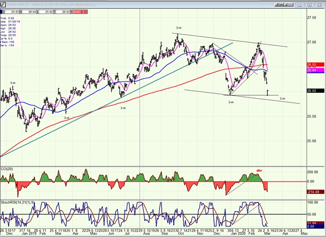
UUP (dollar ETF)
The market weakness combined with a 50-basis point cut in federal funds rate sent UUP sharply lower over the past two weeks. It probably also helped to have the 3-mo cycle in its down phase. The index has now retraced to its former low and the selling may not be over, although it could find some support on the lower channel line which is relatively close. This action has caused the US dollar P&F chart to start looking bearish, with lower counts in store.
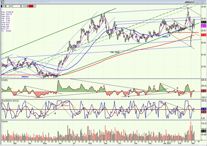
GDX (gold miners)
GDX has joined in the volatility parade with a big drop followed by a big rally. The rally was motivated by the sharp decline in the US dollar and the cut in interest rates. GDX has risen to the top of what could become a large consolidation area in which it could trade for a while longer. Oscillators are neutral.
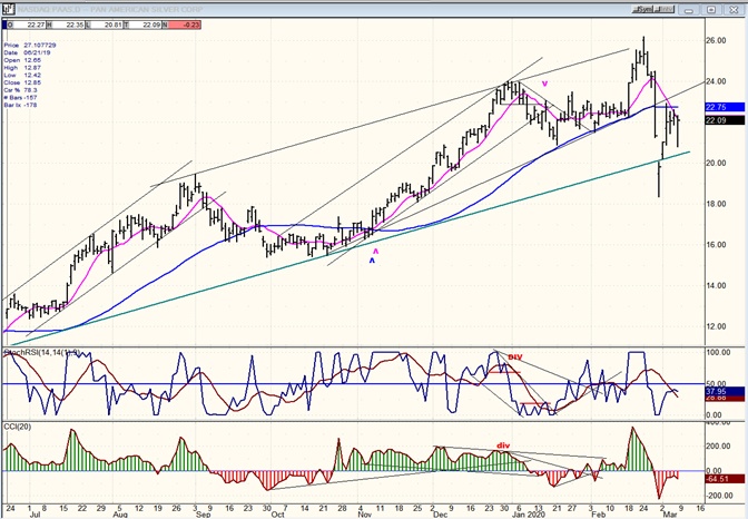
PAAS (Pan American Silver Corp)
PAAS has also rallied after a sharp drop, but more weakly than GDX since it remains below what has become overhead resistance. Remaining in the green channel will be important as it builds a new short-term base.
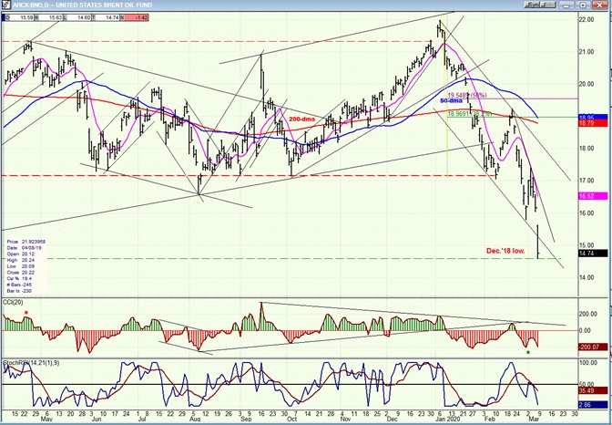
BNO (U.S. Brent Oil fund)
BNO continues to follow the path of least resistance and shows no sign of being done. There is enough overhead supply to send it back down to the 2016 low of 9.
Summary
SPX looks as if it is in the process of completing a pattern of secondary distribution. If so, it could be followed by another significant decline.
Author

Andre Gratian
Market Turning Points
When I was a stock broker years ago, a friend introduced me to technical analysis of the market and it is not an exaggeration to say that I fell in love with this approach! Ever since then, it has become an increasingly important