Great Graphic: Stocks and Bonds

As market participants, we are sensitive to changing inter-market relationships. This Great Graphic, from Bloomberg shows the correlation between stocks and bonds. In particular, it depicts the 60-day rolling correlation over the past year of the change in the US 10-year yield and the change in the S&P 500.
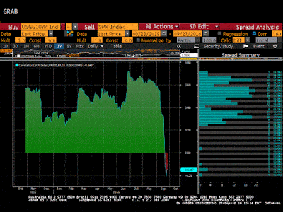
As recently as the beginning of Q3, the correlation was above 0.70. It remained above 0.60 until the end of August. The correlation is now inverse (-0.15) for the first time since the April-June 2015 period.
The inverse correlation is not statistically significant. The point is that the previous relationship has broken down. This is a warning sign to investors of a potential shift in the investment landscape. There have only been three periods since the beginning of 2009 that the correlation between the change of the S&P 500 and the change in the 10-year yields has been inverse: now, the two-month period last year and a six-month period that in bounced in and out of inversion in the second half of 2013.
Author

Marc Chandler
Marc to Market
Experience Marc Chandler's first job out of school was with a newswire and he covered currency futures and Eurodollar and Tbill futures.


