Gold: What's going to happen after the dust settles?

When the market wants to move down and gets short-term bullish signals, it often ignores them or reacts weakly – and that’s exactly what gold is doing.
This week’s back-and-forth movement in gold, silver, and mining stocks is neither particularly exciting nor interesting. There is, however, some fundamental news that I would like to cover today.
Nonetheless, let’s start with the charts. The single notable technical thing is today’s pre-market performance of gold vs. the performance of silver.
Here’s what gold did so far today:
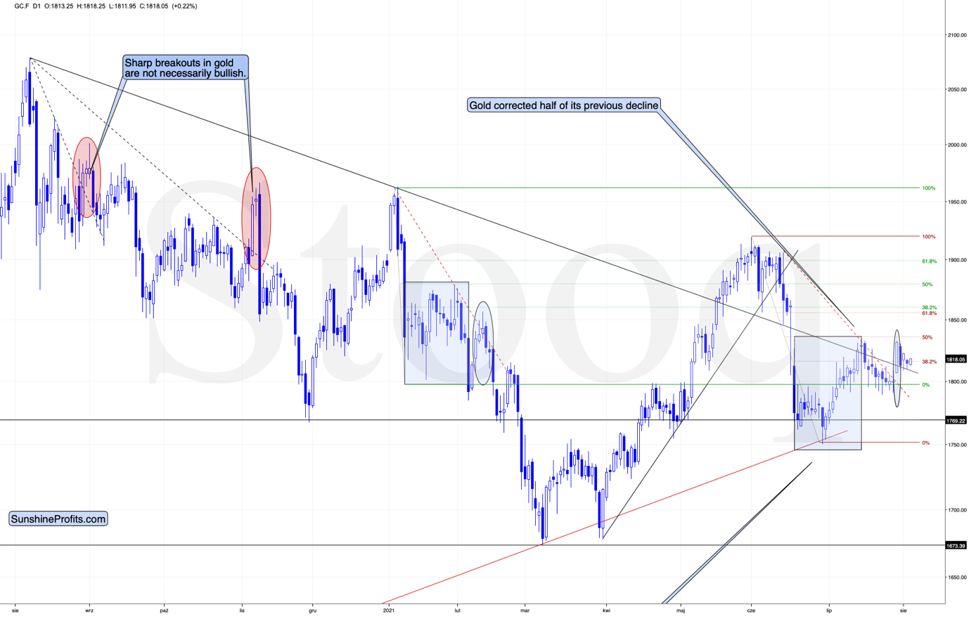
It moved slightly higher in a relatively boring manner; it moved a bit higher after having moved a bit lower. Nothing to write home about.
And here’s what silver did so far today:
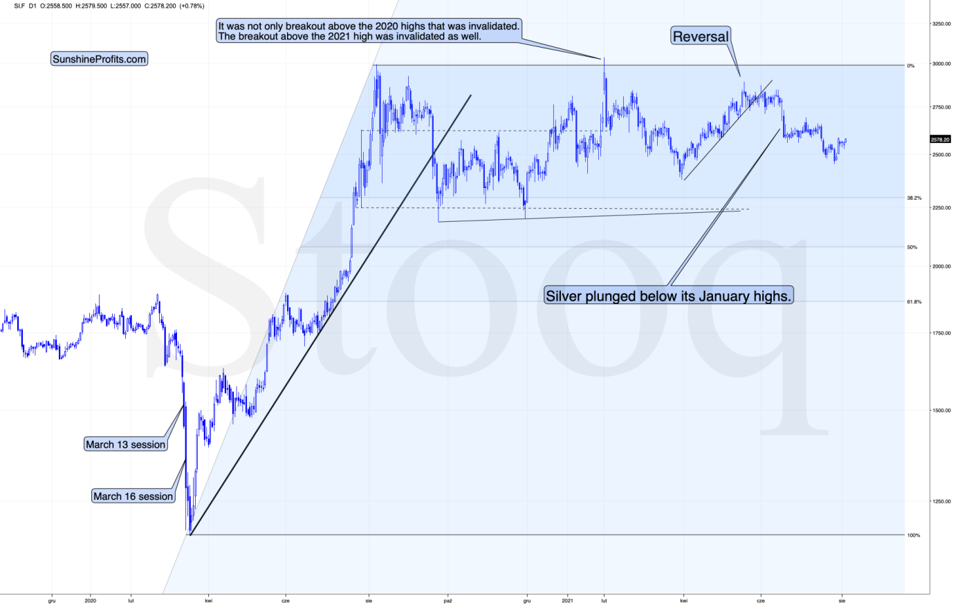
Silver moved higher as well, and while this move was relatively insignificant in nominal and percentage terms (+0.78%), it was much bigger than what we saw in gold (+0.22%); the difference is crystal-clear when we compare today’s pre-market moves to the most recent short-term highs in both precious metals.
Silver moved to its recent short-term high while gold is not even close to being halfway back up. This means that on a very short-term basis, silver is clearly outperforming gold.
This is also what tends to happen shortly before significant declines across the precious metals sector.
Now, the sizes of both moves were not that significant, so this performance could also be more or less random, and, if that was the case, the outperformance would be just accidental. Consequently, it’s not a game-changing signal in terms of its importance. It is something that’s on top of multiple other indications that we have, and the most important ones are not of a short-term nature at all. The long-term self-similarities in gold and the HUI Index (gold stocks) are the true key to understanding where the precious metals sector is likely to head next, and you already know about those, as I described them thoroughly on Monday.
Should we fear countertrends?
Having said that, let’s move to the less technical details and more fundamental ones. Before I proceed, though, I would like to reply to a question that I just received that will serve as a good segue from the world of the technicals into the world of the fundamentals. Here’s the question (the bold formatting was added by me):
You have made a compelling case and a very thorough one for the decline in the precious metals market, and yet the US treasury Bond yields decline and the USD-DXY continue to decline. The analysis needs to include the countertrend that exists and how this countertrend occurred. You refer to this in one-sentence statements which are not very clear. There have been many short-term moves in Gold that have been fairly substantial, and the current trend in the USD and US 10yrT yield is significant. Explaining how the countertrends could and would move within your analysis and projections would help everyone... The daily analyses are much appreciated and I would like to have better understanding of the countertrend moves within your analyses, as well as the US Fed and the ECB influence.
And here’s my reply.
As far as the USD Index (USD-DXY) is concerned, then I wouldn’t say that it “continues to decline”, as it’s been on the rise since the beginning of this year. But let’s say that we’re talking about the last 2 weeks or so. In this case, the USD Index is indeed declining. The highest recent closing price was 92.98 (July 20). Yesterday’s closing price for the USD Index was 92.09, so the USDX is down by 0.89 – almost a full index point.
What did the 10-year yield do between those dates? The $TNX (10-year US Treasury Index) declined from 12.09 to 11.76. But if we took July 13 as the starting date (the recent short-term high in the $TNX), we would see that it moved from 14.15 to 11.76 – a substantial decline.
Ok, what did gold do during these times? Almost nothing. Gold moved from $1,811.40 (July 20) to $1,814.10 (August 3). So, while the USD Index declined by almost a full index point, gold moved higher by a mere $2.70.
And in the case of the TNX, between July 13 and yesterday, gold moved from $1,809.90 to $1,814.10 (it moved higher by a mere $4.20).
Based on this comparison, the reply is already quite evident. What if these trends continue? If these trends continue, gold is likely to do… Nothing.
Based on how gold tends to perform (based on the 2008 and 2011-2013 analogies), it’s time for gold to fall, and to fall hard. If it was just gold that was performing just as it did in all those years, it might not have been as critical. But gold stocks (the HUI Index) are doing the same thing! They are also repeating what happened in all those years. And based on these analogies, the markets are about to slide.
Now, what does the market do if it wants to move in a given direction (here: down) and it gets bullish signals from other markets or the from news? It ignores them. This could take the form of reacting in a weak manner and then, after the dust settles, moving slowly back down. That’s exactly what gold has been doing.
The bullish indications from the USD Index (reminder: they are of a very short-term nature only; the USDX tends to rally after bottoming in the middle of the year) and bond yields are simply delaying the PMs’ slide. At the same time, gold, silver, and mining stocks act like a spring that’s being coiled with bigger force. It doesn’t move, but when something finally changes (yields and the USDX move higher), something big (here: decline in the PMs) is likely to happen.
Having said that, let’s move to the more fundamental part of the analysis. I will also discuss the situation in bond yields more thoroughly in the upcoming analyses.
Work in progress
With the USD Index patiently waiting for the release of the U.S. nonfarm payrolls report on Aug. 6, the greenback has recorded a muted start to the month. However, if payrolls outperform and investors accelerate the U.S. Federal Reserve’s (FED) taper timeline, a U.S. dollar surge could happen sooner rather than later.
In the interim, though, the U.S. labor market is trending in the right direction. Case in point: while Gusto – a software company that provides cloud-based payroll, benefits and human resource management solutions for U.S. businesses – largely downplayed the end of enhanced unemployment benefits in many states, an excerpt from the Jul. 27 report read:
“Looking at employment trends by employee age, we observe that around the time of governors’ announcements in the first week of May, hiring rates for workers 25 and older rose in states ending these benefits early, which indicates that UI did play a role in the labor supply decisions of a group of adult workers.”
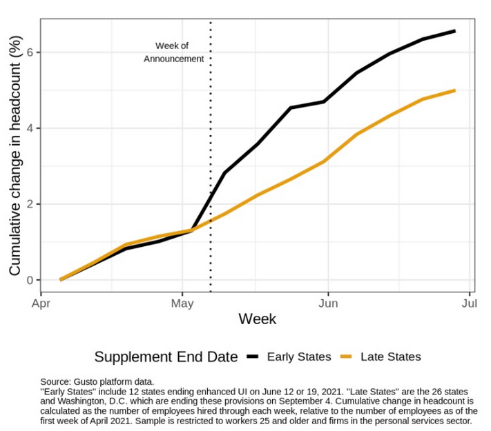
To explain, the black line above tracks the cumulative headcount of adults 25 and older in the states where enhanced unemployment benefits ended early, while the brown line above tracks the same cohort in states where enhanced unemployment benefits are still in play. If you analyze the acceleration of the black line, it’s clear that fiscal benefits have impacted U.S. citizens’ desire to find employment.
Also noteworthy, Indeed revealed on Aug. 3 that U.S. job openings fell by “two points from last week” and that “job postings increased in May, June, and July at a slower pace than in March and April.”
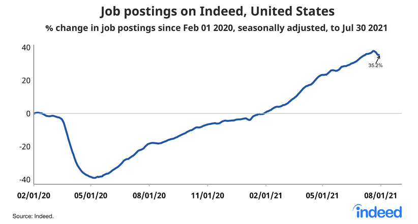
At first glance, the results may seem disappointing. However, it’s important to remember that if job postings are declining, businesses have likely filled the vacancies. Think about it: when a person is hired, the job posting is no longer necessary. And with the latter declining at a time when enhanced unemployment benefits have ended for roughly 30% of Americans, the ‘coincidence’ signals that a restocking of the U.S. labor force is already underway.
Allocation to the dollar rises
Circling back to the USD Index, as indicated in the CoT reports, the non-commercial (speculative) futures traders, asset managers and leveraged funds’ allocation to the U.S. dollar are now at 2021 highs.
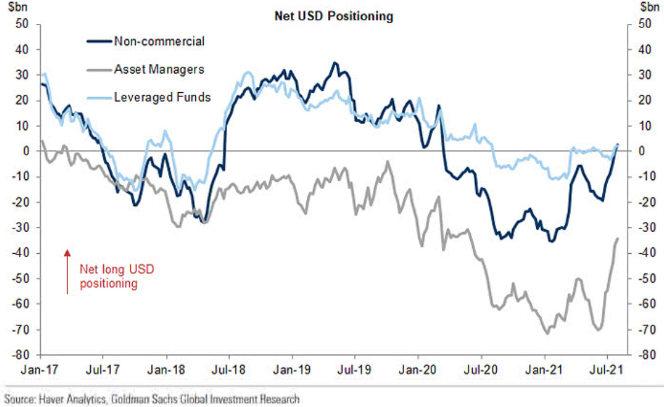
To explain, the dark blue, gray and light blue lines above represent net-long positions of non-commercial (speculative) futures traders, asset managers and leveraged funds. When the lines are falling, it means that the trio have reduced their net-long positions and are expecting a weaker U.S. dollar. Conversely, when the lines are rising, it means that the trio have increased their net-long positions and are expecting a stronger U.S. dollar. And if you analyze the right side of the chart, you can see that the trio have upped their bullish bets in recent weeks (with leveraged funds moving notably higher last week).
On the flip side, euro sentiment is moving in the opposite direction. And because the EUR/USD accounts for nearly 58% of the movement of the USD Index, the performance of the currency pair is extremely important.
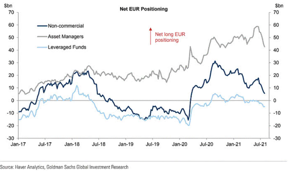
To explain, the dark blue, gray and light blue lines above track the trio’s allocation to the euro. If you analyze the right side of the chart, you can see that speculative euro bulls are throwing in the towel.
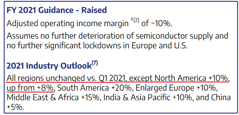
Furthermore, the relative fundamentals also favor the greenback. With U.S. GDP growth poised to outperform the Eurozone, growth differentials still signal a stronger U.S. dollar. For example, Stellantis NV – a European automaker that was created following the merger of PSA Group and Fiat Chrysler in 2021 – increased its full-year 2021 earnings guidance on Aug. 3. The main reason? Higher output in North America.
Source: Stellantis NV Households in the US Are… Wealthier?
On top of that, with U.S. fiscal benefits plumping consumers’ balance sheets, household savings in the U.S. far outweighs the Eurozone. For context, the construction of the European Union makes it difficult for the bloc to find common ground on fiscal policy. And while the lack of spending decreases the supply of euros relative to U.S. dollars, the growth outperformance should result in capital flowing into the U.S. and investors buying the U.S. dollar.
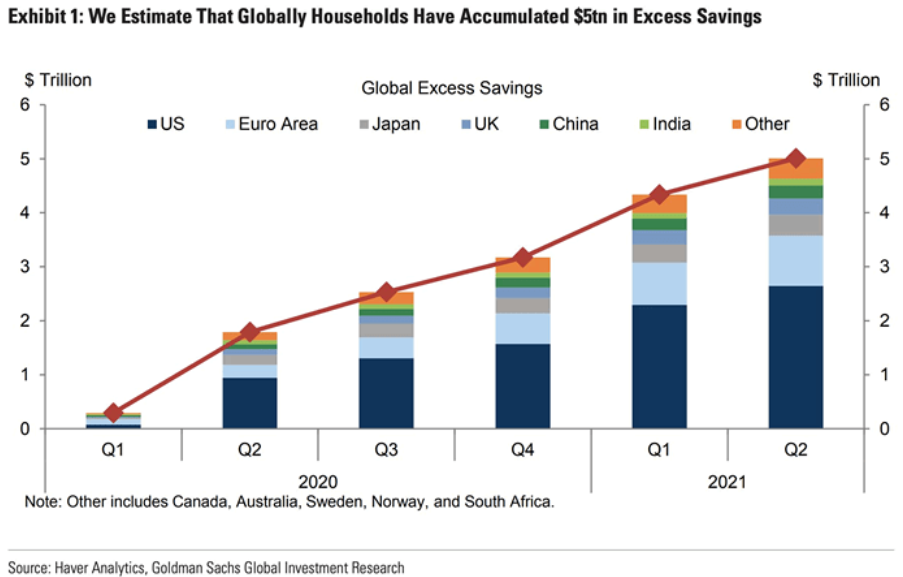
To explain, the stacked bars above depict various regions’ household savings over the last six quarters. If you analyze the column on the right side of the chart labeled “Q2,” you can see that the U.S. (the dark blue section) has much more household savings built up than the Eurozone (the light blue section). As a result, when U.S. citizens’ willingness to spend matches their ability to spend, the prospective economic outperformance is bullish for the greenback.
To that point, while the U.S. is about to recoup its pre-pandemic GDP growth trajectory, the Eurozone isn’t expected to reach the milestone until late 2022.
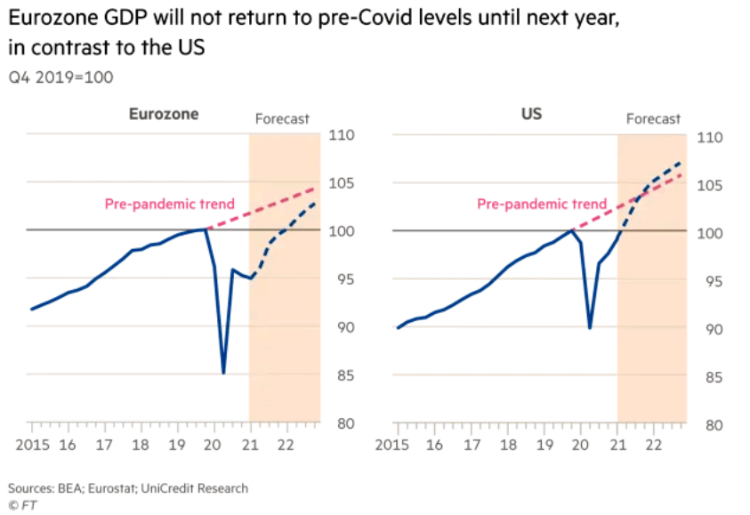
To explain, the chart on the left compares the Eurozone’s current growth trajectory (the blue line) with its pre- pandemic trend (the pink line). If you analyze the gap, you can see that the Eurozone is still a ways away from recapturing its past glory. Conversely, if you turn your attention to the chart on the right, you can see that the U.S. has already recouped its pre-pandemic GDP level (100) and the region is expected to exceed its pre-pandemic trend in the third or fourth quarter of 2021.
Finally, with the momentum shifting across emerging markets, foreign portfolio flows have stalled once again.
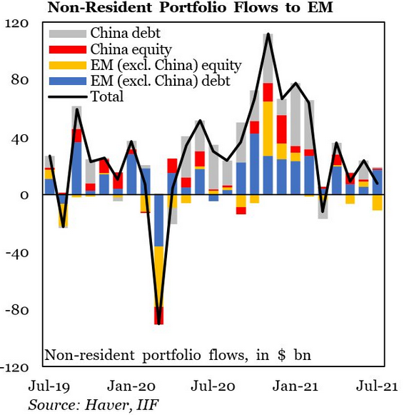
To explain, the stacked bars above categorize non-resident portfolio flows into emerging markets, while the black line above tracks the consolidated total. If you analyze the sharp fall in early 2020 and the sharp rise in late 2020, the former coincided with a sharp rise in the USD Index, while the latter coincided with a sharp fall in the USD Index. More importantly, though, if you focus your attention on the right side of the chart, you can see that non- resident portfolio flows into emerging markets continue to lose momentum. And if the dynamic persists, it will likely add even more fuel to the USD Index’s fire.
In conclusion, the precious metals’ performance was mixed on Aug. 3, as payrolls uncertainty has many assets stuck in consolidation mode. However, whether reality resurfaces on Aug. 6 or the PMs bask in what’s left of the summer sun, the bearish medium-term implications remain intact. With the U.S. labor market moving closer to the FED’s taper threshold, the PMs have become increasingly anxious. And after the U.S. 10-Year real yield hit another all-time low on Aug. 2, the metals’ inability to muster a relief rally is a sign of extreme weakness. The bottom line? While short-term bursts of strength are definitely possible and expected along the way, the PMs’ medium-term trend still remains down. And it seems that the current short-term corrective upswing in gold, silver, and mining stocks is over or about to be over.
Want free follow-ups to the above article and details not available to 99%+ investors? Sign up to our free newsletter today!
Want free follow-ups to the above article and details not available to 99%+ investors? Sign up to our free newsletter today!
Author

Przemyslaw Radomski, CFA
Sunshine Profits
Przemyslaw Radomski, CFA (PR) is a precious metals investor and analyst who takes advantage of the emotionality on the markets, and invites you to do the same. His company, Sunshine Profits, publishes analytical software that any


