Final Warning: Here Are the Stunning Implications of Plunging Gold (Part II)

Gold has turned vigorously lower yesterday. And not only gold at that. Red, red, everywhere in precious metals you looked. The silent scream we wrote about in the Wednesday’s Alert for our subscribers brought serious repercussions. Immediately and just in time to reap the benefits. Today, we will devote extraordinary attention to the long-term view of the PMs complex.
In yesterday’s Part I, we shared with you the short-term check on precious metals sector health. That article was a limited sample of exclusive care our subscribers get on an everyday basis. Today, we will follow up with more of such a peek under the hood - another sample of what our subscribers already enjoyed yesterday. Whether you are reading this article on our website or elsewhere on the Internet, we will now share today’s full picture with you, the visitor, on the long-term charts and signals. Let’s examine whether the most recent developments changed the long-term view.
Long-term Update on Gold and Silver
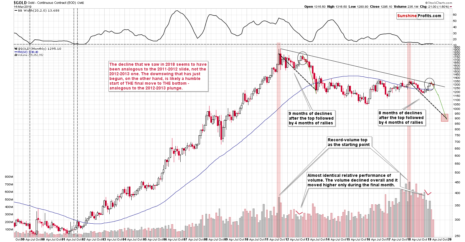
First things first – gold’s analogy to what happened in 2012 and 2013 remains up-to-date. Consequently, it seems to be worth to recall the description of the above chart. As we explained on March 4th, the analogy is striking also in silver and mining stocks, but we don’t want to quote the entire previous Alert here, so we will simply quote what we wrote about gold:
The very first few months of the 2018 were similar to the late-2012 decline, so it was natural to start the analogy with these moves. As we now see, something else fits the analogy better. The record-breaking monthly volume that we saw in 2011 and in 2018 is something that starts an analogy that is confirmed by multiple developments (and not only from gold) and the most recent upswing doesn’t invalidate it. Conversely, it fits and confirms it.
Starting with the record-breaking volume (marked with red rectangles), in 2011 we saw 9 months of declines, and in 2018 we saw 8 months of declines. In both cases, we then saw 4 months of higher prices and then a month where gold moved higher only on an intraday basis, but declined in terms of the monthly closing prices. Both tops formed not too far from the previous high, but still below it. Then gold kept declining for several months.
Quite interesting so far, isn’t it? And we’re just getting started.
The similarity is not only in price. The monthly volume readings are remarkably similar as well. When gold rallied in mid-2012, it did so on declining volume that increased in the final monthly upswing. It was exactly the same case in late 2018 and in January 2019.
What about the shape of the initial decline (late-2011 – early 2012) that was rather chaotic and volatile compared to the stable nature of the mid-2018 slide?
Looking at it with the benefit of hindsight, it’s easy to see why these moves were different. It’s the question of what preceded them. In particular, it’s the question of what kind of volatility was present overall. The former move was preceded by the parabolic upswing in gold prices and the top, while the latter was yet another (boring?) attempt to rally above $1400, which ultimately failed. The volatility that was present at and below the former was very high and the volatility that was present at and below the latter was very low. Consequently, it’s normal and natural to expect that the former decline would be volatile and chaotic, and the latter would be calm. This is normal, not something that breaks the analogy. You can check the volatility levels by looking at the upper part of the above chart – it includes the Bollinger Band width, which can be used as a reliable proxy for volatility.
The above chart shows no deviation from the above-mentioned self-similarity. Gold is down this month, but not extremely so – just like it was the case in the early part of the decline in 2012. The fact of gold moving higher in the last several days didn’t change anything. Our gold price forecast remains very bearish for the medium term.
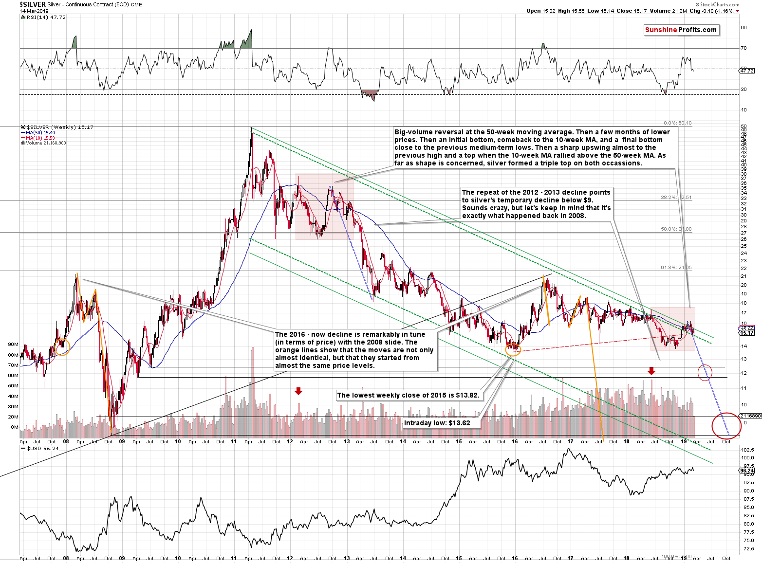
Silver’s very long-term chart also shows that nothing materially important changed even without taking into account today’s pre-market decline. Silver once again invalidated the small breakout above the long-term declining green resistance line. Also our silver price forecast remains very bearish for the medium term.

The relative performance of both markets also continues to have bearish implications. The gold to silver ratio is on the rise once again – as the brief correction after breaking above the previous highs has run its course. The true long-term resistance is at about 100 level, so the ratio still has a long way to go before this level is reached. Since this ratio generally moves inversely to gold and silver prices, both metals are likely to decline.
Please note that it’s not just the value of the ratio itself that suggests higher readings – it’s the time factor as well. In the past two decades, there was no other case when the gold to silver ratio stayed so long above the 80 level. All previous attempts were invalidated rather quickly. This time, the ratio simply pulled back, but remained strong and rallied once again after bouncing off the rising support line. The implications remain bullish for the ratio and bearish for the PM prices for the next few months.
Oh, and by the way, it may seem like our target area is too close in terms of time, but please note how sharply the ratio did soar when it was close to 80. Such sharpness is quite natural at those levels, so the above “daring” prediction is justified.
Want free follow-ups to the above article and details not available to 99%+ investors? Sign up to our free newsletter today!
Author

Przemyslaw Radomski, CFA
Gold Price Forecast
Przemyslaw Radomski, CFA (PR) is a precious metals investor and analyst who takes advantage of the emotionality on the markets, and invites you to do the same. His company, Sunshine Profits, publishes analytical software that any