A Gold Cup, with a handle

The process
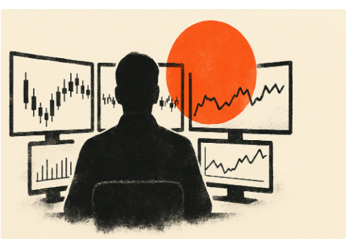
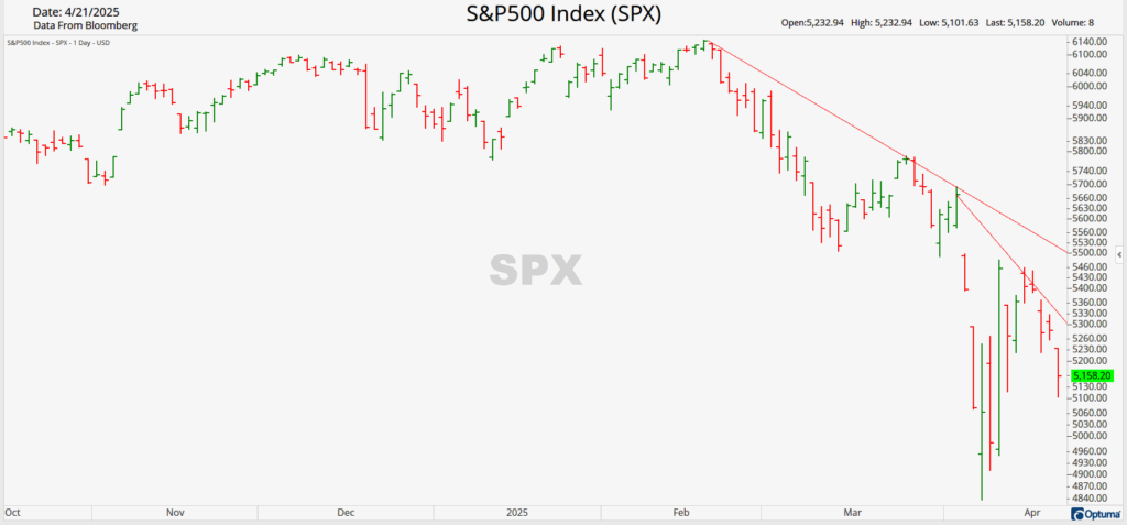
Bottoming is a process, so let it unfold. Yesterday’s market message was clear: the S&P 500 lost another -2.36%. While many technical indicators signaled oversold conditions recently and the market did have a short rebound, the most crucial indicator, price, has yet to confirm the all-clear.
Price holds immense wisdom because it reflects the collective view of market participants. Every transaction involves a buyer and a seller, and the movement of securities prices reflects their collective sentiment. This is why price trends are so important. The adage “The trend is your friend” could literally be interpreted as the increasing number of “friends” (buyers or sellers) aligning with the trend. As long as this trend persists, market participants reaffirm their belief that the asset will continue moving in that direction. Volume further corroborates this view, indicating that more participants share the same sentiment.
Currently, the market signals that the dip buyers who emerged from extreme oversold conditions two weeks ago are stepping back. Moreover, not enough participants believe the market is prepared to rise from here. Since the current trend in the S&P 500 is downward, wait for a breakout from this trend before price signals an all-clear.
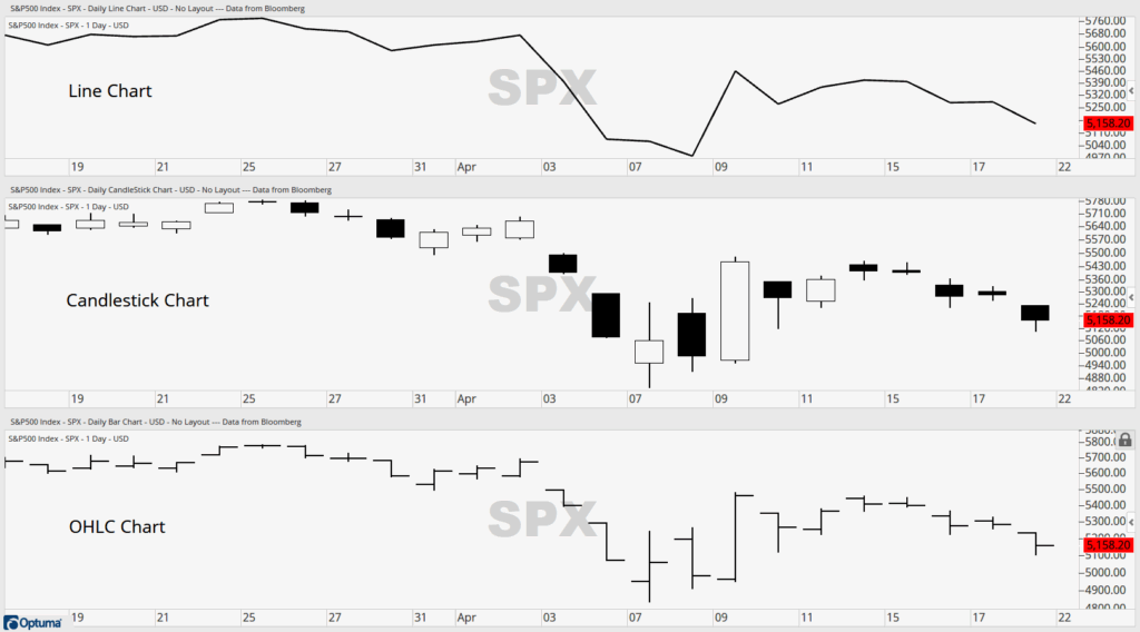
To avoid confusion, consider using OHLC charts
Charting can tell the story of an asset’s performance, but some stories are more detailed than others. Line charts are great for showing the direction of an asset’s price over time, by showing the closing price at the end of each period. This allows users to easily see if an asset’s price is moving up or down on any given timeframe. However, line charts hold significantly less information than what’s available in other charts.
Candlestick charts, which originated in 18th-century Japan, provide additional information about an asset’s trading activity during a specific timeframe. The body of the candlestick represents the open and closing prices, while the wicks represent the high and low prices of the timeframe. These charts offer valuable trading insights that are not available in line charts.
The wicks of the candlestick are self-evident, but the open and close prices can be less clear. Traditionally, green or white candlesticks indicate that the asset was up from open to close, while red or black candlesticks indicate that it was down. This means a security could be up from one period to the next, but still red if it closed lower than the open. When the candlestick body is filled in, it means the asset closed lower than it opened, while an open body indicates that it closed higher. This can lead to confusion, especially when candlestick charts are all black and white, as it requires you to remember what the body of the candlestick signifies.
This brings me to OHLC Charts, a type of Bar Chart. These charts encompass all the information present in a Candlestick chart, eliminating any confusion regarding the open and close prices. OHLC stands for Open, High, Low, and Close, and it consists of two tick marks and a vertical line. One tick mark to the left represents the open price, a vertical line represents the high and low or the range of the timeframe, and one tick mark to the right represents the close price. A straightforward way to read a chart with a clear beginning, middle, and end, Open, High, Low, and Close. While OHLC Charts are often colored red and green, similar to Candlestick charts, these colors are not essential for determining how the asset closed. Additionally, there’s no body left to be filled in, forcing you to remember if it closed up or down from the open. What was it again? As you read a chart from left to right, the older time frames are located on the left (open), the trading range is in the middle, and the last trade is on the right (close). Simple.
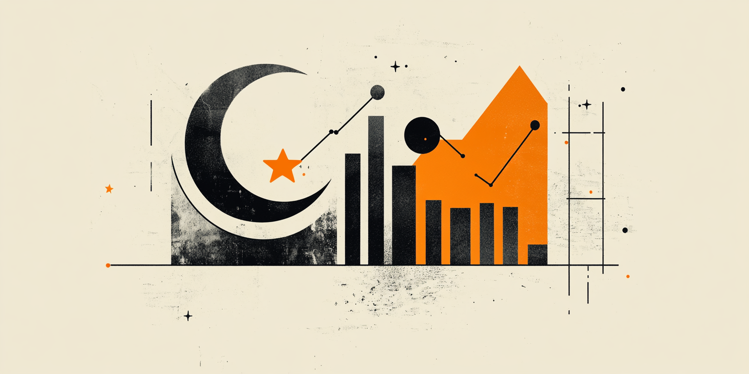
A Gold Cup, with a handle
Amidst market turmoil, finding strength is paramount for your next trade. While Gold continues to soar to new all-time highs amidst economic uncertainty, the Gold Miners have just emerged from a Cup and Handle formation. Some may perceive this as too late to trade, but upon a closer look, it presents potential for upside. From August 2020 to October 2022, the GDX experienced a significant price drawdown of approximately 50%, a crucial indicator in Cup and Handle formations. Subsequently, it completed the right side of the rounded bottom of the cup but encountered a stall near the $44.22 level. As a downward sloping channel formed the handle into the new year, a breakout from it was swiftly followed by another breakout above the top of the cup. To date, this pattern resembles a classic Cup and Handle formation. However, did you miss this opportunity? A classic measure of a Cup and Handle formation suggests a price target equal to the depth of the cup, in this case, $22 higher. This level remarkably aligns with the previous all-time high in the GDX set back in 2011, and which is a potential 25% increase from its current price. With ample room to run as Gold prices continue to rise, the GDX set up may prove to be as good as Gold.
Unlock exclusive gold and silver trading signals and updates that most investors don’t see. Join our free newsletter now!
Unlock exclusive gold and silver trading signals and updates that most investors don’t see. Join our free newsletter now!
Author

CMT Association Research Team
CMT Association
The CMT Association is a global credentialing body that has served the financial industry for nearly 50 years.