Asia Pacific Equity Index & Implied Volatility

Recession & Cross Asset Risk indicators
Last week, having dropped 20% from its peak, the S&P 500 touched technical bear market territory. Does that mean that a recession is imminent? Equity markets are notoriously bad predictors of recessions. On two-thirds of the occasions that the S&P500 index has dropped by 10% or more, the economy was not in recession.
One of the most popular and widely followed recession indicators is the yield curve, even though there has always been significant debate about which part of the curve (indeed, which curve) should be used. Furthermore, today's yield curves may have been bent out of shape by the actions of central banks.
In the following pages, we look at some alternative recession signals. We also look for indications as to whether this decline in the equity market is nearly complete, or if it's just the first phase of something bigger; something which might be commensurate with the onset of a recession.
The Yield Curve Challenge

The Fed monitors the 10-year minus 3-month rate. Wall Street commonly uses the 10-year minus 2-year rate. There are many other iterations. They all have one common feature: it can be as long as 2 years after the yield curve stops inverting that recessions emerge. Neither of the 10Y-3M or the 10Y-2Y have inverted yet. Does this imply that a recession is still quite distant?
Japan, however, has been in a deflationary spiral for nearly 30 years. The yield curve has been positive before recessionary periods due to QE & low nominal rates. Within this environment, their yield curve has been a far less useful indicator of recession. Is the US starting to experience similar circumstances?
The US yield curve has been far more successful at ‘predicting' the next recession compared to the yield curves of other international bond markets. Has QE now muddied the picture?
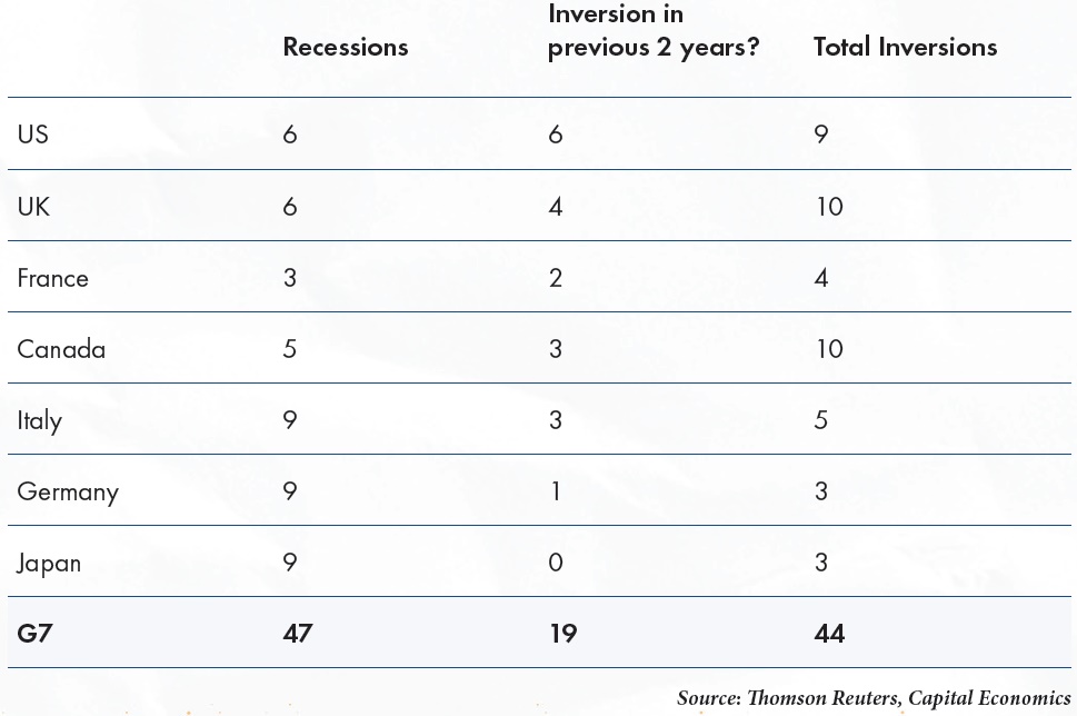
Recessions & Yield Curve
Michigan Consumer Expectations minus Current Situation
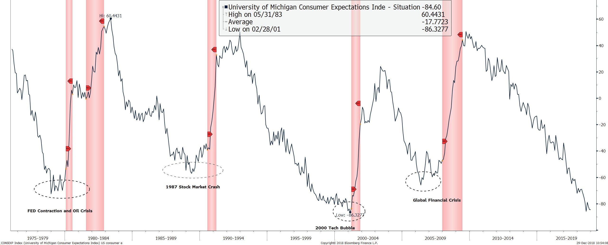
The difference between the US University of Michigan Consumer Expectations minus the Current Situation is back at levels last seen before the dot-com bust that began in 2000. It is now at the extremity of its 40-year range. The spread between the two reflects the state of current consumer spending. The gap prior to the 2008 Global Financial Crisis was far less extreme. Rather like the yield curve, however, the spread between the two has usually bottomed and started to revert a few months prior to the onset of a recession.
Do equities have predictive value?
Bear markets are notoriously poor at predicting recessions ("4 of the last 10"). Market crashes fair better, missing only one in the last 37 years. The problem is, however, that the aggressive price action has already concluded by the time that a recession appears ‘inevitable'. Despite that, there is still some value in looking at the S&P, though it requires a YoY decline of about 18% to trigger a signal, by which time the equity market will already have been in a protracted bear market.
Dow Theory has fallen out of favor in the current technology obsessed and service-dominated economy, but we think it is still worth serious consideration as a leader of the broader market and as a precursor to recession.
Dow Transport: December Weakness
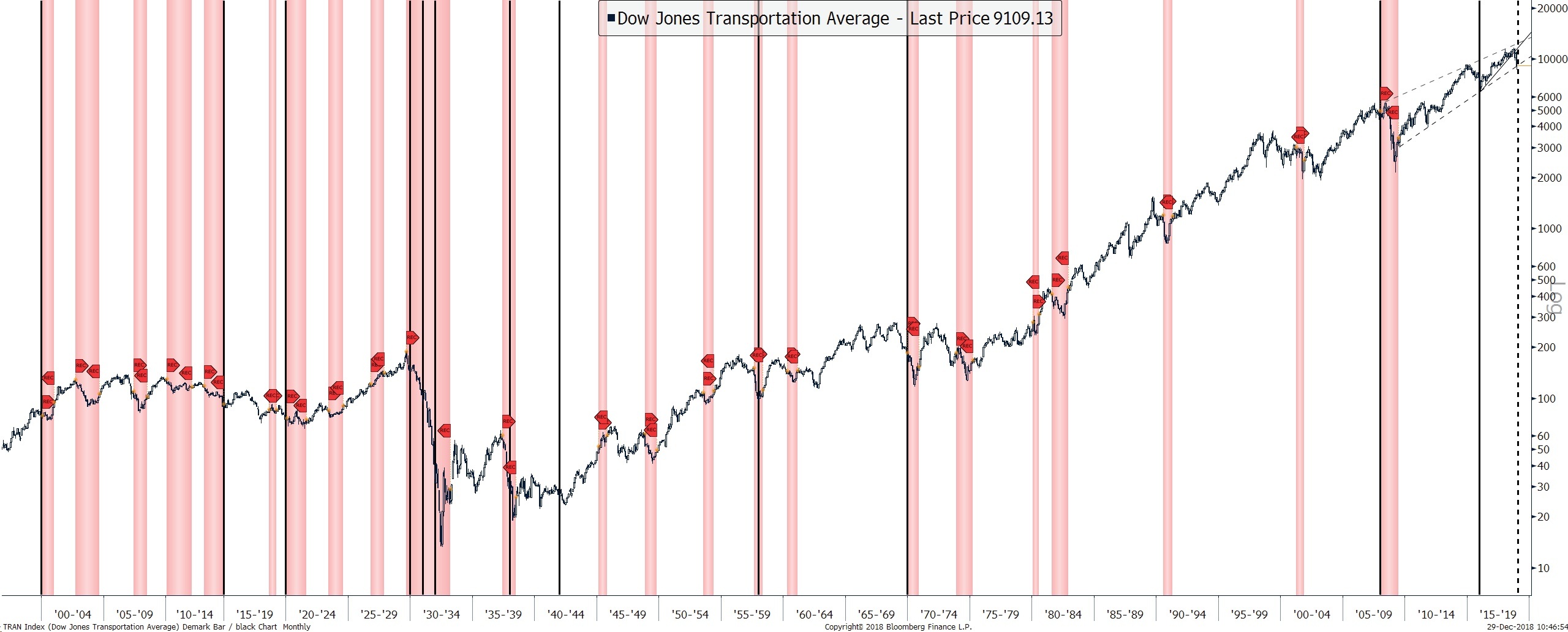
The chart above goes back to 1896. The black vertical lines indicate that the index either made a YTD low in December or the monthly close was the lowest for the calendar year. Including December 2018, there have been 13 occurrences. On all but two previous occasions, the US economy was either at the beginning of, or already within a recession. The two ‘failed' signals were 1941 (7th December Pearl Harbor attack) and 2015. The jury is out on 2018. Historical precedents are ominous but does the 2015 ‘anomaly' signal a declining relevance? As volatility increases and the time frame compresses, the answer will shortly be upon us.
Dow Transport > -15% and Recessions
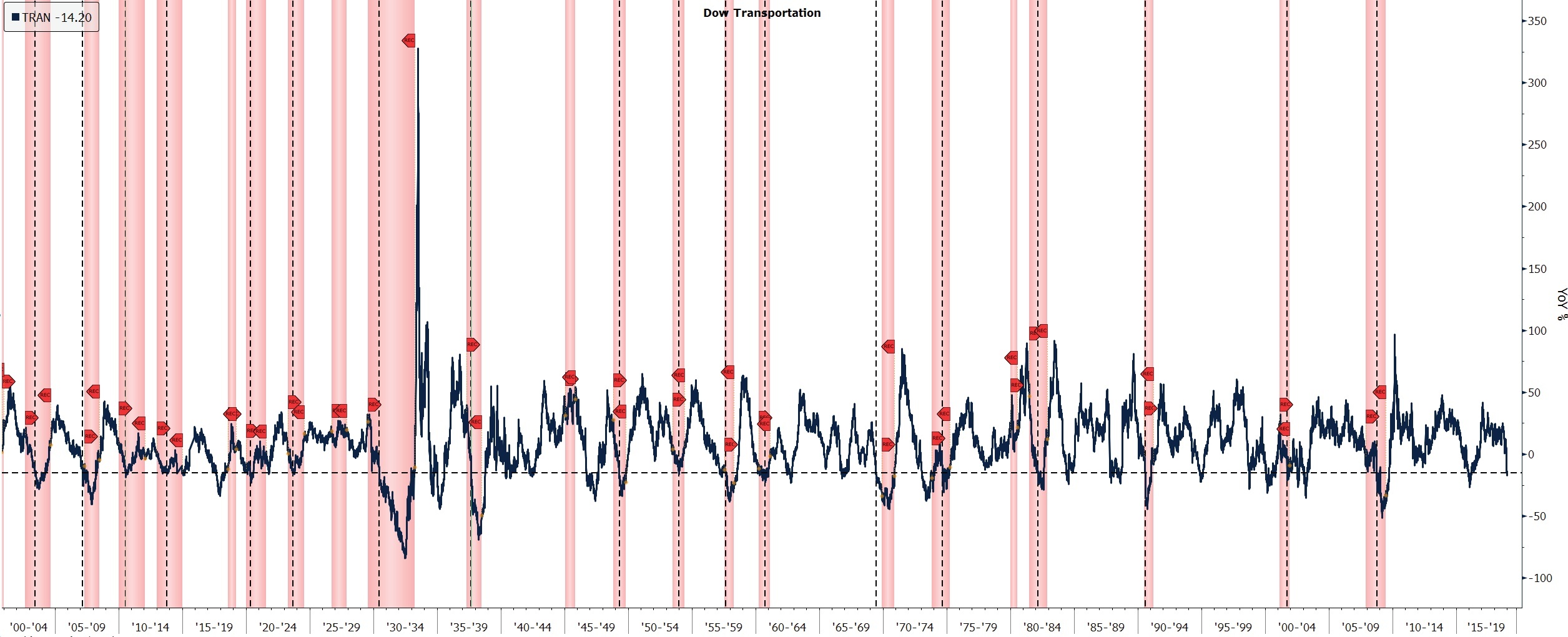
A drop larger than -15% YoY in the Dow Transport catches 18 of the 22 recessions since 1900 (dashed black line, above). There were, however, also 14 false signals (not shown) where the Dow transport dropped -15% or more but recessions did not take place within 9 months.
Although a decline in the Dow Transports of -15% only preceded recessions (within 9 months) on 18 occasions (from 32 readings), a combination of this and the December reading (previous chart) suggests that Dow Theory should not yet be written off.
Goldman Bull Bear: a 59-year high and a robust Bear Market Indicator

The GS Bear Market Risk Indicator combines the average percentile (in the US) for ISM, the slope of the yield curve, core inflation, unemployment and the Shiller PE. For unemployment and the yield curve, a lower reading corresponds to a higher (riskier) percentile. The chart above shows the GS indicator and the YoY change in the S&P500.
All of these variables are related. Tight labor markets are typically associated with higher inflation expectations. These, in turn, tend to tighten policy and weaken expectations of future growth. High valuations, at the same time, leave equities vulnerable to a de-rating if growth expectations deteriorate or the discount rate rises, or worse still, both of these occur together.
To aggregate these variables in a single indicator, Goldman Sachs took each variable and calculated its percentile relative to its history since 1948, then took the average of these.
The indicator currently stands at 76%, which is the highest reading since June 1969. A peak at these levels has been a reasonable indicator of future recession, though often with a few months lead. It has generally been coincident to, or slightly lagging of a peak and turn in the YoY equity performance, though on each occasion that the indicator has hit 70% or higher, the YoY equity returns have turned negative.
Last week we noted that the selloff has been measured and shows few signs of panic, despite the relentless selling prior to Christmas. How have broader risk metrics been affected?
Global Cross Asset Class Risk Indicator
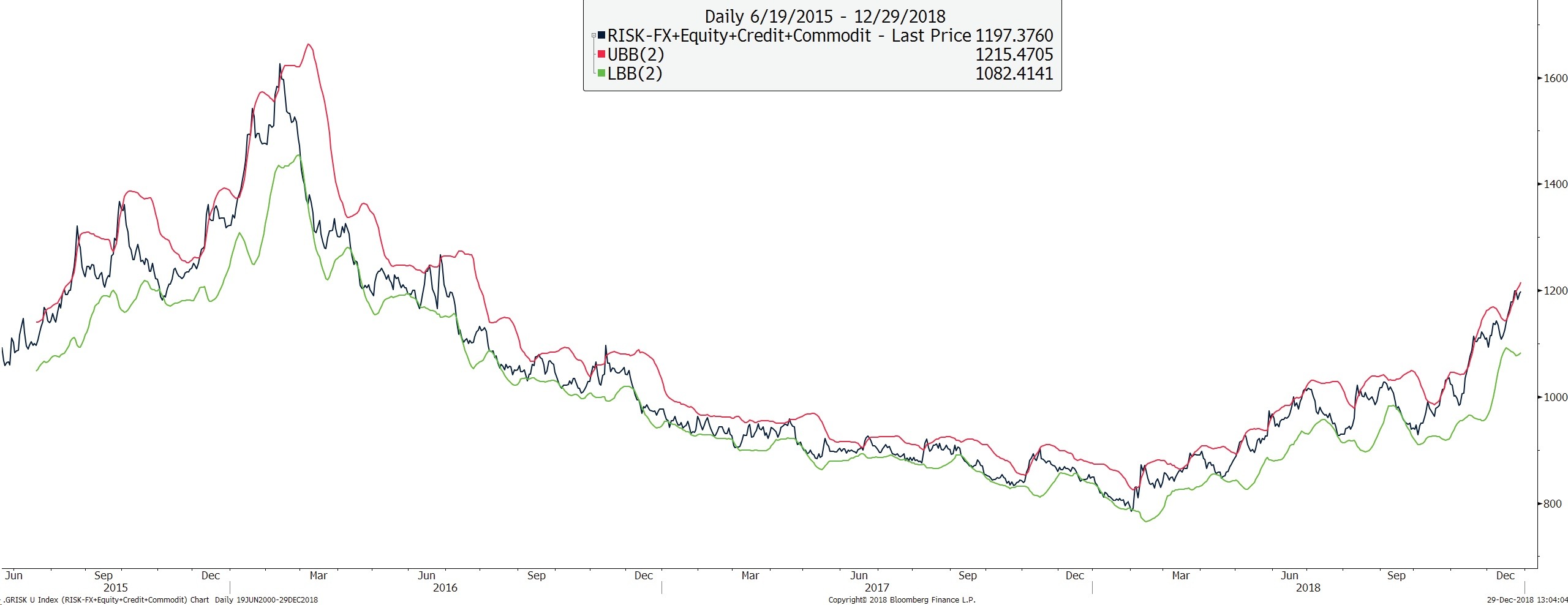
The Index is a composite of ATM 1-month implied volatility for Equities, Commodities, Corporate & Emerging Market Credit spreads and 3-month Global FX volatility (see Appendix).
Although it has pulled back slightly after last Wednesday's US equity rally, the rounding formation implies that higher levels should be achieved. The indicator is still well below the levels of cross-asset stress that were reached in 2015, suggesting that for now, the malaise is contained to the equity market. Equities are a discounting mechanism for the economy. Volatility Indices are by design mean reverting and a new trending formation suggests a change in the market structure. The previous period of declining volatility was also a period of flattening yield curves, falling credit spreads & loose monetary policy. That trend now appears to be reversing.
Risk has been rotating between asset classes and regions without experiencing a significant element of correlation. Therefore, whilst implied volatility has moved up, it has been doing so in a slow and consistent manner. The 2 standard deviation Bollinger band has acted as a cap.
Are risk assets now leading the economy too?
Asia Pacific Equity Index & Implied Volatility
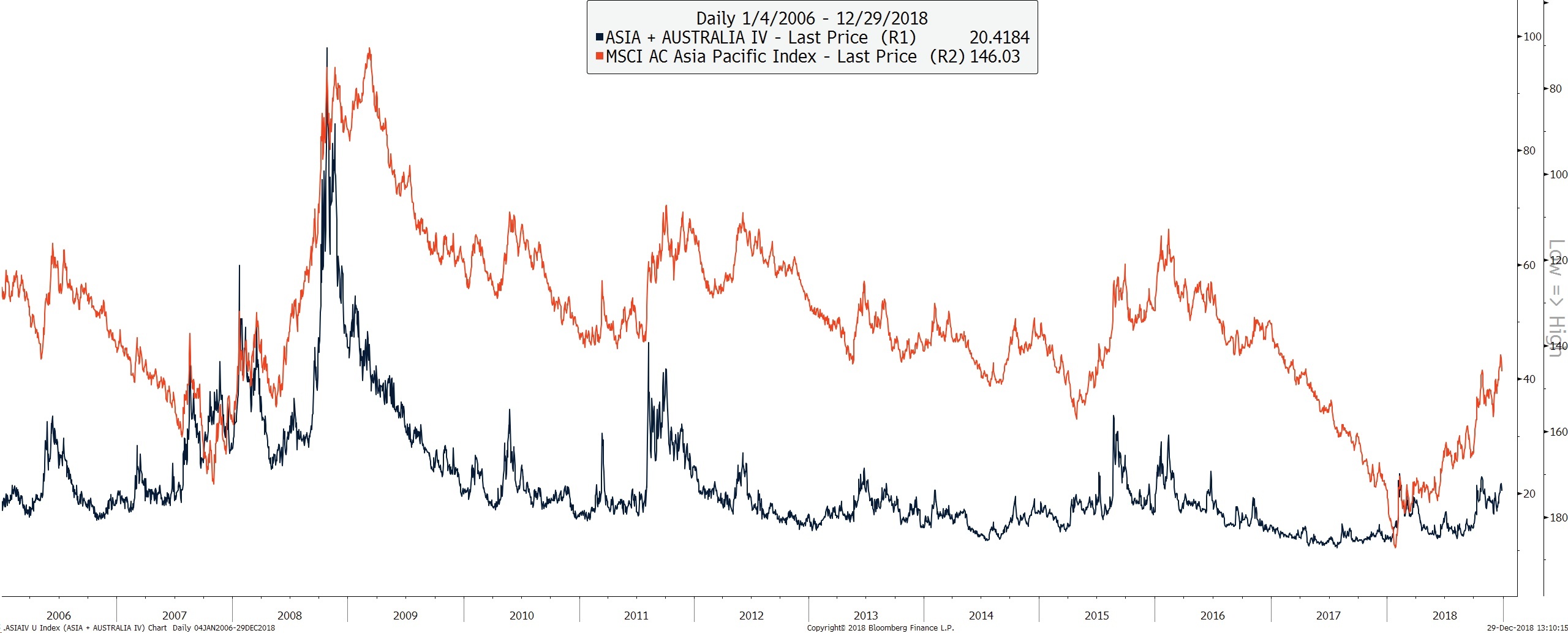
The Equity Index (orange and inverted, above) is a market-weighted index. The volatility index (blue, above) comprises the average of 1-month implied volatility in Australia, Japan, Hong Kong, China H shares listed in Hong Kong, India, Korea & Taiwan. The volatility index has ‘underperformed' the sell-off in the equity index and the rise in credit spreads.
Global measures of combined equity and cross-asset volatility remain relatively calm, reflecting only mild economic or contagion concerns.
Global Credit Spread and Global Equity
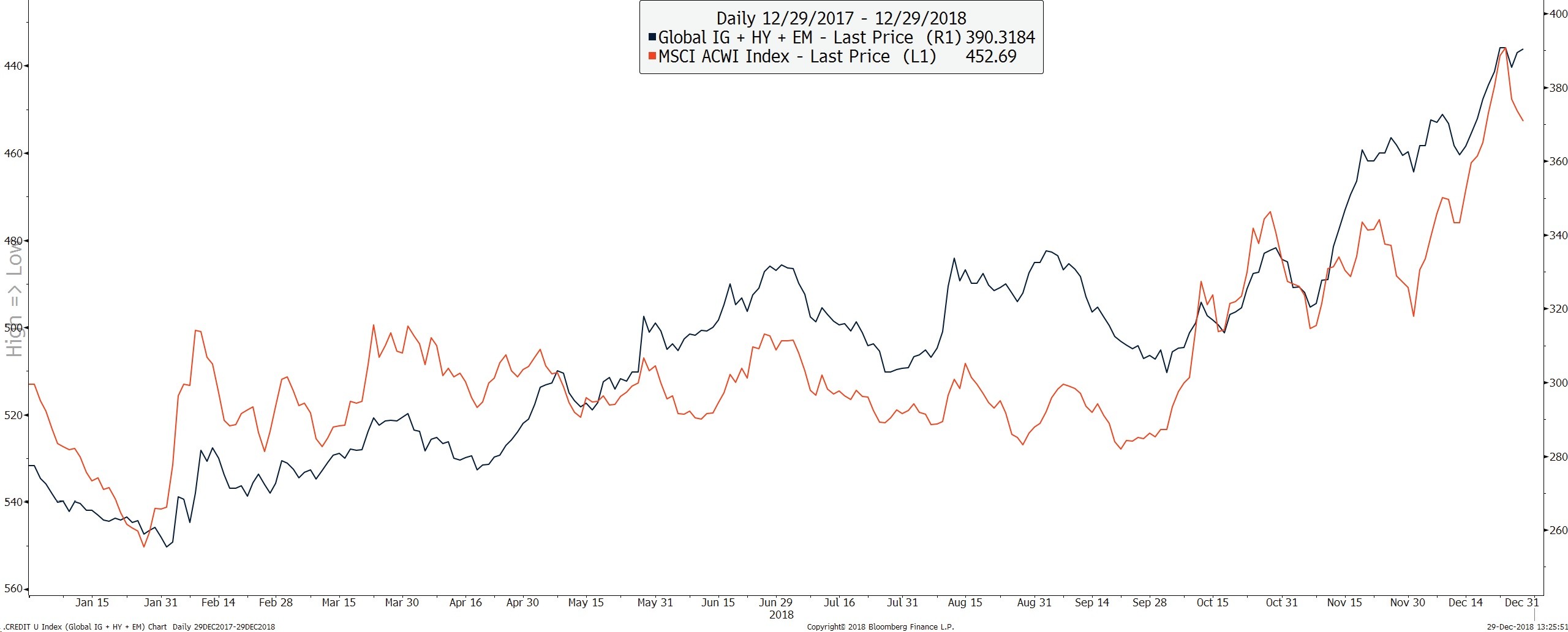
The blue line represents the widening of global credit spreads across global investment grade, high yield and emerging markets and had been leading and underperforming global equities, which is of continuing concern. Wednesday's near 5% rally in US equities saw little change in US investment grade & high yield spreads, underlining the technical nature of the equity rally.
Global Skew
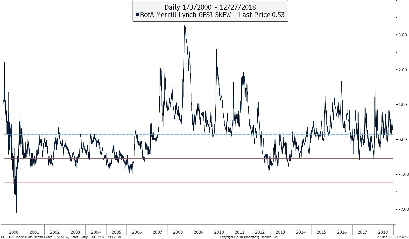
The chart above is of the BofA Merrill Lynch Global Skew Index. The Skew indicator is a measure of relative demand for protection against large swings in major global equities and currencies. Levels greater/less than 0 indicate more/less stress than is usual. Although the index is above the mean, it is not at levels associated with excessive stress (although readings over the last few years could be distorted by the rise in volatility products, which were themselves a response to the market distortions created by central banks).
Extremes in FX Skew appear to signal market dislocations better than extremes in pure equity skew.
Credit Spreads, VIX and the Yield Curve
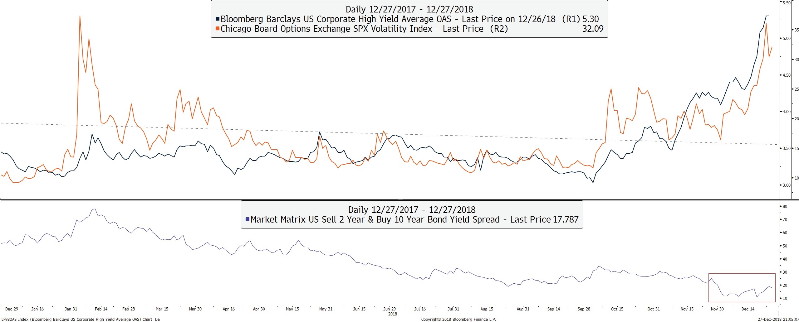
The upper panel shows the traditional ‘correlation' between credit spreads and volatility. This would typically be associated with a yield curve that has inverted and has already started to re-steepen.
Has the traditional yield-curve ‘predictor' lost its value as a lead-indicator?
Yield Curve Volatility Leads Equity Volatility
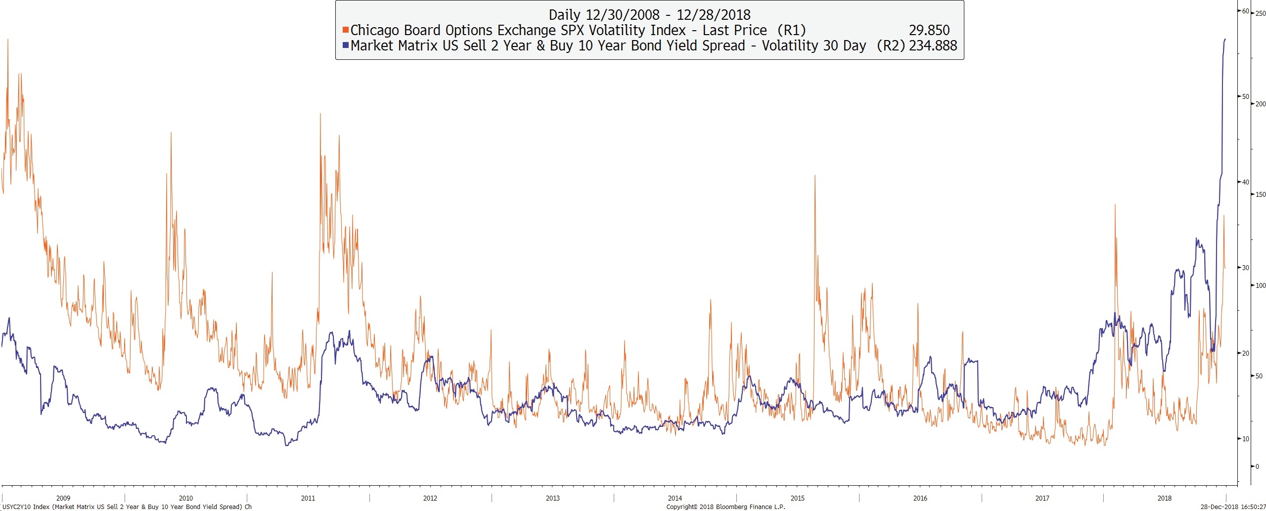
The chart above shows the realized volatility of the 30-day US 10Y minus 2Y yield curve (blue), which recently has been leading the S&P500 volatility index (VIX). In 2011, the curve both steepened and its volatility increased just before the VIX moved significantly higher. Has the current VIX move already played out?
Deutsche Bank has highlighted that 2018 will be the worst year ever for combined losses across all global assets.
However, does that mean recession? Are assets now leading the economy? Rather than equities discounting a deterioration in the economy, it may be that the global economy has still to discount the implications of a sustained fall in asset values. If the world were indeed propped up by QE, then its peak and subsequent withdrawal would imply that the foundations are on increasingly shaky ground and that a continued grind lower in asset values will eventually weigh-down on the economy.
An increase in asset and sector correlation would imply that 2019 could be a year of elevated volatility across risk assets.
Therefore, it's all eyes on China's January Aggregate Financing data. Will they be the first central bank to say, ‘enough is enough' and reopen the liquidity spigots? If they do open the spigots, will it help?
Author

Clint Sorenson, CFA, CMT
WealthShield


