7 powerful stock market chart patterns every trader should know in 2026

Introduction
Earnings, interest rates, inflation, employment data, geopolitical events and sector rotation continue to affect the stock market in 2026. Traders need to know how to interpret these trends, not just watch the headlines. Stock Market Chart Patterns offer a practical method of understanding price action and are able to spot possible breakouts, reversals and continuations. These patterns can be used in conjunction with volume analysis, technical indicators, and risk management to make informed and structured trading decisions.
1. Head and Shoulders Pattern
One of the most popular reversal formations in technical analysis is the head and shoulders.
The typical pattern is that it forms following a long bull market rise and has three peaks:
- A left shoulder
- A higher central peak called the head
- A lower right shoulder
- A neckline connects important lows between these peaks.
How the Pattern Works
The first peak creates the left shoulder. Through price action analysis, traders can observe the pullback before price rises to a higher high, forming the head. Another decline follows, and price rallies again but fails to reach the head's high. This creates the right shoulder, completing the basic structure of the head and shoulders pattern.
The pattern becomes more significant when price breaks below the neckline.
Traders often watch for:
- Formation of all three sections.
- A clear neckline.
- A decisive neckline break.
- Increased volume during the breakdown.
- Confirmation through subsequent price action.
The distance between the head and neckline is sometimes used to estimate a potential downside target. However, this should never be treated as a guaranteed price objective.
Inverse Head and Shoulders
The inverse version develops after a downtrend.
Instead of three upward peaks, it creates three troughs:
- Left shoulder
- Lower head
- Right shoulder
A breakout above the neckline can indicate a possible bullish reversal.
What's important is confirmation. Traders shouldn't assume that every three-peak or three-trough structure will become a valid reversal.
2. Double Top and Double Bottom
The double top and double bottom are relatively simple patterns that focus on failed attempts to break an important price level.
Double Top
A double top typically occurs following an uptrend.
Then, when the price hits a resistance level, it bounces back and then heads back up again. If buyers fail again and price breaks below the intervening low, the formation may signal a bearish reversal.
The basic structure looks like:
Peak → Pullback → Second Peak → Breakdown
The two peaks don't have to be exactly equal. What matters is the broader structure and the market's inability to establish a sustained new high.
Double Bottom
A double bottom is the opposite.
It commonly appears after a downtrend when sellers push price toward a support area twice but fail to create a lasting new low.
The structure becomes more meaningful when price breaks above the resistance level between the two lows.
What Traders Should Watch
Don't trade the pattern merely because two peaks or troughs look similar.
Instead, consider:
- Where the pattern formed
- The existing trend
- Volume
- Breakout or breakdown strength
- Nearby support and resistance
- Broader market conditions
A failed double top can become especially interesting if price quickly reclaims the breakdown area. Likewise, a failed double bottom can signal that sellers remain in control.
3. Ascending Triangle
The ascending triangle pattern is seen as a bull market continuation or breakout pattern.
It typically contains:
- Relatively flat resistance
- Rising swing lows
- A narrowing price range
The rising lows suggest that buyers are becoming more aggressive. Sellers continue defending the resistance level, but buyers repeatedly push price upward from higher levels.
Eventually, price may break through resistance.
Why It Matters
The pattern provides a useful visual representation of changing supply and demand.
Imagine a stock repeatedly approaching $100:
- First pullback: $90
- Second pullback: $94
- Third pullback: $97
Resistance remains near $100, but sellers are getting less room to push price downward.
A breakout above $100 can therefore attract attention.
Still, traders should distinguish between a breakout and a false breakout.
A brief move above resistance followed by an immediate return below it may indicate that buyers haven't gained control.
4. Descending Triangle
The descending triangle is essentially the bearish counterpart to the ascending triangle.
It commonly contains:
- Relatively horizontal support
- Falling swing highs
- A narrowing trading range
Sellers repeatedly push price downward, while buyers defend a particular support area.
Eventually, support may fail.
Reading the Price Structure
- Suppose a stock repeatedly finds buyers near $50
- The first rally reaches $65
- The next reaches $60
- The following reaches $56
- Support remains around $50 while each rally becomes weaker
- This creates a pattern of lower highs pressing against horizontal support
A breakdown below $50 may signal that sellers have taken control
Beware of False Breakdowns
Just as upside breakouts can fail, downside breaks can fail too.
Price may temporarily move below support before rapidly recovering.
This is why traders often wait for confirmation rather than immediately entering when price crosses a level.
Useful confirmation can include:
- A strong closing price below support
- Increased volume
- Follow-through selling
- Weakness across related stocks or sectors
The broader context matters, too.

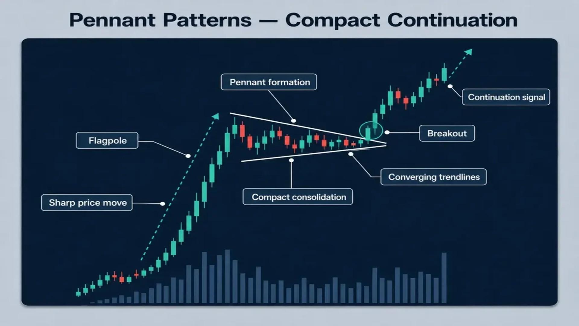
5. Symmetrical Triangle
The symmetrical triangle develops when price creates lower highs and higher lows at the same time.
The result is a narrowing range.
A symmetrical triangle is not a favoring triangle as in an ascending or descending triangle – it just is.
That's what makes it particularly interesting.
What the Pattern Represents
- A symmetrical triangle often reflects a period of market indecision.
- Buyers are willing to purchase at increasingly higher lows.
- Sellers are willing to sell at increasingly lower highs.
- Eventually, one side gains enough strength to push price outside the structure.
- A breakout can occur in either direction.
6. Bull Flag and Bear Flag
Flags are popular because they combine a strong directional move with a short consolidation period.
Bull Flag
A bull flag is typically formed following a strong bull rally.
Price then retraces back in a relatively narrow down or sideways channel.
The strong initial movement is sometimes called the flagpole.
If price breaks upward from the consolidation, traders may interpret it as continuation of the previous bullish trend.
Bear Flag
A bear flag works in reverse.
Price breaks down with a sudden pause in the upward or sideways channel.
A bearish breakdown can indicate a resumption of the bearish trend.
What could be more useful than a flag?
Flags can help traders avoid chasing a large initial move.
Instead of entering after a stock has already jumped substantially, a trader may wait for a consolidation structure to develop.
That can create a more clearly defined area for:
- Entry
- Stop placement
- Risk calculation
- Breakout confirmation
Still, not every consolidation after a strong move is a valid flag.
The larger trend and quality of the breakout matter.
7. Cup and Handle
The cup and handle is another widely recognized bullish formation.
It resembles the shape of a rounded cup followed by a smaller consolidation called the handle.
Cup Formation
The cup generally forms through a gradual decline, stabilization, and recovery toward the previous resistance area.
Unlike a sharp V-shaped reversal, the cup tends to have a more rounded appearance.
The right side eventually approaches the high established before the decline.
Handle Formation
Once the price reaches the previous resistance level it could consolidate or pull back slightly.
This creates the handle.
A breakout over resistance to deals could underwrite capacity continuations.
What makes it stronger?
Traders may look for:
- A well-defined rounded base
- A relatively controlled handle
- Reduced selling pressure during the handle
- A decisive breakout
- Supporting volume
The pattern can take considerable time to form. A tiny formation on a five-minute chart shouldn't automatically be treated as equivalent to a major pattern developing over several months.
Time frame changes the significance of the structure.
The Role of Candlelight Patterns
Chart building shows a larger structure, while individual candles can provide information about stress and amplification of short-term trading.
A candlestick pattern can help investors look at how fees have behaved at particular lengths at a particular level.
Common formations include:
- Doji
- Hammer
- Shooting star
- Engulfing candle
- Morning star
- Famous in the evening
For example, a bullfighting specimen visible near the primary support can provide additional context for a two-rib setup.
However, candles must be interpreted within their setting.
Conclusion
Here, the blanket seven chart styles – head and shoulders, double top and bottom, ascending triangle, descending triangle, symmetrical triangle, flag and cup and dealing with formations – provide buyers with a concrete framework for analyzing market behavior.
But identifying samples is not enough.
The strongest approach is to combine chart structure with charge momentum analysis, guidance and resistance, volume, multiple time frames, market context, and disciplined threat management.
It is mainly important in 2026, while market spending can respond quickly to income, economic release, hobby rate expectations, and geopolitical developments.
FAQ's
What are stock market chart patterns?
Stock market chart styles have recognized authorities created using price movements over the years. Traders use them to observe capacity continuations, reversals, consolidations, breakdowns, and breakout conditions.
Which chart view is high quality for beginners?
Double tops, double bottoms, triangles, and flags can be surprisingly clean for beginners to understand. However, no sample is guaranteed for images, so beginners should have recognition of placement and chance management as opposed to trying to find the "best" sample.
Are chart patterns reliable?
While chart patterns can provide a useful framework, they are not predictions with truth. Their use depends on context, assumptions, market conditions, liquidity and risk management.
Should traders use volume with chart patterns?
Volume can be useful because it provides information about market participation. A breakout supported by stronger volume may appear more convincing than one occurring on unusually low activity, although volume should not be treated as a standalone signal.