The big picture for Gold and Silver could not be more positive

When considering any investment, it is important to step back and gain a “big picture” perspective on where it stands in its life cycle. Like living things, companies go through an establishment phase, a growth phase, a mature phase, and eventually a declining phase. At the end, they either reinvent themselves or die.
On a commodity or stock chart, the establishment phase usually corresponds to a long period of basing before a bull market begins. The growth phase is the bull market itself. For highly successful companies such as Coca-Cola or McDonald’s, this can last for years or even decades.
The mature phase often involves a topping pattern as competitors threaten the company or its products and services fall out of fashion. Finally comes the declining phase, when the stock enters a bear market, often alongside falling market share or profits.
We can simplify this into four stages:
- Stage 1: The basing phase.
- Stage 2: The growth phase.
- Stage 3: The topping phase.
- Stage 4: The declining phase.
The reason for this preamble is that gold and silver’s very long-term charts reveal a similar cycle. Unlike companies, these metals are not born and do not die. But their prices move through these four stages, which subsequently repeat.
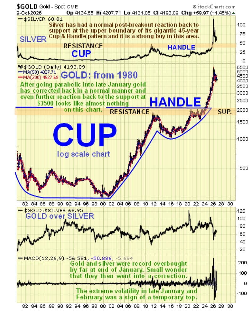
On gold’s very long-term chart, stretching back to about 1981, we can see that its great 1970s bull market was followed by a severe Stage 4 bear market lasting until about 1985. Although gold made lower lows in 1999 and 2001, it was essentially in a Stage 1 basing pattern from the mid-1980s through 2001.
It then began a massive Stage 2 bull market. In this interpretation, even the major correction from its 2011 peak was a prolonged pause in that ongoing bull market, which regained traction early in 2024.
Here is the crucial point: with most fiat currencies on course to become virtually worthless under the weight of insurmountable debt, all the price action from 1980 through early 2024 can be viewed as a gigantic Stage 1 cup-and-handle base. Gold broke out of that pattern in 2024, beginning an unprecedented Stage 2 bull market.
Viewed this way, gold has the potential to fly off the top of this chart and reach much higher levels. Its correction from the late-January peak has been relatively small compared with the preceding advance.
A return to support at the top of the giant cup-and-handle pattern appears highly unlikely under this interpretation. Such a move would also suggest that silver could fall below support at the top of its very similar pattern.
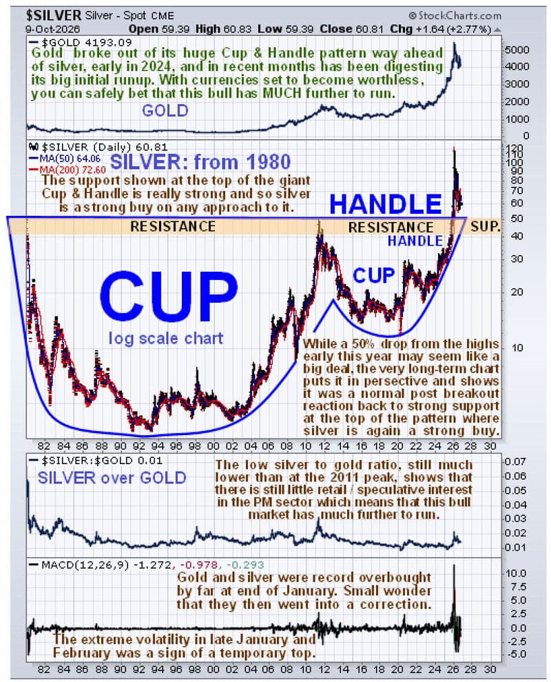
Silver’s very long-term chart, also stretching back to about 1981, is almost identical to gold’s. The main difference is that silver did not advance as far above its massive cup-and-handle pattern. It has now pulled back close to the pattern’s upper boundary.
This is normal in the earlier stages of major precious metals bull markets, when gold tends to perform best. Silver really shines in the later stages.
The silver chart provides valuable guidance. It is now at or near the point where it should begin another major advance—and such a move would likely be accompanied by renewed strength in gold.
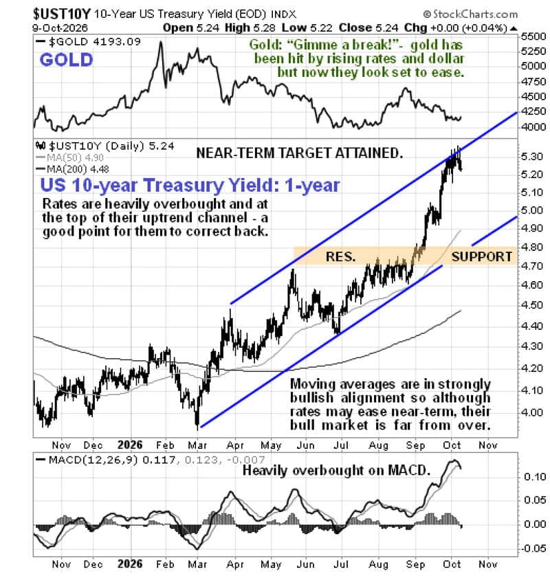
The good news extends beyond the big picture. The short-term outlook also looks positive because both the dollar and interest rates appear poised to pull back after their sharp gains in recent weeks.
Starting with the one-year chart of the 10-year U.S. Treasury yield, we can see that it remains heavily overbought near the upper boundary of its orderly uptrend channel. It is therefore likely to consolidate for a while, or more probably retreat across the channel.
That would provide a favourable backdrop for the precious metals sector to advance again after its recent decline.
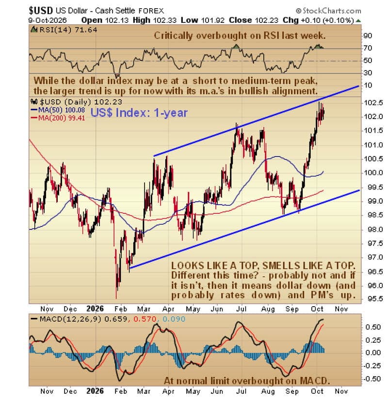
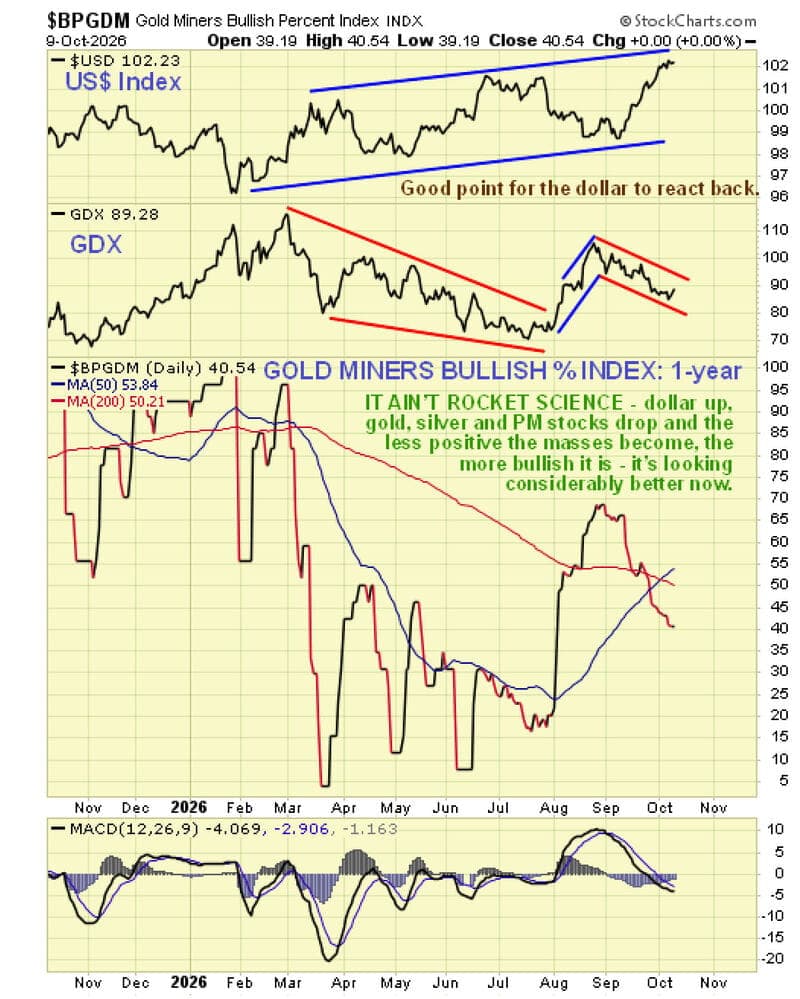
The surge in U.S. interest rates has helped drive the dollar index higher. But the dollar, too, is sputtering near the upper boundary of its intermediate uptrend channel and looks poised to retreat.
Could it simply keep climbing? Anything is possible, but the graveyards of Wall Street are full of people who thought, “It’s different this time.”
Now consider a positive development for the precious metals sector that has been many years in the making.
Longtime investors and mining executives will recall the appalling underperformance of gold and silver stocks relative to the metals from about 2008 through early 2016. Interest in the sector fell to abysmally low levels.
Fast-forward to today. With all-in sustaining costs (AISC) for many producers well below current and recent gold prices, these companies are making money “hand over fist” and reporting stellar results.
Many investors have yet to fully appreciate this, but that is beginning to change. As more recognize the profitability of these companies, mining stocks should increasingly reflect that reality.
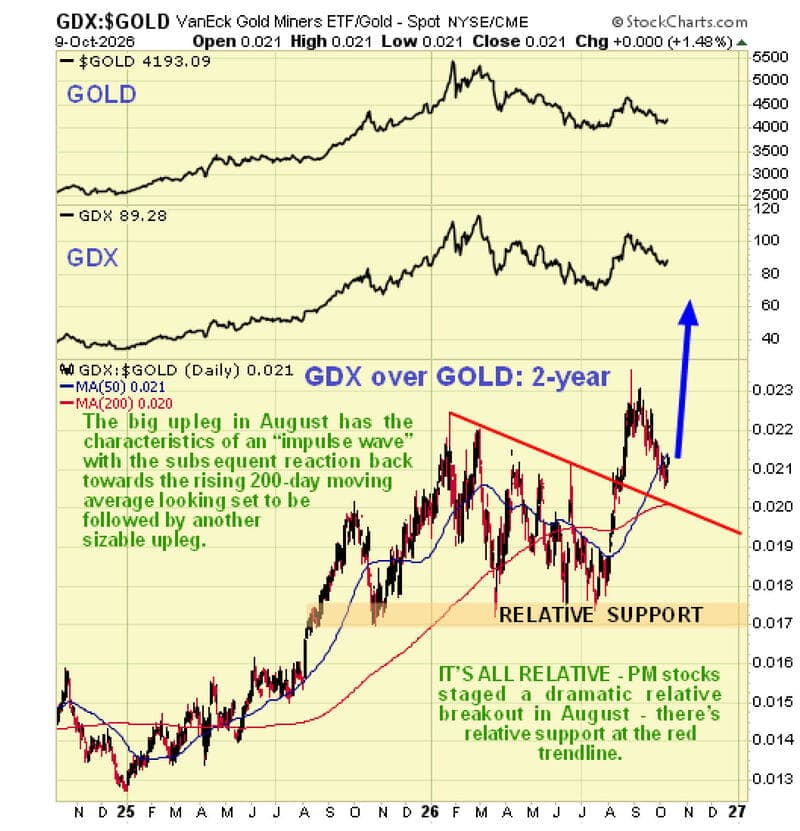
The process has already started. On the latest two-year chart of the GDX-to-gold ratio, August’s sector breakout pushed the ratio to clear new highs. In other words, mining stocks began outperforming gold on a proportional basis.
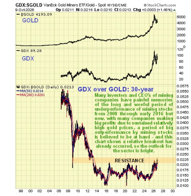
This could be just the beginning. The long-term GDX-to-gold chart shows that a giant relative base formed after gold stocks’ prolonged underperformance from 2008 through early 2016. The ratio has only begun breaking out of that base this year.
The chart suggests that gold stocks may be preparing for a long-awaited period of outperformance. If the ratio returns to its mid-2000s levels, the potential gains for gold stocks would be substantial.
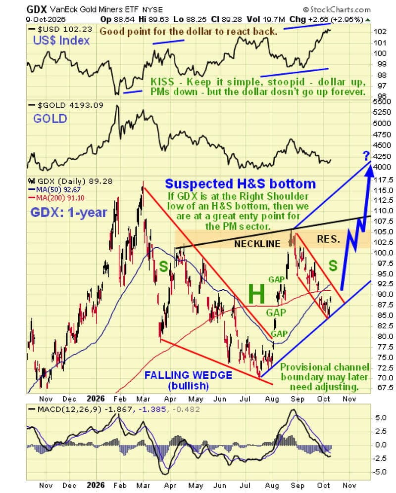
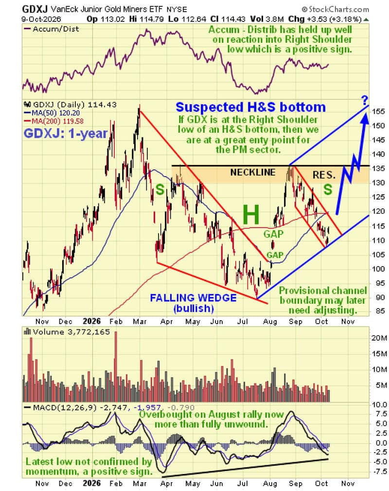
With that backdrop, consider the one-year charts of the VanEck Gold Miners ETF (GDX) and the VanEck Junior Gold Miners ETF (GDXJ).
Both broke decisively higher in August from strongly converging, bullish falling-wedge corrections that began after their late-February highs. The miners had peaked slightly later than gold itself.
Strong advances followed, including bullish gaps on heavy trading volume. The subsequent pullbacks look normal and proportionate. They also coincided with the steep gains in the dollar and interest rates, which now appear to have largely run their course.
The declines from late August in GDX, GDXJ, and several individual stocks may be forming the right shoulders of head-and-shoulders bottoms, as marked on the charts.
If this interpretation is correct, we are at an excellent point to buy the sector or add to existing positions.
Over a month ago, the Gold Miners’ Bullish Percent Index stood near 68%—a reading we did not like, suggesting that “too many dummies are getting rich.”
It has since moderated to a more reasonable 40.5%, opening the door to a renewed advance.
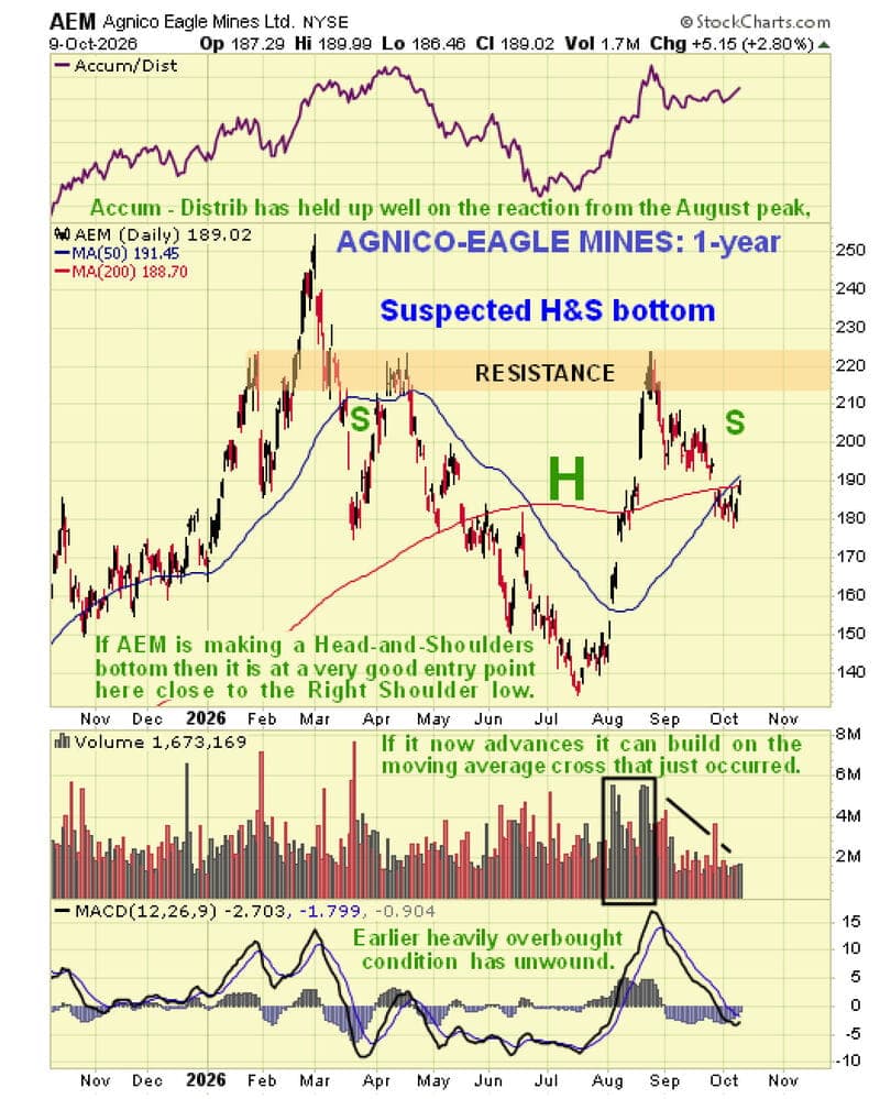
As a practical example, consider the one-year chart of major gold miner Agnico Eagle.
The chart shows what appears to be a developing head-and-shoulders bottom. Heavy volume on the advance forming the right side of the head strengthens this interpretation.
So does the buoyant accumulation line at the top of the chart, which has held up well during the pullback from the late-August peak.
One fundamental development could provide an immediate boost: Trump’s sudden conciliatory moves toward Putin and Russia.
Trump said Ukraine’s leader was responsible for prolonging the war and that Russia could export much-needed diesel to the United States without penalty.
This shift could help defuse tensions and lower oil prices. It could also encourage a temporary retreat in the dollar and interest rates, providing a tailwind for the precious metals sector.
To receive free commentary and analysis on the gold and silver markets, click here to be added to the Money Metals news service.
Author

Money Metals Exchange
Money Metals Exchange
Now you can safeguard your assets from financial turmoil and the devaluing dollar – without paying costly middleman mark-ups or fending off high pressure, bait-and-switch sales tactics.