More on Picturing the Greeks in Options
|In last week’s article, about visualizing the Greeks in options, we looked at the payoff graph for a potential option trade on XOP. I said that that graph had more to tell than we had space for there. Today we’ll look at that a little more.
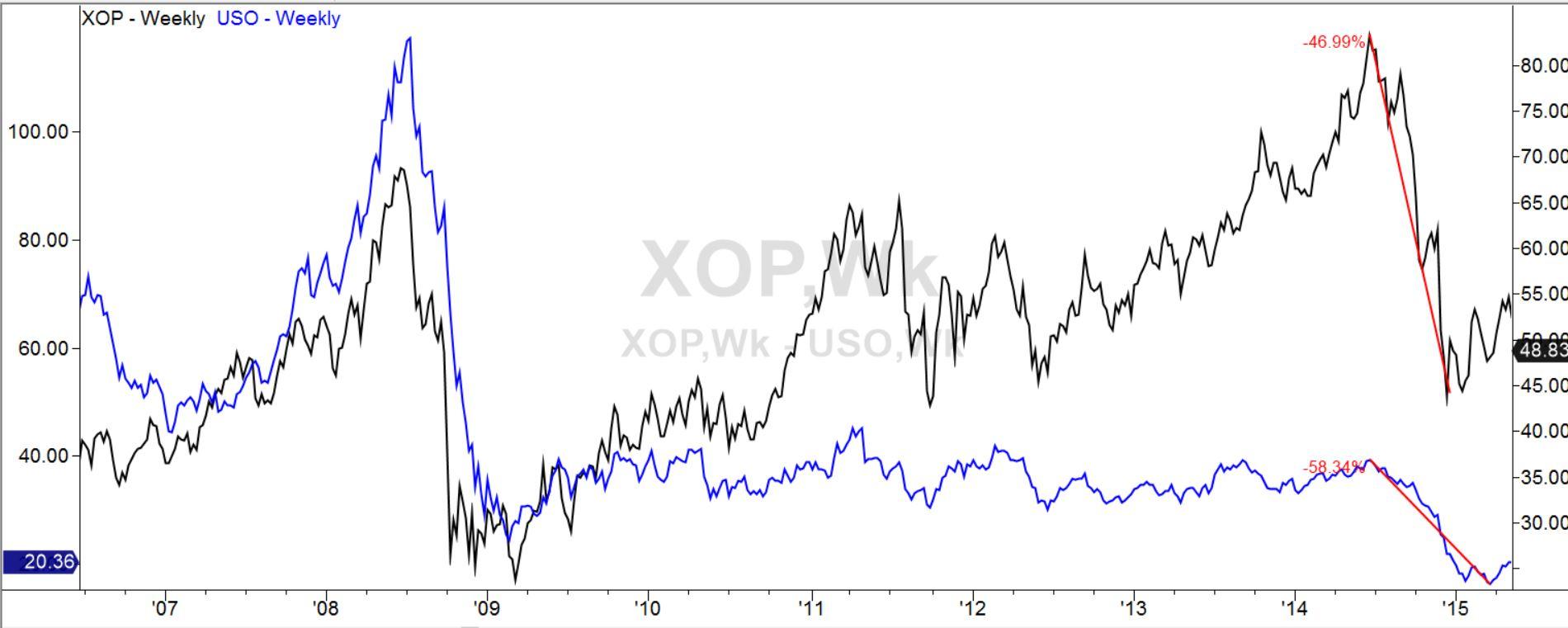
XOP is an oil-related exchange-traded fund. It largely tracks the price of oil. But unlike the fund USO, which does so by holding oil futures contracts, XOP owns stock in oil exploration companies. Over time, it has shown itself to be a bit less of a wild ride than USO, just a little less dizzying in the upswings and marginally less terrifying in the downswings. Here is a comparative chart of XOP and USO:
XOP has been somewhat more resilient, standing 33% above where it was in 2006, compared to USO, which has lost 70% of its value in that time. In the recent oil crash XOP lost 47% of its value while USO lost 58%. XOP pays a small dividend yield of about 1.3%, while USO pays none.
If we believed that oil has bottomed out in price and is likely to advance from here, then XOP could give us a way to benefit from that with a bit less drama than USO.
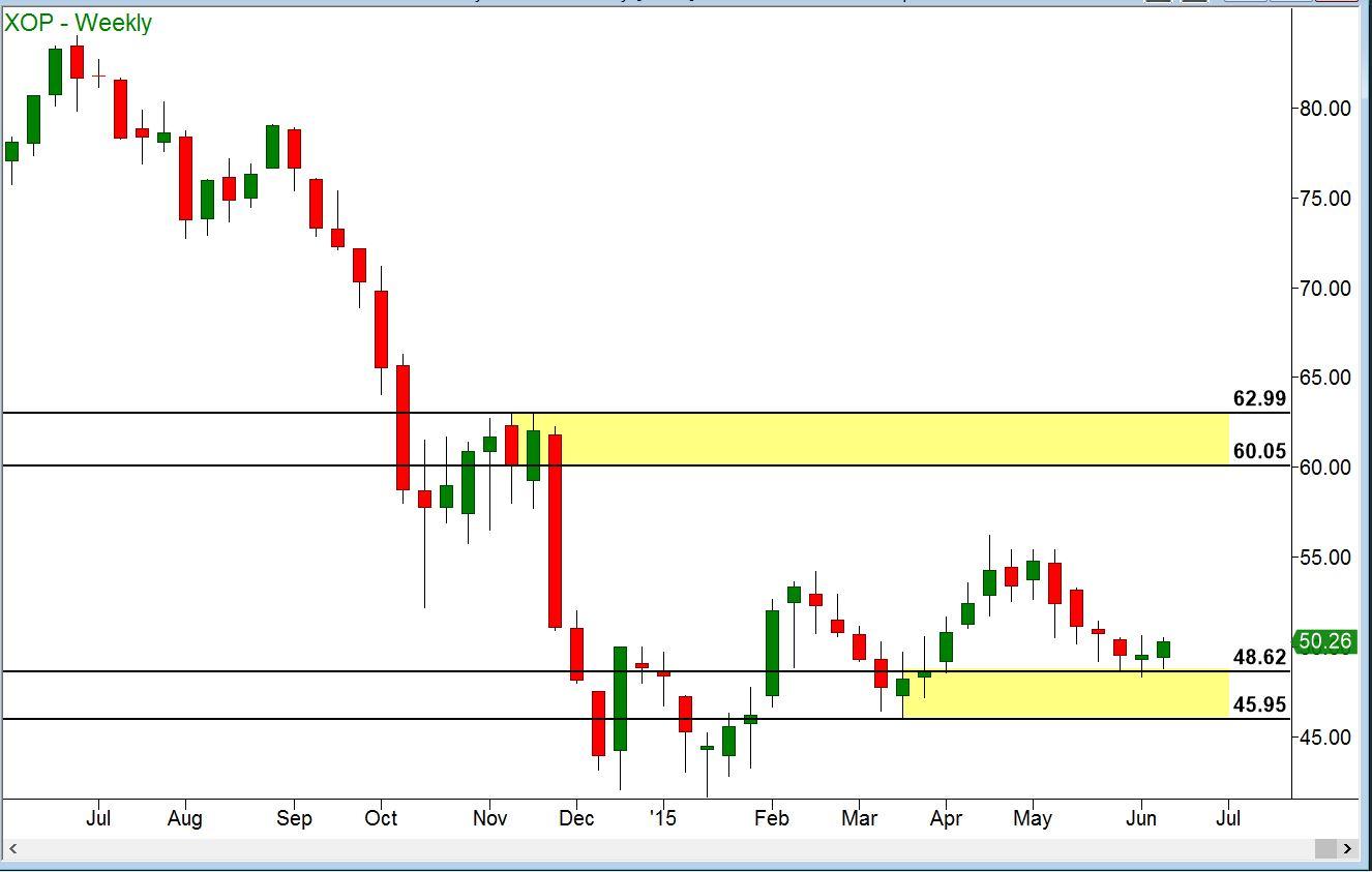
Last week I showed a chart of XOP alone, which appeared as follows.
We looked at the payoff graph of a 50-strike call on XOP:
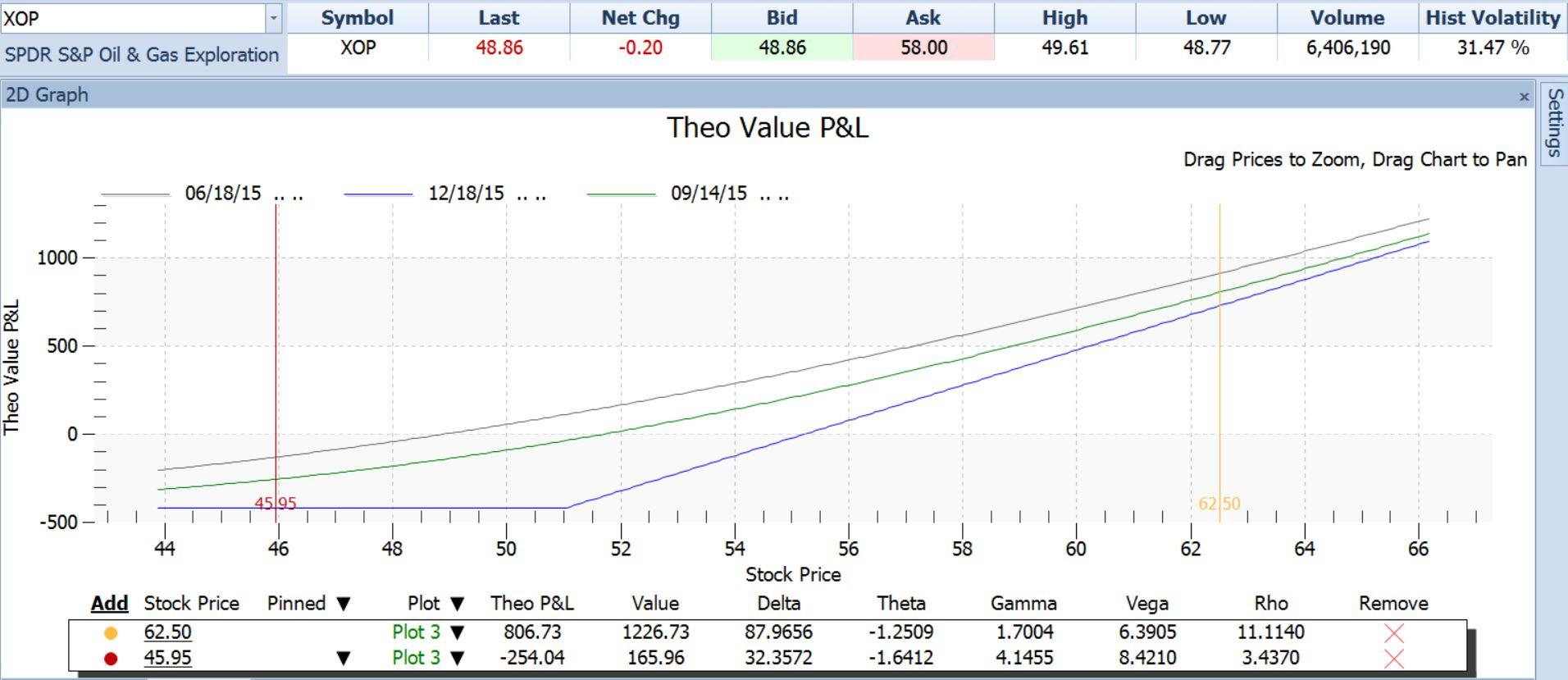
The chart and its associated table tell us that if XOP were to make it to a near-term target of $62.50 in the next three months, then this call option could make a profit of $806.73 per contract (the cost of the call option was $420). If XOP dropped below its recent low of $45.95, the value of our $50 call would be expected to drop to $165.96. We would sell the calls and take our loss, which would amount to $254.
Note that these estimates are possible even though we are talking about prices and dates quite different from where we are today. The reason we are able to compute those future prices is because of the Greeks.
- We know the effect of stock price movement on the call because of the combination of the Greeks Delta (ratio of call price change to stock price change for the next $1.00 increase) and Gamma (rate of change in the Delta as price continues to increase). Delta and Gamma together account for the upward slope of the P/L graph.
- We know the effect of the passage of time on the call – this value is given by Theta. By incorporating Theta into the drawing of the P/L curves, we are able to see how this position would look not only at any stock price, but also at any future time between now and expiration. In the graph above, the blue straight lines show what the P/L would be at any stock price as of the December expiration day. The gray line shows what the P/L would be at any stock price if it were reached today. Note that the gray line is higher at every point than the blue (expiration) P/L line. The difference is due to the erosion of the option’s value as it approaches its expiration. We have also plotted another P/L curve, the green line, at an intermediate time, three months away at September 14, 2015. The three lines together show us visually how time affects this position.
Having taken into account stock price movement (Delta, Gamma) and time passing (Theta), there is just one of the three main forces left unaccounted for in the payoff graph so far. That is changes in investors’ expectations. If they come to believe that XOP will move faster, they will pay more for its options. If they think it will slow down, then they will pay less.
We can incorporate this as well. The Greek named Vega shows the effect on an option’s price of changed market expectations. The price at which an option is actually trading can be translated into an expected rate of volatility. Right now, for example, XOP’s option prices are indicating an expected volatility rate of 28% per year. This expected volatility rate, called implied volatility, has varied over the last year between 20% and 61%, so the current 28% reading is on the low side. The Greek called Vega allows us to estimate what would happen to our $50 strike call if implied volatility were to go back to the middle of its range, say to 40% (halfway between 20% and 61%).
By dialing in this hypothetical increase in volatility, we can generate new P/L curves like so:
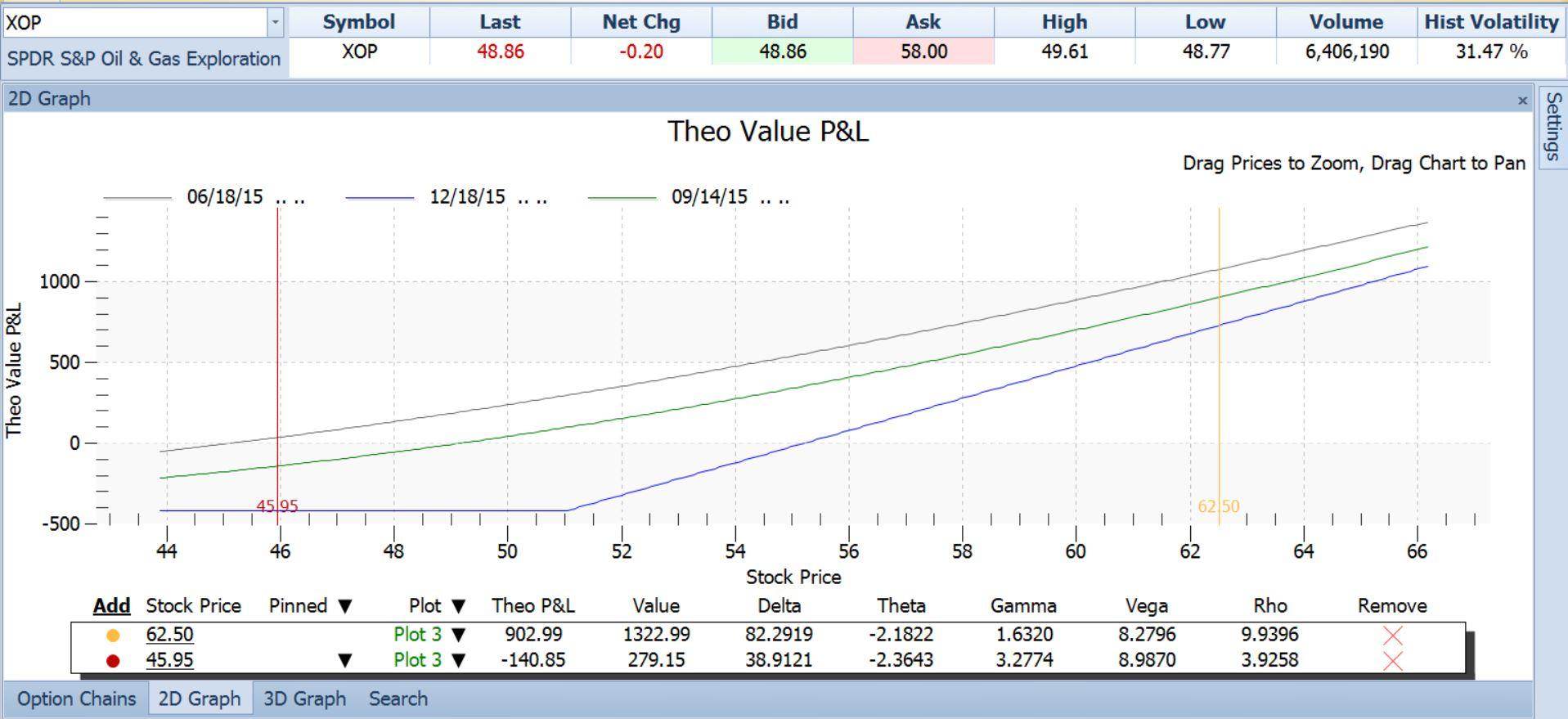
If such an increase in implied volatility were to occur, the new lines above show a healthy increase in our profit potential. Our profit at our $62.50 target rises to $903, while our loss at our $45.95 stop-out price goes down to just $140.
So, using the Greeks via a software tool that is user-friendly and intuitive (once you get the hang of it), we can make very detailed estimates of how this trade will behave under different conditions.
The payoff graph is a powerful tool in the right hands. It saves us enormous amounts of time and allows us to concentrate on the real keys to option Profits: finding stocks on whose direction we have confident opinions, and identifying stocks where expectations are out of line.
Information on these pages contains forward-looking statements that involve risks and uncertainties. Markets and instruments profiled on this page are for informational purposes only and should not in any way come across as a recommendation to buy or sell in these assets. You should do your own thorough research before making any investment decisions. FXStreet does not in any way guarantee that this information is free from mistakes, errors, or material misstatements. It also does not guarantee that this information is of a timely nature. Investing in Open Markets involves a great deal of risk, including the loss of all or a portion of your investment, as well as emotional distress. All risks, losses and costs associated with investing, including total loss of principal, are your responsibility. The views and opinions expressed in this article are those of the authors and do not necessarily reflect the official policy or position of FXStreet nor its advertisers.