Picturing Option Profits Part 6 – What If?
|This is the sixth and last in a series of articles about option payoff diagrams. The previous articles were part 1, part 2, part 3, part 4 and part 5.
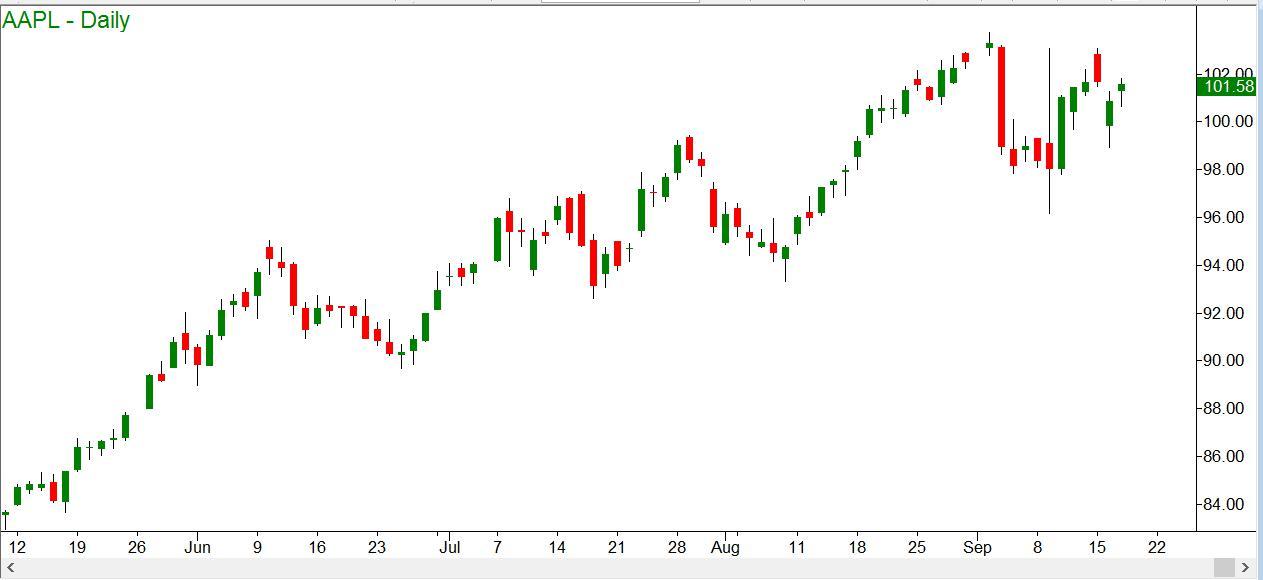
In last week’s installment, we looked at an example of a Vertical Call Spread on Apple stock. Here is the price chart as it appeared then:
Assuming a bullish outlook, we could at that time have put on a Bull Call Spread, which is one of the variations of the vertical spread. At that time the October 95/105 call spread could be done as follows: Long 1 October 95 calls at $7.20 and short one October 105 calls at $1.25. The net debit was $595 per contract. Here is the diagram as it looked then:
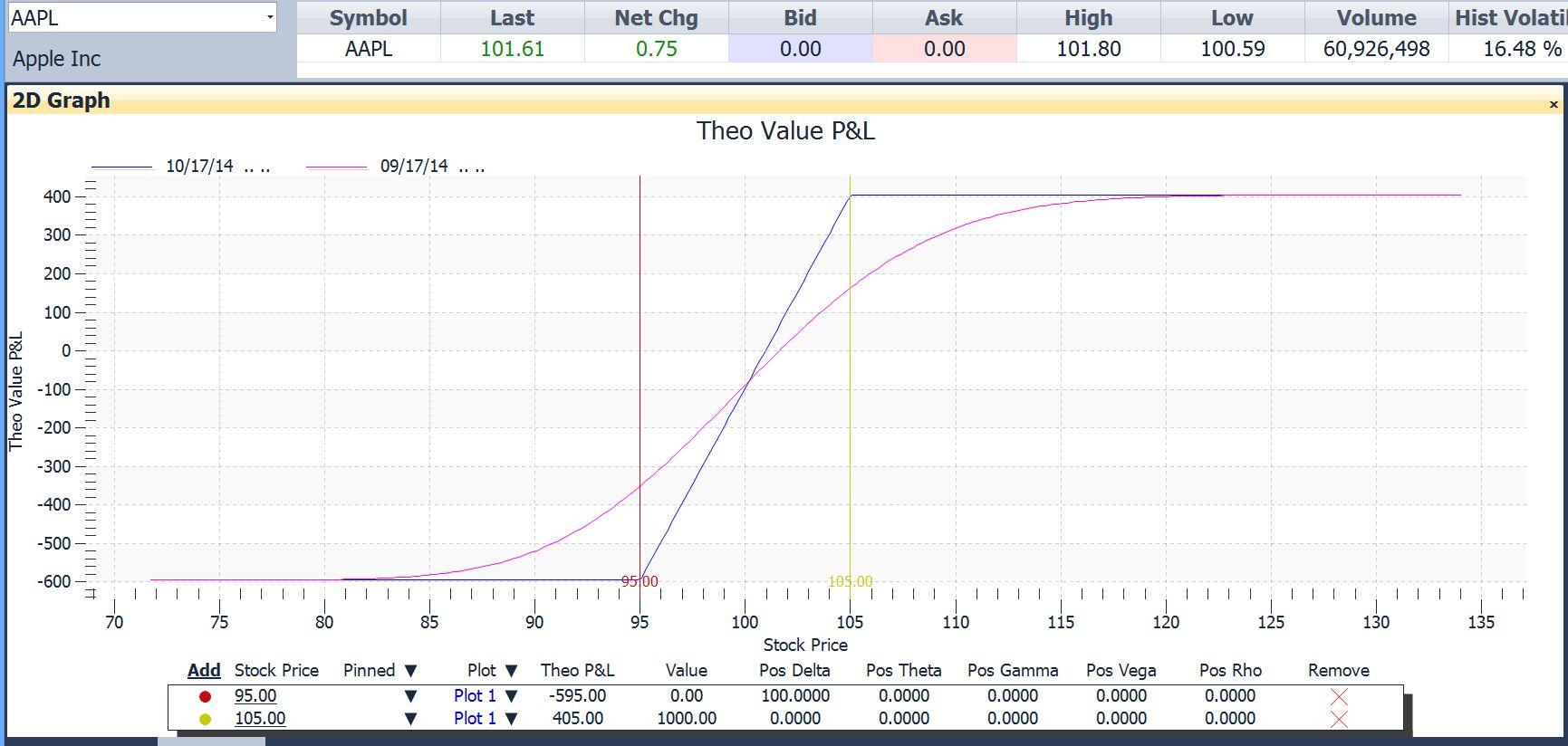
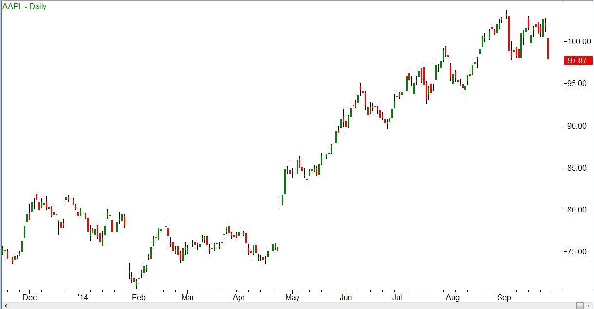
A week later, Apple had dropped a bit, from $101.61 to $97.87 by the close. In after-hours trading it had recovered a bit, to $98.27.
The price chart now looked like so:
The stock had dropped, and was not too far from a previous low at $96.23. Assuming that we were still bullish (which is getting to be a harder assumption to make), we would want to place a stop around that $96.20 level.
A diagram of the 95/105 bull call spread now appeared like this:
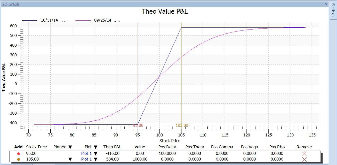
Using the payoff diagram, we can answer some what-if questions, like these:
- If Apple drops to my stop level at $96.20 – How much would I lose if it happened today? What if it didn’t happen until expiration?
This is easy to answer by placing a marker at that $96.20 price, as in this version:
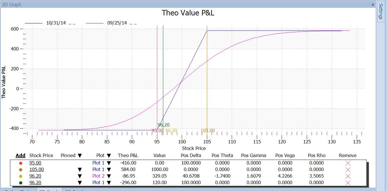
From the table under the chart, we can see that if that happened today, we would have a loss of $86.95 (next to last row, Theo P&L column). If the trade tortured us by waiting until the last minute to hit that stop, our loss would be $296.00 (last row). The difference is the net time value that we own today.
In the same way we can see what the effect would be of Apple reaching the $105 target, by placing a marker there:
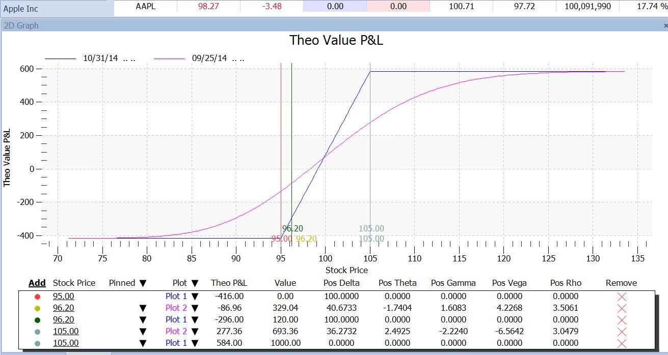
Now we can see that at the $105.00 target, this trade would make $277.36 if it happened today; and if it took until expiration, it would make $584.00, which is twice as much. Also, following that magenta line upward, we can see that it doesn’t hit the maximum P/L mark today unless Apple goes to $125.
This might be kind of curious until we think about it. Why is it a good thing that the trade ends soon if it goes against us, but better if it takes longer if it goes our way?
The answer here can be seen from the fact that the current P/L line (magenta) is above the expiration P/L line (blue) at stock prices below $100. In that range, the $95 long call has more time value than the $105 short call, so we are net long time value. But at stock prices higher than $100, the opposite is true. When the stock price leaves the $95 strike behind and rises toward the $105 strike, the $95 call goes further and further into the money. It gains intrinsic value, but actually loses time value. Meanwhile, the $105 call transitions from being very far out of the money to being close to the money. So it gains time value. At some point the $105 short call has more time value than the $95 long call. At that point, we become net short time value. From that price upwards, the passage of time no longer hurts us, and instead it helps us.
Furthermore, at prices that are high enough ($125), the blue and magenta lines merge. That tells us that if that price were reached today, the $105 call itself would be so far in the money that it would no longer have any time value either. At that point, there would be no time value in either option, and each would be worth just its intrinsic value. The intrinsic value of our long $95 call would be stock price – strike price = $125 – $95 = $30. That of the short $105 call would be would be $125 – 105 = $20. So the net value would be $30 – $20, or $10 per share.
As each day goes by, the magenta “current P/L” line moves toward the blue “expiration P/L” line. If we want to see the effect of that at some intermediate time, we can add another plot, which is as of a different time – say 2 weeks away. Here is what that looks like:
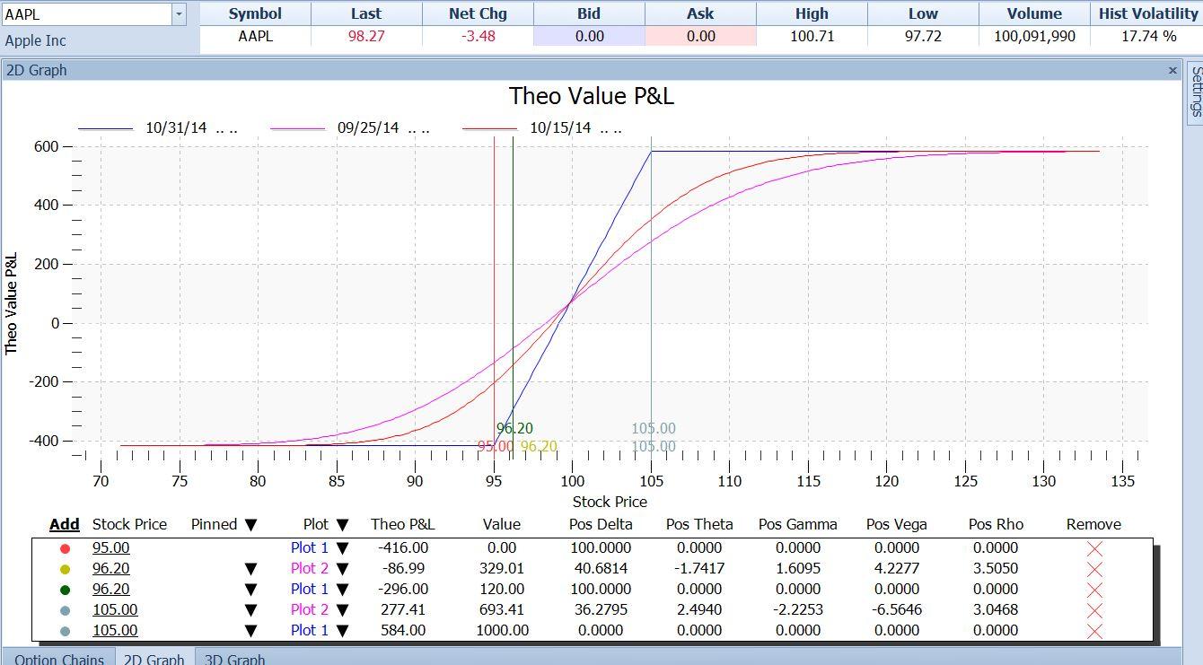
The red line now shows that the farther out in time we are, the nearer the price at which we make our maximum profit.
I hope this series has stimulated you to look into the uses of the option payoff diagrams for your option trading. The more you use them, the more invaluable you will find them.
Information on these pages contains forward-looking statements that involve risks and uncertainties. Markets and instruments profiled on this page are for informational purposes only and should not in any way come across as a recommendation to buy or sell in these assets. You should do your own thorough research before making any investment decisions. FXStreet does not in any way guarantee that this information is free from mistakes, errors, or material misstatements. It also does not guarantee that this information is of a timely nature. Investing in Open Markets involves a great deal of risk, including the loss of all or a portion of your investment, as well as emotional distress. All risks, losses and costs associated with investing, including total loss of principal, are your responsibility. The views and opinions expressed in this article are those of the authors and do not necessarily reflect the official policy or position of FXStreet nor its advertisers.