Using Volume Alternatives
|After last week’s article I received several emails asking me to expand on the topic of volume and tick charts. Since they are unfamiliar for many traders, I decided to dive deeper into the topic. These types of chart can be really useful to increase your chances for success.
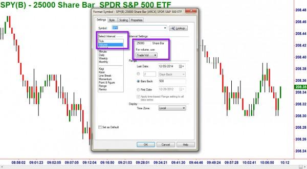
First, in order to create the tick charts, you must format your chart. There is no exact number to use for the size of the chart, you will have to use larger numbers for higher volume stocks and lower for light volume stocks.
In the “Interval” section, the “tick” refers to the number of trades made, not the size of each trade. I have chosen the “Volume” interval so that each candle is based on the shares traded, not just the number of trades.
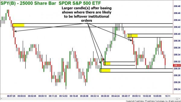
Now, when using the chart to find quality levels of supply and demand, you must think like an institution, not a retail trader. Most traders incorrectly believe that they should be looking for high volume to confirm trends and also for entering trades. This makes no sense if you think about it.
Supply and demand zones work as entry and exit points because there are leftover orders from the institutions. This would imply that we are looking for a large candle leaving an area of basing. In the example of a demand zone, this would mean that we left that area with very few buy orders being filled and no sell orders holding price down. There would likely be a lot of leftover buy orders to cause prices to bounce if they return to that zone.
The same would help find a supply zone. You would want to find a zone where we left a basing with a large red candle. Prices moved fast with only a few sell orders being filled. There was a lack of buy orders in that zone and if prices return, the remaining sell orders that were not filled should cause price to drop quickly.
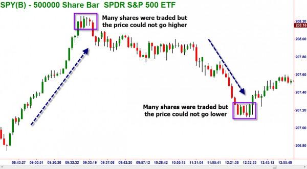
The volume charts can also assist when looking for the end of a trend. Most novice traders have been taught to look for an increase in volume to sustain a trend. This is also counterintuitive. When the volume increases it means that all of the traders who were interested in joining the trend have done so. The trend will only continue if there is renewed interest and new orders coming into the market.
A sign of trend weakness in volume tick charts would be when you see several small candles together. Remember that each candle is volume based, not time based. A small candle or one with no body, (doji) means that there is enough opposing pressure to halt the trend. This could be a pause in the trend or if it occurs at a zone of supply or demand a reversal of the trend itself.
Information on these pages contains forward-looking statements that involve risks and uncertainties. Markets and instruments profiled on this page are for informational purposes only and should not in any way come across as a recommendation to buy or sell in these assets. You should do your own thorough research before making any investment decisions. FXStreet does not in any way guarantee that this information is free from mistakes, errors, or material misstatements. It also does not guarantee that this information is of a timely nature. Investing in Open Markets involves a great deal of risk, including the loss of all or a portion of your investment, as well as emotional distress. All risks, losses and costs associated with investing, including total loss of principal, are your responsibility. The views and opinions expressed in this article are those of the authors and do not necessarily reflect the official policy or position of FXStreet nor its advertisers.