Candles or White Space, Where is Your Focus?
|
One thing that has puzzled me over the years when reading what trading books have to offer, books on candlesticks, trading education on the internet, and trading education anywhere for that matter is the main focus of the education. Always, the focus is on the chart and volume. There are books written solely about candlesticks and others that deal only with volume because conventional wisdom says those two contain the most important pieces of the trading decision making process. If we step backwards for a moment and ask ourselves the basic question of how and why prices turn and move in markets, I think you will find that conventional focus is way off.
The goal is to have a rule based strategy that helps you determine where price will turn and where price will move to with a very high degree of accuracy. So, what is the governing dynamic behind price turns and moves? Simple, price turns (changes direction) at levels where supply and demand are out of balance. It will then move until it reaches a price level where there is another significant supply and demand imbalance. So, what does a supply and demand imbalance that causes price to turn look like on a price chart? To answer this question, many would quickly start talking about candlestick patterns and formations and also include volume. Most people suggest you should focus on price levels where there was a turn in the past and to watch for heavy volume, above average volume. This is where the focus gets off track in my opinion. Think about it, at price levels where supply and demand are most out of balance which creates the highest probability turn, is there going to be lots of trading activity or very little? Like anything in life, the more unbalanced an equation or two competing forces are, the quicker and more predictable the outcome is. In a market, the more out of balance supply and demand is at a price level, the less the trading activity will be. What this picture will look like on a price chart is not heavy trading activity and above average volume like all the trading education promotes, it’s actually the opposite.
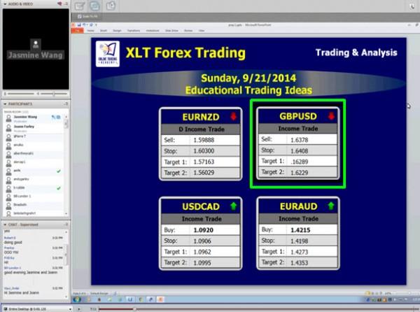
To illustrate what I am talking about, let’s look at a trading idea that was given to our students inside our live trading rooms, the XLT (Extended Learning Track). This was from September 21st, last week in our live Forex trading room. Each session begins with the information you see below in the screenshot of the live session. We give students trading ideas based on our core supply and demand strategy. We give them the entry, protective stop, and profit target at the beginning of the sessions. The trade setup here was to sell short the GBPUSD at supply for a move lower.
GBPUSD – The Live Setup (9.21.2014)
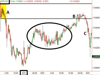
The chart below is the result which worked out well. “A” represents supply (banks selling) as we have a “Rally – Base – Drop” which shows supply exceeds demand. “B” is the time to sell short as you are selling to a buyer who is paying retail prices, just before price is most likely to decline. “C” is the profitable price decline for those who took the trade during that live trading session. However, notice the circled area on the chart which is the focus of this piece. Conventional Technical Analysis would suggest you should not sell short at “B” because there is so much trading activity below which will make a price decline challenging. Many traders would look at all that trading activity in the circled area and not sell short at “B” because they would not think price could fall through that area. Again, to me, the focus and understanding is way off. The fact that there was so much trading activity in that circled area tells me price is very likely to fall through that level and should do so with ease. If supply and demand were really that much out of balance in that area, you would not have so much trading activity. Price proceeded to fall through that area after “B” which was expected if your focused on the right logic. In summary, the major price turns in a market don’t typically happen at price levels where there is lots of trading activity, it’s the opposite. When looking for this on a price chart, don’t focus on levels surrounded by lots of pretty candles. The focus should be on price action mainly surrounded by white space.
GBPUSD – The Result
So why has this puzzled me for so long? Because when you break a solution to a challenge down logically, the answer is typically so simple, Occam’s Razor. My experience on a trading floor years ago dealing with order flow from banks, institutions, money managers, and so on made this basic concept I am writing about today very clear for me. All I did was train my eye to see this on a price chart which now allows me to share the information with you.
Hope this was helpful, have a great day.
Information on these pages contains forward-looking statements that involve risks and uncertainties. Markets and instruments profiled on this page are for informational purposes only and should not in any way come across as a recommendation to buy or sell in these assets. You should do your own thorough research before making any investment decisions. FXStreet does not in any way guarantee that this information is free from mistakes, errors, or material misstatements. It also does not guarantee that this information is of a timely nature. Investing in Open Markets involves a great deal of risk, including the loss of all or a portion of your investment, as well as emotional distress. All risks, losses and costs associated with investing, including total loss of principal, are your responsibility. The views and opinions expressed in this article are those of the authors and do not necessarily reflect the official policy or position of FXStreet nor its advertisers.