Proper Trading Questions Lead To Proper Answers
|What I always find fascinating are all the different ways people look at charts and all the different pieces of information they try to attain from a price chart. With all the different schools of thought on money, markets, charts, and so on, what should we really be looking for in a price chart? I mean, conventional technical analysis books have hundreds of pages in them with information on so many indicators, oscillators, chart patterns, and more. With all this, there must be some edge to be gathered, right? I speak with thousands of traders around the world and everyone is trying to make something “work.” This is where I see most people are off track. They spend more time trying to make the latest strategy or indicator “work” instead of taking a moment and “thinking” about how money is made and lost in the markets because after all, isn’t that what all the “work” is for?
Let’s go down the simple logic path for a moment and ask ourselves a few questions to make sure we are very focused on what information we need to get from a price chart.
Question: How are profits derived when trading a market?
Answer: Buy low and sell higher or sell high and buy lower.
Therefore…
Question: How do we buy low and sell high?
Answer: Figure out where price will turn and where it will go.
Therefore…
Question: How do we figure out where price will turn and where it will go?
Answer: Identify where willing demand exceeds willing supply and vise versa.
Lastly…
Question: What does this look like on a price chart?
When we think in these simple terms, we see that the last question is all we need to focus on and the good news is, we have the answer. Beyond these questions, there is literally nothing else needed to consider when it comes to proper trading and investing but most people don’t ever get to this level of simplicity because they are blinded by the illusion of complexity offered by the world of conventional technical and fundamental analysis. Let’s look at a recent trading opportunity from our Supply and Demand grid, a daily service for our Mastermind Community members where we deliver supply and demand levels in the major markets each day. I want to share a thought today that will help you increase your winning percentage and show you how to get this crucial, yet simple information from the price chart.
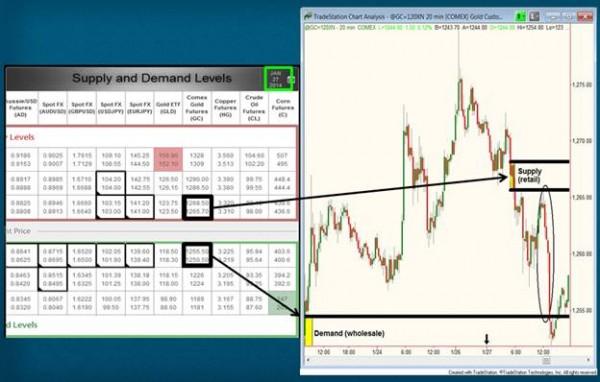
OTA Supply/Demand Grid, Jan. 27, 2014 GOLD (GC) – Jan. 27, 2014
Increasing Your Winning Percentage
When we measure the distance from our entry price into a market to the stop loss price and compare that distance to our profit target, we get our “risk/reward” ratio. For example, “I am risking 2 points to make 6.” Of course the ultimate risk is the amount of money you are willing to lose and to determine what that number is, we always need to adjust position size depending on the distance from our entry to stop loss price. Wouldn’t it be nice to be able to look at a price chart and quickly see 3:1, 5:1, and so on? We can…
Notice the supply level of 1265.50 – 1268.50 on the supply/demand grid above, the morning of January 27 (last week). This supply zone was a 3 point range. After adding a point for the stop, the distance from entry to stop was 4 points. That day, price rallied up to our level and gave our members an opportunity to sell short. However, no matter how good the supply zone is, we must have a clear profit zone that offers us at least 8 points (2:1 reward to risk). Notice the first demand zone on the chart (grid). This was the nearest area of demand below the supply zone. It was 10 points below to be exact. So, the chart was telling us we could risk 4 points that day to make 10. When the chart is telling us we can make 10 points and we only need 8 to make the risk/reward work, that makes this opportunity very high probability. Therein is my nugget of information for you:
If you’re looking for 2:1, make sure the chart is offering at least 3:1. If you’re looking for 5:1, make sure the chart is offering you at least 6:1, and so on… Make sure the chart is offering you more than what you are looking for and enjoy a higher winning percentage.
When the chart is offering 3:1 and you take your profit at 2:1, your odds of achieving your profit target are dramatically increased. You see, the chart gives you all the information you need, if you know what you’re looking for. You first however have to know what you’re looking for and then how to identify it on a price chart. Don’t let complex illusions created by conventional trading analysis distort what is really a simple picture of willing buyers and sellers. When it comes to “charting”, I’ll take my old color pencils and graph paper over the latest high tech charting package any day.
Hope this was helpful, have a great day.
Information on these pages contains forward-looking statements that involve risks and uncertainties. Markets and instruments profiled on this page are for informational purposes only and should not in any way come across as a recommendation to buy or sell in these assets. You should do your own thorough research before making any investment decisions. FXStreet does not in any way guarantee that this information is free from mistakes, errors, or material misstatements. It also does not guarantee that this information is of a timely nature. Investing in Open Markets involves a great deal of risk, including the loss of all or a portion of your investment, as well as emotional distress. All risks, losses and costs associated with investing, including total loss of principal, are your responsibility. The views and opinions expressed in this article are those of the authors and do not necessarily reflect the official policy or position of FXStreet nor its advertisers.