![]() Andre Gratian
Andre Gratian
Market Turning Points
Market Overview
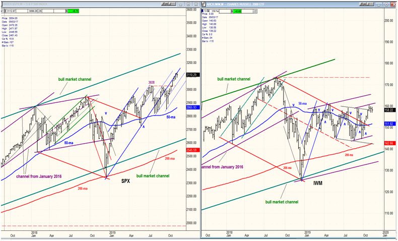
For the past three weeks SPX has been grinding higher, seemingly glued to the exterior of the lower line of the blue channel which started at the 2346 low. That channel line has served as a strong resistance line and, sooner or later, prices are going to fall away from it, potentially indicating the beginning of a correction. This process may have started last week, and we’ll be able to see it more clearly on the daily chart.
On the daily chart, we are also beginning to see that a congestion pattern is starting to form, i.e. that the index has started to trade in a narrow price range which could denote either accumulation or distribution. In this case, many indications point to the latter, suggesting that the next move will be to the downside. Congestion shows up best on a Point & Figure chart and, when complete, we can estimate the extent of the next move. This would most likely be the initial phase of a more extended correction. Only a steady improvement in the relative strength of IWM vs. SPX would suggest otherwise.
Market Analysis (All charts are courtesy of QChart)
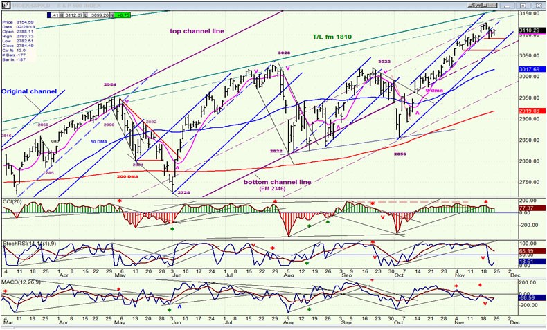
SPX daily chart
Last week, I pointed out that all the blue bullish channels shown on the chart signaled the end of their uptrend in exactly the same manner. First, the price starts to pull away from the top channel line and moves into the lower half of the channel; soon after, the index moves out of the lower channel line, starting a price decline. After the dashed middle line has been broken, there may be a retest of the high, or a slightly new high before the decline begins. In the indicators, negative divergence appears in the CCI, the two lower oscillators become negative, and finally the top oscillator goes negative as the decline begins in earnest. Most of this sequence has already occurred. We could still have a retest of the high followed by a move out of the channel entirely; therefore a little more patience is required.
With regard to cycles, the 80-day cycle turned out to be a dud, only producing a 36-point decline; or it may simply have inverted, producing a high instead of a low. Spending time trying to figure out which would serve no purpose. Instead, our attention should be on when the next reliable cycle due to make its low in early December, toward the end of the first week will start putting pressure on prices.
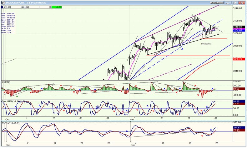
We’ll now move on to the hourly chart where we will see that a retest of the high is a definite possibility.
SPX hourly chart
Since we are looking for a reversal to take place, let’s focus our analysis on the top portion of the blue channel. We can see that since the beginning of the month deceleration has occurred which has taken the price moveaway from the top channel line, and three days ago price crossed into the lower half of the channel (but not by much) and since then has crawled back up, causing the three oscillators to move into the green. If we are going to retest the high, now is our best chance to do it. If instead, we roll over from here and trade below 3090, we could go and challenge the bottom channel line right away. If the 80-day cycle just made its low, it would make sense for the deceleration phase of the channel to extend upward a little longer, and perhaps even register a slightly new high.
A brief move higher would extend the congestion phase which is already beginning to look important on the P&F chart, especially if we think of it as starting at the 3065 level instead of just considering the action of the past three days.
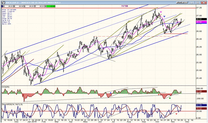
UUP (dollar ETF) daily
On Friday, UUP extended its short-term uptrend. In the course of the day there were some positive comments about the phase onetrade talks which were probably responsible for its move (as well as that of the DJIA). More time is needed to see if UUP is heading for a new high, or if it is getting ready to start a more protracted correction.
GDX (Gold miners ETF) weekly
After a good bounce from a slightly new low, GDX has lost its upside momentum and looks ready to retest that low. A new low cannot be ignored since the index has not yet retraced a full 50% of its previous uptrend. On the other hand, if it is able to trade above its 50-dma, this would be a bullish sign calling for a move to about 29.50 or higher.

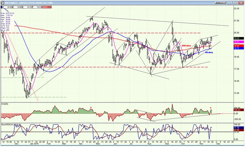
BNO (U.S. Brent oil fund) daily
BNO is moving along with the market. Also, although not exactly, it tends to observe the 50-dma. It has remained above it since its last low and will probably continue to do so until the market rolls over.
Summary
We appear to be moving closer and closer to a reversal, but there may still be room for a little more distribution to take place before we end the uptrend from 2856.
The comments made in the daily updates and the Market Summary about the financial markets are based purely on what I consider to be sound technical analysis principles. They represent my own opinion and are not meant to be construed as trading or investment advice, but are offered as an analytical point of view which might be of interest to those who follow stock market cycles and technical analysis.
Recommended Content
Editors’ Picks
AUD/USD jumps above 0.6500 after hot Australian CPI data

AUD/USD extended gains and recaptured 0.6500 in Asian trading, following the release of hotter-than-expected Australian inflation data. The Australian CPI rose 1% in QoQ in Q1 against 0.8% forecast, providing extra legs to the Australian Dollar upside.
USD/JPY hangs near 34-year high at 154.88 as intervention risks loom

USD/JPY is sitting at a multi-decade high of 154.88 reached on Tuesday. Traders refrain from placing fresh bets on the pair as Japan's FX intervention risks loom. Broad US Dollar weakness also caps the upside in the major. US Durable Goods data are next on tap.
Gold price cautious despite weaker US Dollar and falling US yields

Gold retreats modestly after failing to sustain gains despite fall in US Treasury yields, weaker US Dollar. XAU/USD struggles to capitalize following release of weaker-than-expected S&P Global PMIs, fueling speculation about potential Fed rate cuts.
Crypto community reacts as BRICS considers launching stablecoin for international trade settlement

BRICS is intensifying efforts to reduce its reliance on the US dollar after plans for its stablecoin effort surfaced online on Tuesday. Most people expect the stablecoin to be backed by gold, considering BRICS nations have been accumulating large holdings of the commodity.
US versus the Eurozone: Inflation divergence causes monetary desynchronization

Historically there is a very close correlation between changes in US Treasury yields and German Bund yields. This is relevant at the current juncture, considering that the recent hawkish twist in the tone of the Fed might continue to push US long-term interest rates higher and put upward pressure on bond yields in the Eurozone.