As far as I’m concerned, the only way to answer the question of which is the better investment between gold and the Dow Jones Industrial Index is to analyse the chart of the Dow expressed in gold. So, let’s do just that using the monthly and weekly charts of the Dow/Gold ratio.
DOW/GOLD MONTHLY CHART
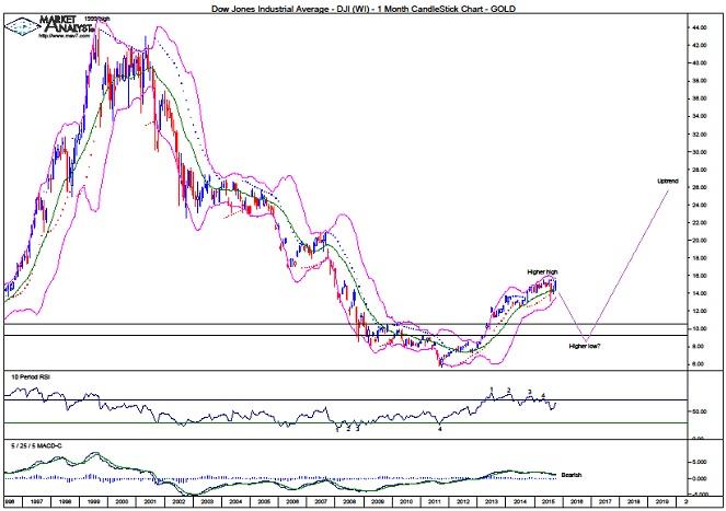
We can see the massive downtrend that was in place since the 1999 high of 43.92 until price bottomed in 2011 at 5.70. That is a solid gold smashing!
Price has been rising steadily for the last four years and has made a higher high after cracking above previous swing high levels which are denoted by the two horizontal lines. Now, all that is needed is for price to come back down and put in a higher low. Then the bull trend can really let loose.
Old tops often act as support in future and I expect price to now head down and test the support from the previous swing highs. I actually think price will nudge a bit below as it gives that support a thorough test.
The 2011 low was accompanied by a quadruple bullish divergence so it was no surprise to see a significant rise in price. However, the recent high at 15.56 was accompanied by a quadruple bearish divergence so perhaps the multi-year leg up is now in need of a break and a significant correction is set to occur.
The MACD indicator is bearish.
The Bollinger Bands show price bouncing back up just above the lower band with price now a touch above the middle band. It is not uncommon to see some toing and froing between the bands during trend changes.
The PSAR indicator has a bearish bias with the dots above price.
Now, this chart of mine only has relevant data going back to the mid 70’s but using data from a much longer time period shows a massive megaphone top pattern. I find these patterns are generally nonsense and are given too much publicity by those with suspect knowledge of the technicals predicting doom and gloom. Price heading up now and cracking to new highs would invalidate the megaphone pattern and that is my expectation.
Let’s move on to the weekly chart.
DOW/GOLD WEEKLY CHART
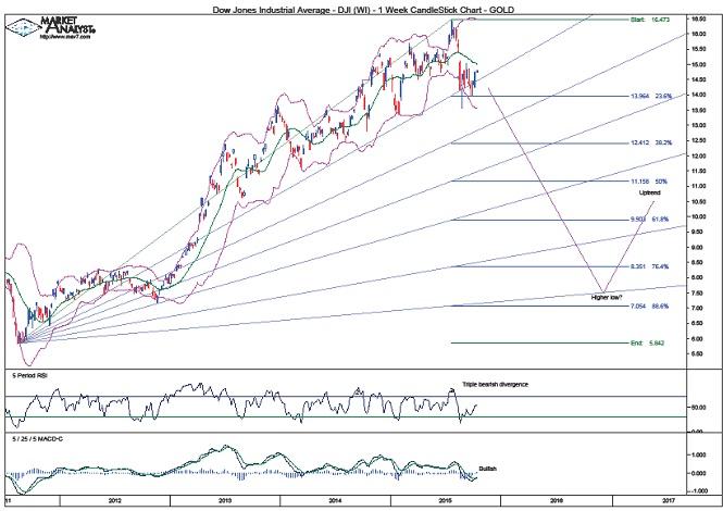
The RSI showed a triple bearish divergence at the recent price high.
The MACD indicator is currently bullish but it doesn’t look overly convincing coming on the back of a solid move down.
The Bollinger Bands show price finding support at the lower band and now being around the middle band. If a significant correction is indeed about to take place then I would expect to see price move back to the lower band and hug it as the downtrend takes hold.
I have added Fibonacci retracement levels of this initial move up. The first correction in a new bull trend often makes a deep retracement and I am targeting the 76.4% level of 8.35 as the minimum with the 88.6% level of 7.05 also a chance. Perhaps somewhere in between.
I have drawn a Fibonacci Fan and I am targeting the low to be around support from the 88.6% angle which looks set to be in between of the aforementioned retracement levels in late 2016 and early 2017.
So, let’s come back to the question of which is the better investment – gold or the Dow? My analysis leads me to believe that, over the next year or so, gold will be a better investment. However, over the longer term, the Dow should prove to be a much better investment by far!
The above is a matter of opinion provided for general information purposes only and is not intended as investment advice. Information and analysis above are derived from sources and utilising methods believed to be reliable, but we cannot accept responsibility for any losses you may incur as a result of this analysis. Individuals should consult with their personal financial advisors. Put simply, it is JUST MY OPINION.
Recommended Content
Editors’ Picks
AUD/USD could extend the recovery to 0.6500 and above

The enhanced risk appetite and the weakening of the Greenback enabled AUD/USD to build on the promising start to the week and trade closer to the key barrier at 0.6500 the figure ahead of key inflation figures in Australia.
EUR/USD now refocuses on the 200-day SMA

EUR/USD extended its positive momentum and rose above the 1.0700 yardstick, driven by the intense PMI-led retracement in the US Dollar as well as a prevailing risk-friendly environment in the FX universe.
Gold struggles around $2,325 despite broad US Dollar’s weakness

Gold reversed its direction and rose to the $2,320 area, erasing a large portion of its daily losses in the process. The benchmark 10-year US Treasury bond yield stays in the red below 4.6% following the weak US PMI data and supports XAU/USD.
Bitcoin price makes run for previous cycle highs as Morgan Stanley pushes BTC ETF exposure

Bitcoin (BTC) price strength continues to grow, three days after the fourth halving. Optimism continues to abound in the market as Bitcoiners envision a reclamation of previous cycle highs.
US versus the Eurozone: Inflation divergence causes monetary desynchronization

Historically there is a very close correlation between changes in US Treasury yields and German Bund yields. This is relevant at the current juncture, considering that the recent hawkish twist in the tone of the Federal Reserve might continue to push US long-term interest rates higher and put upward pressure on bond yields in the Eurozone.

